[TL;DR: Google appears to be voluntarily tampering with its maps to appease the local populations of Russia and Ukraine, rather than being forced to do so by local laws, which was the case until now.]
What can we infer about Google’s technology, politics and business from observing its approach to mapping Crimea, a few weeks after the invasion and subsequent annexation of the region by Russia?
Technology: We’ve long known Google has the ability to serve different mapping datasets to different Google top-level domain properties. For example, different-language versions of Google Maps will show you different toponyms. However, some local versions of Maps also differ in their boundaries: In China, ditu.google.cn shows Arunachal Pradesh as being Chinese, rather than disputed; in India, maps.google.co.in shows Aksai Chin as being Indian, rather than disputed. And in South Korea, maps.google.kr prevents you from zooming in on satellite imagery. For each of these locations, however, the default international maps.google.com defaults to a accurate, uncensored reference map — where the borders are shown as disputed, and where you can zoom in on the satellite imagery as much as you like.
Now we have evidence of yet two more examples where localized Google Maps differ from the global reference version in their boundaries — in Crimea, for Russian Google Maps but also, surprisingly, for Ukrainian Google Maps.
Let’s have a quick discovery phase re how Crimea looks in different versions of Google Maps:
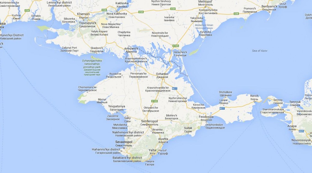
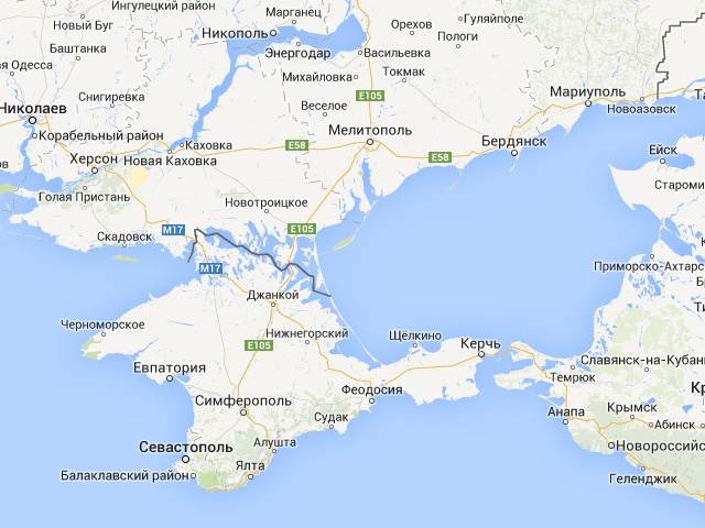
International Google Maps: The new facts on the ground are reflected in a dark dashed line, indicating contested territory:
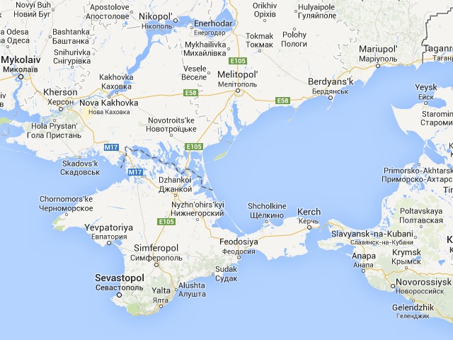
Russian Google Maps: The new border between Russia and Ukraine puts Crimea inside Russia. No dispute is indicated.
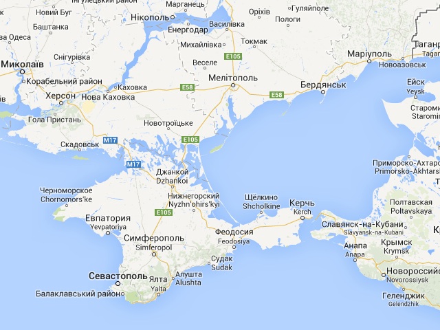
Ukrainian Google Maps: Crimea is part of Ukraine. The line defining Crimea light gray and dashed; it is the same kind of line demarcating other Ukrainian oblasts. No dispute is indicated.
Politics: In every documented case until now — in China, in India and in South Korea — Google’s explanation for showing a dataset that diverges from the reference map has been that is is obliged to observe local laws, and in the case of China and India, local laws dictate that locally-published maps (including Internet maps) must show borders drawn a certain way. For South Korea, the dispute with North Korea legally precludes showing high-resolution imagery.
Why does Google do this? Because it has a local presence — perhaps a sales office, or a development team — and so can be held accountable in local courts of law. In countries where Google does not have a presence, it does not care whether it observes local laws — look no further than North Korea, where the recent addition of concentration camps to the default layer of Google Maps is unlikely to pass local legal tests. Equally interesting, however, is that in countries where Google has a presence, but where there are no local laws mandating how maps shows national borders, Google has until now not adulterated its maps, because it is not legally obliged to do so. A fantastic case in point is the border between Thailand and Cambodia, most of which is in dispute. Both Thai Google Maps and Cambodian Google Maps show the two conflicting border claims side by side, in both datasets — a wonderful example of how more context on a map is always a good thing.
It is worth noting that in all cases where Google does show tainted maps, these are only shown locally. None of these defects bleed into the international map dataset shown to the rest of us. Meanwhile, citizens of India, China and South Korea who choose to type maps.google.com into their browser will always get an accurate map.
Business: So why does Google show Crimea as part of Russia to the Russians, and as part of Ukraine to the Ukrainians?
Let’s look at Russia first: According to NPR and Russia Today, Google has flashed the “they made us do it” card:
“The Google Maps team is doing its best to objectively mark disputed regions and landmarks. In relevant cases the borders of disputed areas are marked in a special way. In countries where we have a localized version of our service, we follow local laws on representing borders and use of landmark names,” Svetlana Anurova of Google Russia told ITAR-TASS.
Unfortunately, while this statement is true in the narrowest reading, it is also wholly disingenuous, because it does not apply to Russia, where there is no law that compels local map publishers to show Russia’s borders in a certain way. Unlike in India and China, The Economist does not get censored in Russia when it maps a relevant area as disputed. And for what it’s worth, Article 29 of Russia’s constitution explicitly protects the freedom of ideas and speech:
Everyone shall be guaranteed the freedom of ideas and speech. […] No one may be forced to express his views and convictions or to reject them. […] Everyone shall have the right to freely look for, receive, transmit, produce and distribute information by any legal way. […] The freedom of mass communication shall be guaranteed. Censorship shall be banned.
So on what possible grounds could Google argue that it must show Crimea as indisputably Russian, as opposed to being subject to a dispute, which is what every reasonable observer agrees on — including Putin’s envoy to the UN Security Council, merely by showing up?
One possibility: The Lugovoi law. According to the Moscow Times, this law, which came into effect February 1, 2014, allows Russia’s Federal Mass Media Inspection Service to block websites that “contain calls for unsanctioned acts of protest”. In the opinion of the Moscow Times, this new law clearly violates the Russian Constitution. But the same Article 29 of that constitution limits speech in the following ways:
The propaganda or agitation instigating social, racial, national or religious hatred and strife shall not be allowed. The propaganda of social, racial, national, religious or linguistic supremacy shall be banned. […] The list of data comprising state secrets shall be determined by a federal law.
It would admittedly be a stretch to argue that disputed areas are a state secret. But in the strange new world of Putin’s Russia, I can almost fathom somebody arguing that showing the “wrong” borders instigates national hatred to the extent that it amounts to a call for “unsanctioned protest”. And apparently, that is exactly what one Russian Deputy intends to do.
Google has clearly decided not to test whether this bizarre interpretation of a bizarre law would stand in court. I suspect Google might even win were it to stand its ground.
Instead, I think the real reason why Russian Google Maps shows Crimea as undisputedly Russian is that the annexation is popular inside Russia. Showing Crimea as disputed territory would likely lead to calls for boycotts of Google’s services in Russia. Quite possibly, local Googlers also feel it is just and right for Google Maps to show Crimea as undisputedly Russian. More charitably, Google HQ might fear for the safety of its local employees. But these are not the reasons Google has given for its caving in to Russia’s increasingly dogmatic world view. Perhaps Sergei Brin, whose early experiences of persecution in Russia ultimately led him to take the moral high ground in China and pull the plug on Google.cn in 2010, has yet to tackle this issue.
And then there is Ukraine: Another major hint that these maps were tampered with not due to legal coercion but in order to protect Google’s existing business in an environment of charged nationalism is the fact that the Ukrainian Google Maps also differs from the international version. To the best of my knowledge (and no little Googling), Ukraine also has no law constraining the depiction of its borders on maps. And yet in Ukraine too, Google’s map aligns with the prevailing popular sentiment.
Google should take a stand for accuracy in every situation it is not compelled to do otherwise. Acknowledging that Crimea is disputed territory must not be made tantamount to taking sides in this conflict. Surely the Ukrainians and Russians can agree that they fundamentally disagree on who should own Crimea. That truth should be reflected on the map.