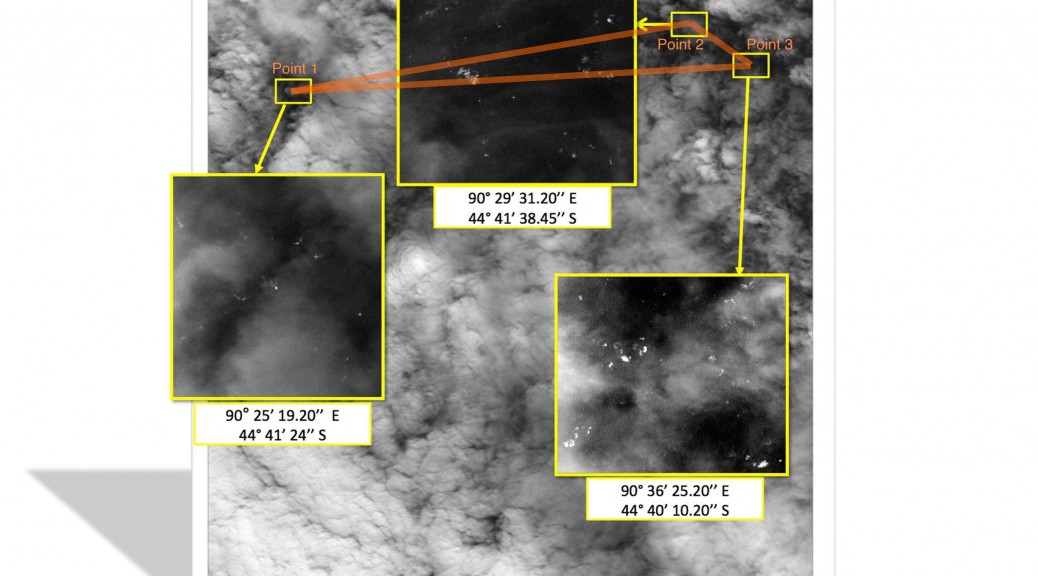
The Malaysian Remote Sensing Agency (MRSA) today released an annotated satellite image purporting to show a debris field in the Southern Indian Ocean, near the area where the plane is believed to have perished.
Unfortunately, using only the information contained by the image, it can easily be proven to be self-contradicory, and hence useless.
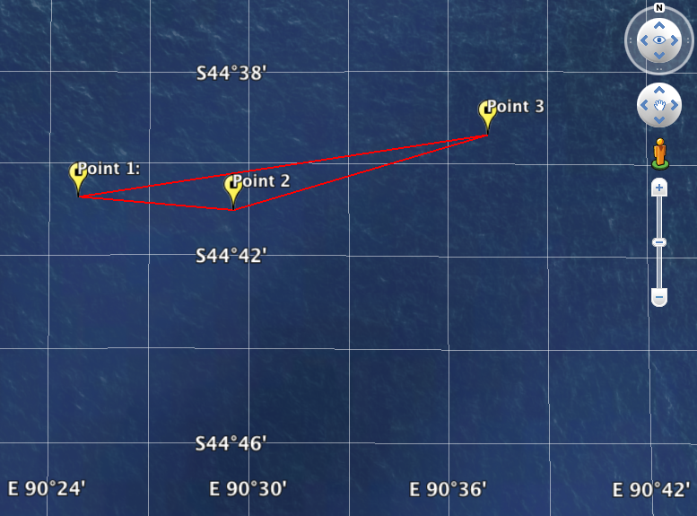
I’ve been collecting satellite imagery of possible debris sightings in a Google Earth file as they are shared with the press, using the coordinates displayed on the image to georeference them as accurately as possible.
The image released today by Malaysia superimposes three areas in high-resolution from breaks in the cloud in a mostly cloudy image, accompanied by their coordinates.
On the image, these three areas form a long and narrow obtuse triangle (which I’ve highlighted in orange). When I plotted their associated coordinates on Google Earth, it quickly became clear that they do not at all correspond to the same shape. The triangle on Google Earth is completely different.
A subsequent quick casual inspection of the coordinates in the image shows their arrangement to be geographically impossible. Here is the view in Google Earth of the same points, their coordinates accurately georeferenced.
With their placement known to be wrong, I took a closer look at the high-resolution areas in the image and compared them to their adjacent smaller counterparts. The do not in fact seem to be related. The cloud layers bear no similarity.
This image is either a fabrication — a piece of fiction cynically concocted to feed the journalists and families of the victims — or it is an honest mistake by somebody who perhaps should step aside for the greater good of this recovery mission.
Very interesting observations Stefan. Let’s see what turns up when they start zooming in to find the black box. Apparently the signal will only be emitted for 30 days.
To me, it looks as if they flipped the image, making South at the top, and at a slight angle. Could that be a possibility?
No amount of flipping and rotation would change the shape of the triangle. The distances between the points are not the same, nor are the angles.
Agree to your conclusion on the wrong coordinates 100%, i got the same results. One more part in the collection of total wrong information about flight MH370… more to come???
I couldn’t quite believe it – this image is all over every news service – so had to check the coordinates as well, with the same conclusion.
Those 3 satellite images were released to the public back on March 23, 2014. Remember it was the third set of images released a few days after the first two on March 16 and March 18. A casual inspection of the south latitude values clearly showed me that point #3 had to be further north than the other two since 44-40-10 is smaller than either 44-41-24 or 44-41-38, thus point #3 was closer to the equator. I emailed CNN about that discrepency the same day but never heard back from them. They continued to show the images incorrectly for several more days, until the next search area to the southwest published on March 24 was eventually given up on.
Stephan, I don’t mean to quibble, but shouldn’t your point #3 be plotted just a bit below the unlabled 44-40 S latitude line?
Good point — but what you see is an optical illusion. Google Earth’s coordinate lines straddle the ocean floor, while the points of interest are at sea level. I took that screenshot from the top right edge of the screen with North up, so the points look more northerly than they are. Try it yourself in Google Earth and you will see that you can create a parallax effect by moving your point of view. It’s a bit unfortunate but the KMZ file is completely accurate.
I’d think Google Earth would project the geodetic graticule onto a sea level surface. But I take your word for it. Unfortunately my public library here in Fort Myers does not see fit to buy Google Earth or even put an academic version on their system! I need a new laptop!!
BTW here’s the RAAF brochure I alluded to before:
https://www.airforce.gov.au/docs/JORN_FAQS.pdf
I did just check again. But do check yourself when you get access.
So the reasoning for lat & lon being projected down to a varying depth of ocean is what? I’m also trying to visualize the effect. I suppose if the viewing point (perspective point) is directly over a location, it makes no difference, but when it is off considerably, say to the south, yeh I can see how the latitude lines would move north, that is, if projected up to the sea level surface, the lines would shift slightly southward. Interesting. Is this done for oceanographic mapping purposes? I still have trouble with the variation of ocean depth and it’s effect upon the position of the latitude lines. Hmmm …
I thought more about how Google places the geodetic graticule onto the sea bottom surfaces. Does that mean they also do it in reverse for high terrain surfaces as well? I used to be a geodesist for a U.S. national mapping agency, now retired. I assure you back then we carefully positioned the graticule onto an ellipsoid or geodetic datum that approximated a mean sea level surface.
I know this is not the correct forum for any discussion of JORN, but here’s another URL I found in one of my emails to some associates. This shortened renamed brochure (down to 6 pages from 9) is quite similar to the previous one, but it apparently was edited and released only 2 days later on June 14, 2011.
http://www.airforce.gov.au/docs/JORN_Fact_Sheet.pdf