Biannual Swedish media panic sets in as Google Earth continues to show Sweden’s “secrets”

In Sweden late last week, the story “broke” [translation], as it tends to do every few years, about how Sweden’s military secrets are visible in imagery on Google Earth and Maps, but not on its local competitors, Hitta.se and Eniro.se, amid general consternation from random interviewees.

The one big difference this time round is that Google Sweden’s own spokesman, Andreas Svenungsson, appears to join in, expressing what Swedish Radio describes as “self-criticism” when he says that “clearly, if it’s not supposed to be there [on the map] then we will take it away.”

It is possible that he was being diplomatic, knowing full well that Google is not required to censor imagery taken from space or which is already in the public domain. Much better, however, would have been to use the interview as a teachable moment, pointing out that just like any other country, Sweden has no sovereignty over space, but that it is welcome to censor its own aerial imagery before it is published by Sweden’s national GIS agency, Lantmäteriet. And that Google has no obligation to use Lantmäteriet’s imagery, though it currently does for large parts of the country.

This blog has long lambasted Lantmäteriet’s policy not just of censoring its maps, but of obfuscating the censorship, making it look as if “sensitive” locations are forests or fields instead of just pixellating them. Lantmäteriet was caught doing this with the National Defence Radio Establishment (FRA) HQ back in 2006 and more subtly in 2009. This kind of behavior undermines trust in all their maps and data, and is unbecoming an open society, especially when the information is easily available via other channels. (The Dutch, for example, openly pixellate.) There was a moment of hope earlier this year, when it looked like Lantmäteriet had moved on from these cold-war methods: It released what appears to be uncensored imagery of the FRA HQ, visible in Google Earth. It now looks like this was just sloppiness on their part.

Because Google’s spokesman doesn’t educate the reporter, Peter Andersson, much of his article is mired in confusion. The current panic is about the locations of the two main underground control centers for Sweden’s air force — one near Stockholm, and the other in the South of Sweden; both are well-known nationally. In Google Earth, the one outside Stockholm is visible, but not the one in the South. This happens to be because near Stockholm, Google’s current imagery consists of uncensored satellite imagery from DigitalGlobe; in the South, it uses censored imagery from Lantmäteriet. Andersson and his interviewees assume that because one of the locations is censored, both should be.

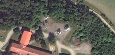
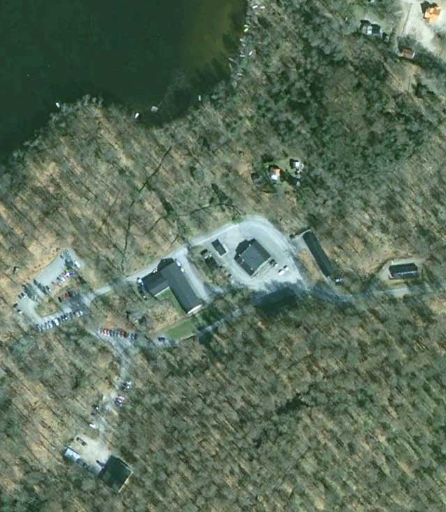
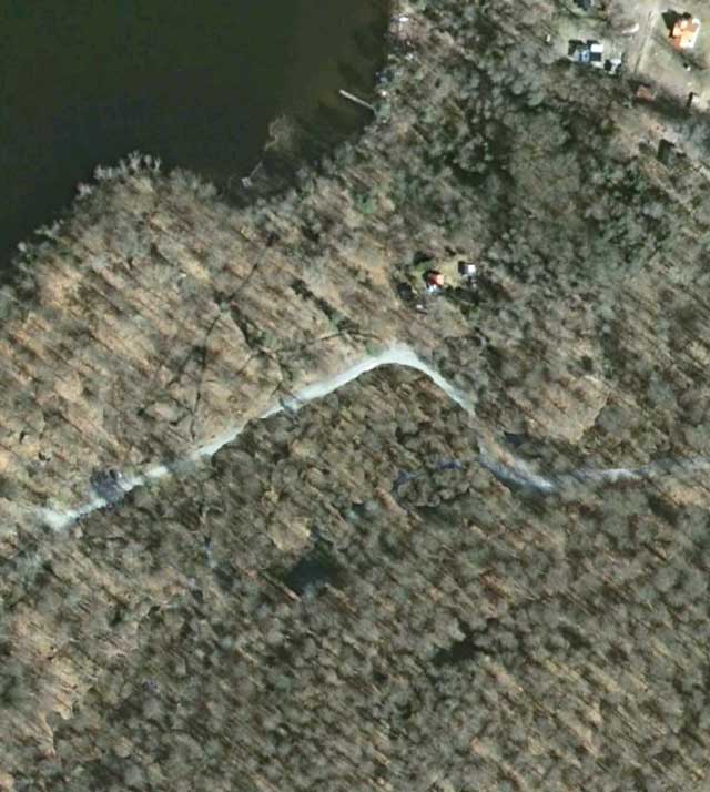
In fact, neither is: Even in the South, if you use Google Earth’s historical imagery tab, you can see two uncensored views of the control bunker area. It’s imagery dated from 2006 and 2009, and curiously also credited to Lantmäteriet, which obviously previously released it into the public domain without censorship. The location is very easy to find for anyone with basic Googling skills: Searching for the generic name for these underground centers, “stridsledningscentral”, leads to an article discussing how the nearby village of Hästveda depends on jobs at the control center in question. In Google Earth, the village is easily found. Then, by toggling between the current imagery and that from 2009 using Google Earth’s historical imagery panel, the Photoshopping by Lantmäteriet of the current imagery pops out immediately from the surrounding countryside, because it looks like buildings in 2009 have been replaced by virgin forest in 2010:


Hästveda stridsledningscentral in Google Earth, imagery from 2009.


Hästveda stridsledningscentral in Google Earth, imagery from 2010.

Try it yourself at this location in Google Earth (open downloaded KMZ file in Google Earth). Nobody should be in any doubt that keeping this kind of “secret” is pointless; the effort and intelligence required to discover it is so minimal as to render the term meaningless. The only people not in the know are those who don’t care.

(If you read Swedish, this post on Cornucopia? runs through how the various mapping services portray Sweden’s various “secret” locations.)

Iran set to launch Google Earth rival

Got GeoInt? flags a great story: Iran’s military is launching a Google Earth competitor, slated to go live later this week, according to the Iranian Mehr news agency and Tehran Times.

According to Brigadier-General Mohammad Hasan Nami, head of the armed forces’ geographical affairs organization, the web service will be called Basir, and is motivated to counter the “cultural aggression” of Google Earth/Maps against Islamic countries.

Google Earth is also accused of “distorting history”; while he doesn’t specifically refer to it, the Brigadier-General is no doubt referring to Google’s naming policy, which has resulted in the waters between Iran and Saudi Arabia to be labelled both Persian Gulf and Arabian Gulf. This has irritated the more literal-minded Iranians to no end, and resulted in both a protest from the Iranian foreign ministry and an online petition signed by 1,245,781 people last time I checked.

With Basir, Iran will now be able to call the Gulf anything it wants.

When asked to differentiate Basir from Google Earth, Brigadier-General names a qibla-finding tool — Which calculates the direction to Mecca, for prayer. Alas, due to the Google Maps API, qibla finders are now a dime a dozen.

But the most fantastical feature attributed to Basir by the Brigadier-General is the fact that “it can prevent certain websites such as the ‘Google Earth’ from gathering information about other countries.” I suspect something got lost in translation but I’ll have a guess at what he means: Now that Iranians will have access to a Google Earth/Maps substitute, it will be easier for the regime to justify blocking Google’s mapping services. After all, Google Earth is cultural aggression, so surely the next step is to block it.

Notes on Sweden’s high-resolution update in Google Earth

Just a quick heads up for Swedes and/or power users of Google Earth: I noticed via the latest KML change log for imagery in Google Earth that Sweden had gotten a significant new addition of high resolution imagery after years of being mostly in low-resolution purgatory.

Just as with previous updates, most if not all of the imagery turns out to be from Sweden’s state GIS agency, Lantmäteriet.

There is good news and bad news to share with you.

The good news, overlooked by me since a previous smaller update in March 2011: Lantmäteriet appears to finally be restraining itself from censoring their datasets before release — the satellite dishes at the National Defence Radio Establishment (FRA) HQ, so clumsily airbrushed out of existence in a 2009 update, are now back:

Compare the current view to the view in 2009 and in 2007. If this is a trend, it is definitely in the right direction. It would be great to know if there was a policy decision behind it. Perhaps an actual journalist in Sweden will find out for us. (Or, Lantmäteriet reads this blog and decided to throw us a bone;-)

The bad news: Most if not all the imagery is labeled 1/1/2010, aka January 1 2010. This jars quite spectacularly with the new imagery’s summery scenes visible north of the Polar Circle — these images quite clearly were not taken on New Years Day.

So what happened? My bet is that Lantmäteriet either doesn’t have dates for a dataset taken piecemeal over a season (likely; it looks like it might be aerial imagery, reduced somewhat in resolution) or else it doesn’t want to give specific dates for privacy or financial reasons (unlikely). And so the metadata only tells us it is from 2010 — except that Google Earth can’t accommodate this level of all-too-human fuzziness, and so defaults to January 1.

Who cares? If you’re using Google Earth for research, it’s good to know that January 1 dates are probably bogus.

Mapping South Sudan’s northern border: Not so fast!

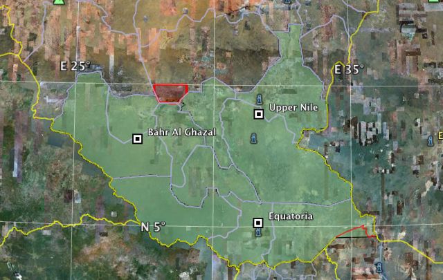
South Sudan gained its independence on July 9, 2011, but it took another 10 days before its border with Sudan made a debut in Google Earth. Wikipedia, OpenStreetMap and even this blog made that border available from day one. So what would justify the delay at Google?
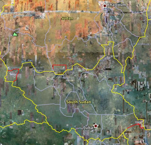
The answer is hinted at if you compare Google’s version of the border with the dataset most others used. They are not the same. Conspicuously, Google outlines two large areas — Abyei in the center and the Kafia Kingi enclave to the west — in red, indicating a dispute; but there are also more subtle discrepancies between the two delineations of the border along the entire course. (Just open this file in Google Earth to see the differences.)

After decades of civil war, the world’s newest border is also one of the most volatile. Straddling it are mineral deposits, oil reserves and traditional grazing rights, all of which intermittently lead to clashes that could easily escalate. Delineating an accurate and authoritative version of this border is thus a crucial step to a stable peace.

Google’s map data carries no authority in any legal sense, not any more than Microsoft’s, Yahoo’s or National Geographic’s, but that is not surprising. What sets it apart from the others, however, is that over the past half decade, the ubiquitous use of Google Earth as a universal digital atlas has bequeathed it a popular authority, and a sense that Google’s choice regarding a border (or place name) constitutes a weighty endorsement in the court of global opinion. This has led to remarkable situations where states themselves have petitioned Google about perceived bias or errors in its maps. Documented cases include Cambodia, Iran, Azerbaijan and even Japan. In an even more bizarre case, Nicaragua’s government cynically invoked Google Earth’s (erroneous) depiction of its border with Costa Rica to justify a land grab.

How Google depicts South Sudan’s northern border, then, matters. And so it has done its homework. This post will get into the nitty-gritty in a minute, but if you want the executive summary, here it is, based on the story I got from Google: Google was late because it decided to use a brand new and detailed delineation of the border made by the Geographic Information Unit at the US State Department, which late in the game needed some more information about the disputed borders. Google in turn needed time to decide how to apply its policy for disputed borders and names to the specific instance of South Sudan. Hence the delay.

But why prefer the State Department/Google version over the one already in the public domain, derived from colonial-era surveys of Sudan’s provincial boundaries? Which is the most accurate?

The answer to this requires a brief but fascinating detour into an explanation of the difference between the delimitation, delineation and demarcation of a boundary. The delimitation of a boundary is its definition, for example as a text in a treaty or judgment, and it often comes accompanied by maps delineating the boundary. But a delineation on a map can also be made much later, based on interpretations of delimitations in historical documents that may be ambiguous. Demarcation, in turn, is the physical marking of a boundary on the ground, through fences, beacons, signs, etc. Sometimes boundary definitions can reference existing physical boundary markers, so the process is not always linear. Ideally, the text, map, and ground markers agree without ambiguity. In the case of South Sudan’s border with Sudan, there are discrepancies large enough to fit a small town, as we’ll see.

In reading up on South Sudan these past few weeks, I found some great literature on the specifics of the North-South border, via the wonderfully thorough and focused blog South Sudan Info, which recently came up with a reading list specifically about the border. Some reports on the list look at all the potential flash points along the border, and here it is evident that Abyei and Kafia Kingi enclave are merely the two most preëminent of up to nine contested boundary areas, depending on who’s counting.

Most of these boundary issues are matters of delineation and demarcation rather than delimitation — where there is agreement about the definition of the border, but not about where exactly it runs. Here’s one example, excerpted from When Boundaries Become Borders — The impact of boundary-making in Souther Sudan’s frontier zones (PDF, 2010), by Douglas H. Johnson:

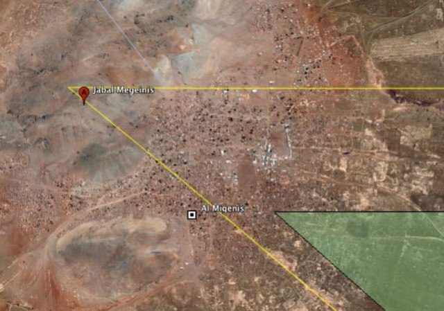
The delicacy of determining the north-south boundary is well-illustrated by Upper Nile state’s northernmost boundary with White Nile State. This straight line runs west to east and would appear to be unproblematic and a simple matter to confirm. Unfortunately, this is not the case. The northwestern corner of this boundary (where it meets South Kordofan) is supposed to be anchored on Jebel Megeinis [hill], but modern GPS readings have revealed that Jebel Megeinis is not located on the coordinates that have been recorded on the Sudan Survey maps since the early part of the 20th century. Not only that, but there are two beacons on the mountain, one at the base, and one at the summit. A precise fixture thus turns out to be imprecise, creating room for argument.

I’ve marked that location on Google Earth, where you can see that US State/Google’s brand new delineation places the corner atop Jebel Megeinis hill, as called for by the original delimitation. At the foot of the hill lies a small town, Al Miqenis.
Here’s how the US State Department comments on its delineation of that section of the border, from a draft of its “Detailed Boundary Recovery Report”, as provided by Google:

[…] The line is much more accurate near where it is anchored by the distinct Jebel Megeinis peak. This is fortunate, as the last two km of this line [coming from the southeast] (minus the last half km on the peak’s steep slopes) cuts through by far the most heavily built-up area near the entire 1956 line [dividing north from south], the town of Al Miqenis… at least 20 buildings and many more small lots are literally sliced by the line. This town does not appear on either the 1930’s Sudan Survey map, [nor] the 1970’s Soviet map (though a major road intersection does appear).

From Jebel Megeinis, the line follows the parallel defined by that peak’s distinct summit due east for 71 km and is thus one of the entire line’s few absolutely accurate sections.

In the dataset used by Wikipedia, OSM and others, most of the town of Al Miqenis is located in Sudan (i.e. outside the green area in the image above.) In Google Earth, it lies mainly in South Sudan (i.e south and east of the yellow line.) Of course, in the Wikipedia/OSM dataset the corner was never intended to be located to the southeast of the town, but on top of Jebel Megeinis hill; it’s just that the hill turns out not to be where previous mappers thought it was, through inaccurate surveying. This kind of error would have been cemented when paper reference maps were replaced by digital datasets, but politicians may not necessarily be swayed by such explanations when a border town is up for grabs.

For Abyei and the Kafia Kingi enclave, the dispute is not a question of delineation or demarcation but of delimitation, and these are the ones that Google has drawn in red.

At this point, there is no way to avoid a quick history lesson. From 1898, Sudan was jointly governed by the British and the Egyptians (a so-called condominium), but with northern and southern Sudan firmly separated into different regions — the northern provinces tied to the Arab sphere of influence, the southern provinces connected to Britain’s East African colonies, where Christian missionaries were given free rein. By the 1920s, crossing between these two territories required a passport, and Britain was planning two very different futures for them. But it was not to be: After WWII, a stressed UK decided on central administration from Khartoum, and it was thus that in 1956 a single unified Sudan became independent.

After decades of civil war between northern and southern Sudan, in 2005 the government of Sudan and the Sudan People’s Liberation Movement (SPLM) agreed on a process for the eventual secession of South Sudan. The Comprehensive Peace Agreement (CPA) defined the future international border to be the boundary between Sudan’s northern and southern provinces at independence in 1956.

Abyei, which lies to the north of the 1956 boundary, is subject to a separate protocol: It is populated predominantly by ethnicities affiliated with South Sudan, and so Khartoum was coaxed by the international community into allowing Abyei’s inhabitants to decide whether they too want to join South Sudan. Pending a delayed referendum amid signs the government of Sudan is increasingly unwilling to part with Abyei, the protocol nevertheless dictates that the area is to be governed jointly by Sudan and South Sudan until the people have made a choice. In other words, Abyei is in limbo, and that is reason enough to color it red on Google Earth.

What about the Kafia Kingi enclave? I defer to Edward Thomas, who wrote an entire book (PDF, 2010) on this remote and sparsely inhabited region of Africa, long used as slave hunting grounds by Arab slave traders. Kafia Kingi was part of southern Sudan at independence in 1956, but in 1960 jurisdiction over the area was transferred to northern Sudan.

The 2005 peace agreement dictates that Kafia Kingi should therefore be returned to southern rule upon independence for South Sudan. On the ground that transfer does not seem to have happened, however. Even if the agreement is clear on the delimitation of the boundary, a de facto continued occupation and administration by Sudan is reason enough to color the boundaries red.

Because the Wikipedia/OSM border dataset is based on Sudan’s provincial boundaries as they existed in 2011, not in 1956, they do not show Kafia Kingi as part of South Sudan — it stays with Sudan’s province of South Darfur. This is an error. You could even argue that South Sudan’s claim to Kafia Kingi is stronger that that for Abyei, because Kafia Kingi belonged to southern Sudan in 1956 and thus its transfer requires no further discussion. This view is apparently held by the CIA; its World Fact Book entry depicts Abyei as disputed but Kafia Kingi as integral to South Sudan:
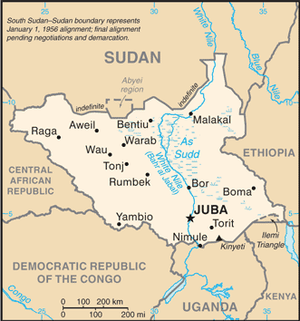
On the other hand, it is not clear whether South Sudan is actively pursuing a claim on Kafia Kingi. The fledgling state has a lot on its plate, and cannot afford to confront Sudan militarily. Official maps of South Sudan are hard to come by: The only map available on the government’s official website omits both Abyei and Kafia Kingi, though likely for the same reason it is missing from the dataset used by Wikipedia and OSM. For the International Court of Justice or other arbitration courts, however, such omissions will over time come to undermine territorial claims. Edward Thomas, meanwhile, in his book suggests that Khartoum is holding on to Kafia Kingi as a bargaining chip, because its sparse population and mineral wealth makes it easily tradable for concessions elsewhere along the border.

In other words, I can see a scenario where Khartoum would offer to finally let Abyei go in return for Kafia Kingi. South Sudan would then have to consider whether it could get more through other means, and at what price, or else accept a somewhat ignoble trade.

(As of this writing Bing Maps and Yahoo Maps still show Sudan and South Sudan as one nation indivisible.)
Satellite corroborates accounts of a massacre in Sudan (now also in Google Earth)

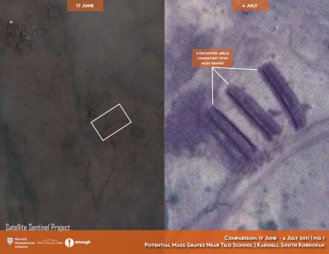
The Satellite Sentinel Project — which uses satellite imagery to monitor human rights and ceasefire violations in the border area between Sudan and South Sudan — today issued a report showing satellite images of what appear to be mass graves near the village of Kadugli in Sudan’s South Kordofan region. These images were taken to corroborate eyewitness observations. The high resolution images are made available on Flickr here, and are accompanied by a PDF that provides the narrative context.

What these images attempt to show is that since early June, Sudanese-backed troops in Kadugli have been rounding up and executing suspected sympathizers of the Sudan People’s Liberation Movement (SPLM), an opposition militia. Eyewitness accounts talk of mass graves being dug to bury the dead beginning on June 8. The report provides imagery from June 17 and July 4, with the latter imagery showing clear signs of excavation. Satellite Sentinel Project concludes that the June 17 imagery shows “no discernable activity at the alleged mass grave site near Tilo School” that day but that the July 4 imagery does show excavations.

From looking at the imagery, I think that the June 17 imagery does in fact show evidence of recent activity, just no open pits on that day. You can see on the June 17 imagery what appears to be recently flattened earth, consistent with bulldozed-over pits, in a pattern that is especially visible on the July 4 imagery, right next to the the open pits visible on that day.

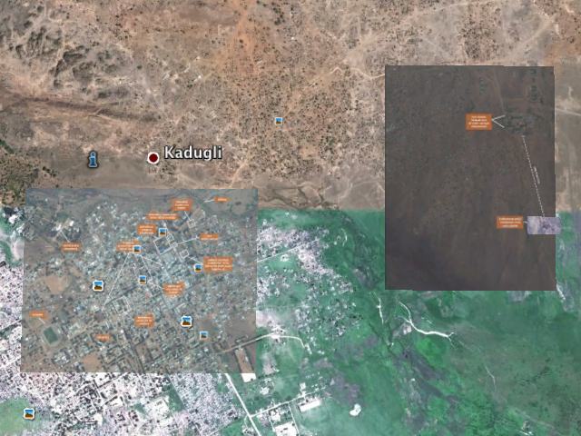
But the point of this post is mostly to add a further layer of context: These images need to be shown in Google Earth to give them an immersive quality and a situational dimension that a satellite image just by itself cannot provide. So I’ve superimposed them onto Google Earth — you can download the resulting KMZ file (4.8 MB)to open in Google Earth. I’ve included both the July 4 and June 17 imagery, as well as the July 4 imagery of Kadugli town proper, which purports to show a collection of body bags.

As always, I recommend toggling on and off the various layers, especially the June 17 one, to compare the imagery on different dates. The region straddles 2 different base imagery sets in Google Earth. To the north, the imagery was taken in August 2004, during what appears to be a drought. To the south, the imagery is from September 2009, and much greener. There is a seam between the two base images, with an error of perhaps 15 meters, making precise positioning of overlays impossible.

(Looking at the scattered huts near the purported mass graves on the July 4 imagery, it is remarkable how transient they are, with very few of them present both in 2011 and in the 2004 base imagery. Only the paths between the huts seem to show any permanence.)

Finally, a note on the limits of what satellite imagery can show: These images alas cannot prove a massacre occurred; they still allow the alleged perpetrators to claim plausible deniability, absent a fact-finding mission on the ground to Kadugli. But there is no doubt that such a fact-finding mission will one day take place, and that these areas will be re-excavated to look for bodies. In the meantime, any effort to hide evidence on this scale will be in vain, as satellites will no doubt keep a close eye on that one very suspect location. if there is one thing we’ve learned from Katyn to Srebrenica to Rwanda, is that mass graves don’t erase history — rather, they tend to focus the attention of history.

links for 2011-07-10

  • "Abu Saif, a rocket maker for the al-Aqsa Martyrs' Brigades, is a fan of Google Earth. One recent evening in Gaza City, I sat next to him as he showed me how he used the popular satellite mapping program to target sites within Israel."

    My take: We'e heard from these guys before, boasting about how they use Google Earth to target their missiles from Gaza into Israel, but what this article makes clear is that the militants aren't really all that adept. Google Earth doesn't appear to be the enabling technology here, given that the missiles they build seem to have the most rudimentary of guidance systems, if any, and the resulting missiles seem to crash randomly. Google Earth isn't much use then.

South Sudan arrives

A few hours ago South Sudan went live as the Earth’s 193rd nation, amid scenes of jubilation in Juba and elsewhere.

Surprisingly, Google Earth and Maps are as of this writing still not showing the newly created national boundary between Sudan and South Sudan; meanwhile Wikipedia has both Sudan and South Sudan‘s maps updated to reflect the new reality.

Considering that the country is right this moment a cartographic focal point, and that Google Earth is the usual gold standard for this kind of reference, this constitutes something of a missed teachable moment — not just about South Sudan, but also about how online atlases are supposedly instantly updatable, in opposition to all paper atlases, which are now without exception irrevocably out of date.

In any case, considering that South Sudan is comprised of the bottom three regions of Sudan (comprising 10 of the old 25 federal states, which were Sudan’s first-level administrative borders) it’s quite easy to make your own South Sudan map, by removing the superfluous bits from this original Sudan map by maplibrary.org. The result: An outline map of South Sudan as a KMZ file, so that your edition of Google Earth can stay current until the long-anticipated yellow line gets added.

It will be interesting to see how Google decides to represent Abyei, a town straddling the border between Sudan and South Sudan. Pending a referendum which should decide which country it will ultimately join, Abyei officially belongs to both Sudan and South Sudan. On May 21 2011, Sudanese forces took control of the town, though these have now apparently withdrawn, to be replaced by UN troops from Ethiopia.

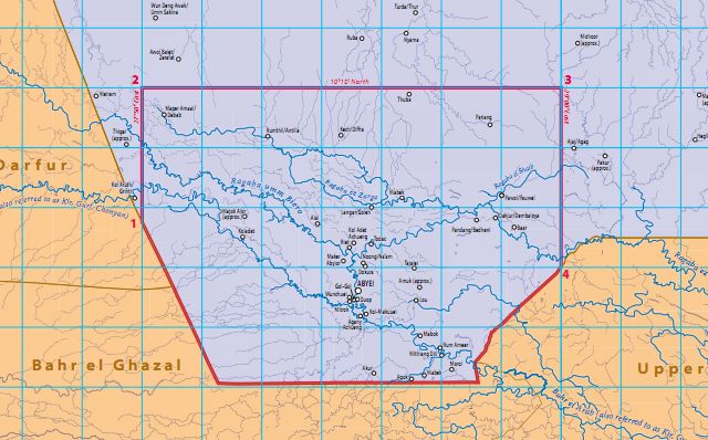
In other words, there should be a red line surrounding the disputed area of Abyei. The size of this area was previously also a matter of dispute, but as of 2009 both sides agree to the boundaries set at the Permanent Court of Arbitration in The Hague. They now look like this:

I’ve added it to the KMZ map downloadable above. That map looks something like this:

PS Don’t get me started on the Ilemi Triangle, bottom right on that map — a border dispute with Kenya now inherited by South Sudan.

UPDATE July 10: Over 24 hours have gone by and still none of the “big three” mapping services (Google, Yahoo, Microsoft) show South Sudan’s borders. In addition to Wikipedia, OpenStreetMap also had the new border in place soon after South Sudan’s independence. I’m really surprised the big players dropped the ball, considering how this event was not exactly unexpected, and an obvious opportunity to do some CSR PR. It turns out the scrappy not-for-profits got there first.

Notes on the political, social and scientific impact of networked digital maps and geospatial imagery, with a special focus on Google Earth.