Category Archives: Uncategorized

South Georgia on my mind

You might soon start to think this blog should be re-christened Ogle South Georgia, but earlier I asked British Antarctic Survey‘s Andrew Fleming for some context around the new imagery of South Georgia in Google Earth, and here is what he wrote back:

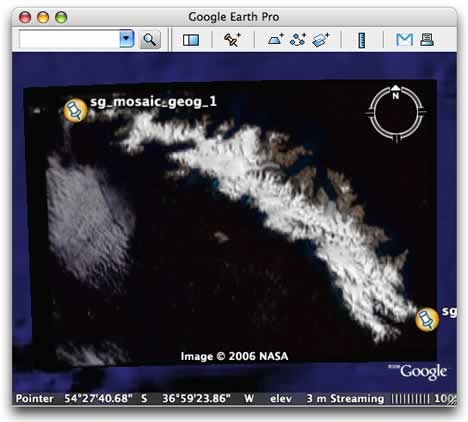
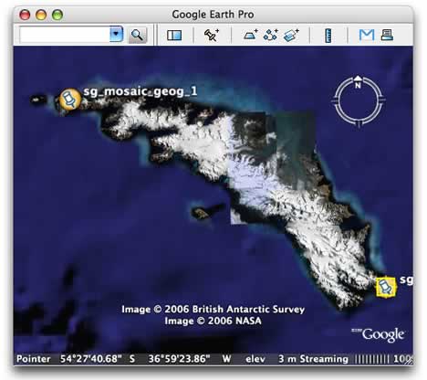
The new satellite imagery of South Georgia available in Google Earth is a Landsat 7 colour composite which preserves the 15m pixel spacing of the high resolution panchromatic data. This image was acquired in February 2003 and is the only (mostly) cloud free Landsat image of South Georgia in the entire archive. There are a couple of very small areas in the west where another image was used to replace a cloudy patch. The image, together with elevation information from the SRTM shuttle mission and other data held by the British Antarctic Survey was used to complete a new topographic map of the island at 1:200,000 scale for the Government of South Georgia – the first new map since Duncan Carse‘s map of 1957. The appearance of the Landsat image in Google Earth is hopefully the first step in providing better detail imagery of the Southern Polar regions over the coming months.

The case for encrypting GPS data

Dean Brown of Racine, Wisconsin, has unwittingly made the case for encryption in GPS units. He was pulled over by police while driving with freshly harvested marijuana in his car and arrested, according to the Racine Report. But that was just the start of his troubles:

Deputies found a GPS unit around Brown’s neck with coordinates to areas throughout Racine County, the complaint said. On Saturday, Metro Drug agents plugged coordinates saved in Brown’s GPS unit into Google Earth…

… and they found all his grow sites. And now he faces 59 years in prison! For marijuana!

Sensor webs & you

Jeremy Cothran at the University of South Carolina’s Advanced Solutions Group has been busy: Ever since he first came out with a KML visualization of a sensor web of weather stations and ocean buoys, he’s been working towards making it easier for others to do the same. He wrote a toolkit and web service to automate the conversion of sensor data to KML, he created the ObsRSS XML format (observations RSS) to standardize the sharing of such data, and now he’s put it all together and improved on his original sensor web visualization. Here is the KML file, updated every hour.

What’s new? First, he’s made it possible to filter observations by type. Each of these types obeys a different color code, so that the data is brought to the surface. For example, here is the view for water temperature observations:

sensorwebs.jpg

Jeremy has also time-enabled all the content, so that you can now isolate the most recently updated stations with Google Earth’s timeline.

Behind the scenes, you (as in you, holder of raw sensor web data) can feed your own XML files to Jeremy’s PHP scripts via a URL and get filtered, styled KML back, or you can take the scripts, modify them, and host them on your own server. In both cases, you can create new observation types; if you had stations tracking something exotic like hydroxyl radicals in the atmosphere, using these scripts to would be a matter of writing a few lines of text. All is explained in the development notes.

(Some feedback: 1) Because it doesn’t make sense to show more than one color-coded data type at a time, it would be better to have the parent folder show its contents as radio buttons. 2) Color works for me for the display of magnitudes, but not for directions. Perhaps future development could incorporate the use of directional icons?)

In sum, what Jeremy is doing is removing — one by one — the excuses organizations might have for not sharing their live sensor web data with millions.

[Update 2006-10-18: Jeremy makes another update, adding radio buttons, among other things.]

Do virtual globes distort the Earth?

Claire Heald’s BBC News article “The map gap” is an interesting read (and name-checks Ogle Earth — thanks!) but at the risk of betraying my non-GIS background, it seems to me that some of the quoted cartographers are not all that acquainted with virtual globes. First, there is this:

On a world scale, the pictures on Google Earth, and programs like it, look accurate. The view is less skewed than with some other projections, such as cartographic models used to set out the world.

[…] And [Google Earth] still does not solve the age-old problem. On a world scale, all’s well, “but when you zoom in you still get that distortion, because it’s on a flat screen”, says Mr Lennox.

I would argue that 2D representations on computer screens of 3D virtual globes are not skewed or distorted at all. They show exactly what a one-eyed astronaut or one eyed airline passenger would see. But even if I was wrong on that point (and I don’t concede it), wouldn’t zooming in on Earth reduce distortion, as you’re getting less and less curvature to deal with? The analog with maps is that on the most local scales, the Earth really is flat, so distortion disappears.

My one other criticism concerns this quote, by Steve Chilton, chair of the Society of Cartographers:

“Google Earth is just the satellite image. It doesn’t show us land use, slope, precipitation. So the need for cartographers still exists. The paper map hasn’t died.”

But in fact Google Earth, NASA World Wind and the upcoming ESRI ArcGIS Explorer can show us these kinds of data — exported from the same datasets with the same professional tools that are also the backbone of paper maps. Whether the operators of these tools call themselves cartographers or GIS specialists is a matter of semantics. The advantage of paper maps is that they don’t run out of batteries. The advantage of virtual globes is that they can show live data — interactively, and without distortion.

No, the paper map hasn’t died, but it is suffering the same fate as paper editions of newspapers.

Short news: Panoramio, X Prize, GPSTagr

  • Photo mapping site Panoramio.com gets an update: Not just a new, more functional design, but also hosting help from Google, writes Eduardo Manchon. As a result, “the speed has improved quite much, specially when browsing the map or watching the photos in Panoramio’s KML, they download much faster.”
  • Google Earth Blog’s Frank Taylor has been working hard on bringing X Prize Cup-related events to Google Earth, and now Google has put up a special page that showcases the different ways to explore space flight in Google Earth.
  • Red Hen Systems produces GPS devices for Nikon DSLRs. (Though if these things work on the D200, as the press release says, they might want to update their website.) Now they’ve come out with IsWhere, a PC application for quickly showing in Google Earth where an image was taken, if the info is in the EXIF headers. The website says its a free download, the press release says it retails for $30, and if you run it, the app tells you you need to use at least one photo geotagged by a Red Hen GPS device. Why not make it free and attract lots of visitors to the site? IsWhere isUseful but not exactly groundbreaking or unique. (Via this press release on Directions Media)
  • GPSTagr lets you georeference existing Flickr photos by uploading a GPX file. Clever. (Via GPS Tracklog)
  • What Japan Thinks lists the most popular outbound links on Goo, a popular Japanese blog hosting tool. Google Earth Japan tops it.

Google Earth, Indian farmhand

DNA India has a good article fleshing out the episode of how Indian farmer activists are using Google Earth to get their money’s worth for lands being acquired by the government for “special economic zones”. While the government says the lands are infertile, the farmers say otherwise, and use Google Earth’s imagery as evidence. There also seem to be plans for a Google Earth Unplugged:

Shivkar has decided to make use of Google Earth for a larger cause. He says that Google Earth pictures showing the condition of canals, rivers and coastline in different villages will be displayed as big banners in respective villages so that people would know what environmental changes would take place in the future.

But the article ends a bit alarmingly:

Shivkar is also planning to make use of Google Earth’s pay service facility which provides the latest picture of the specific area.

Don’t do it, Shivkar! The imagery is the same, regardless of the version.

Super Overlay Tiler: Automate the creation of KML regions

One of the big new features of Google Earth 4 is its support for KML 2.1’s regions — a method for saving bandwidth and CPU cycles by showing tiles of imagery at progressively higher resolutions as you zoom in on Earth, rather than having you try to download and render one gigantic file.

The only problem? If you’re authoring a region-based solution, writing the KML and preparing the imagery is not something you’d do manually. And so the lazy and inept among us (I’m thinking chiefly of myself) have been waiting for somebody, anybody, to come out with a software application that automates all this. You know, give it a big file, some coordinates, and out pops the KML and the image tiles. Thanks.

Google has tried to egg on developers by releasing the regionator, “a collection of Python classes and scripts which can be used to generate Region-based KML”. But it’s Paolo Mistrangelo of Magellano Progetti in Milan who now has come out with a free tool for Windows that I’ve gotten to work like a charm — Super Overlay Tiler v0.1.

SOT is not exactly a standalone application, but the steps involved are straightforward and do not require programming or command-line prowess. In other words, it may not yet be idiot-proof, but it is certainly me-proof. It took a matter of minutes on my barebones Windows 2000 installation to install RMagick and unpack SOT into the required folder.

I happen to have the British Antarctic Survey’s 100MB TIFF image of the South Georgia Islands lying around — the same one that got incorporated into Google Earth’s dataset in the last update. I put SOT to work on it as per the instructions, and not two minutes later I had me a 33MB folder with 1,451 KML files and 1,280 JPG files in it:

sotw2k.gif

Viewing this in Google Earth from the hard drive resulted in smooth, seamless and instantaneous imagery of South Georgia, icebergs and all. Here are views with and without the region-based KML, for comparison:

regions.jpg

noregions.jpg

I threw the resulting folder onto Ogle Earth’s server, partly as a demo and partly as a stress test. Start here to check it out. (It’s a bit slow, thanks to my server).

The upshot: If you have a massive image file you’d like to publish to Google Earth, Paolo Mistrangelo’s SOT now makes that a straightforward process.