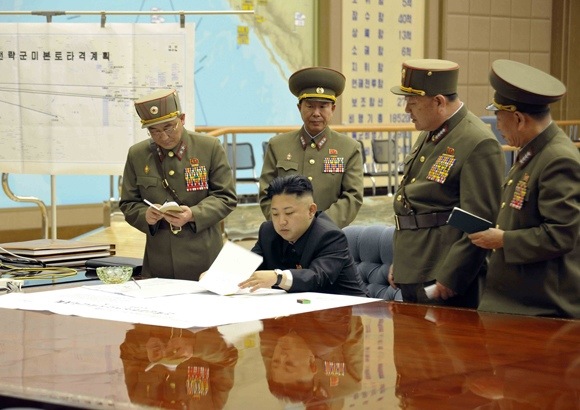
Evan Osnos in the New Yorker today:
… [T]he official Korean Central News Agency released an unusually showy photo of Kim huddled with generals over what the caption described as “plans to strike the mainland U.S.,” complete with a chart in the background depicting trajectories of North Korean missiles hitting American cities.
I’m on the road so this will be brief: The paper map visible in that photo shows the Pacific on the left and the continental US on the right, with missile trajectories drawn from North Korea to a number of locations in the US, including Hawaii. The only problem: Missile trajectories from North Korea to the continental US fly over Kamchatka and Alaska… because the Earth is not flat.
North Korea’s military probably knows about great circles, but its propaganda department obviously failed geography. Or perhaps the photo above depicts Kim Jong-un providing on-the-spot cartographic guidance to his aerospace engineering team, and the problem will by now have fixed itself.

Presumably, as far as their propaganda department is concerned any map in the background showing the Pacific and USA W. Coast is most probably deliberate fear-mongering… as it is not a tactical map at all but the whole thing is stage-managed for *The World Press* to notice and comment on (?); As you imply they are unlikely to show their *actual* routes of attack… even if they have any…so perhaps that why they used the map (and Press) -as a “Weapon of Mass Media”- instead ?
The map proves nothing. A politician does not need to see an accurate trajectory, and the straight lines schematically mean “shortest possible route”. Militaries on both the attacking and defending sides know the true routes required. I assume it was a journalist who described it as a mapped “trajectory” rather than simply a conceptual diagram.
I disagree. I think the photo is a pure propaganda piece for domestic and international consumption, so the map is mere prop, badly executed. Maps are not diagrams. That’s the whole point of a map.
They also used some badly-executed (‘shopped) landing craft pictures in the week, too, yet another ‘propaganda prop’ – including their deliberately-provocative ‘illustrations’ of attacks on Washington. These diagrams/photos (and other such ‘comic-strip’ depictions) are mere internet-era saber-ratting of course, and so they only have to be ‘good’ enough to inflame/fool the journalists……. ?
The map, while technically inaccurate, certainly does not PROVE that he’s bluffing. Assuming that the map was used as media propaganda, it does not mean that bluffing is all he’s doing. I’m sure they know the actual routes of trajectories, so providing a fake map does not disprove that they are willing to use the real deal. Maybe they provided a fake map ON PURPOSE to make you feel like he’s bluffing.
@andrew ah, then you mean the title should in fact be “Cartographic proof that North Korea is DOUBLE bluffing” ??….
– The main problem here maybe is that the *New Yorker* stated the map ‘depicted trajectories’ when it should have said “obviously depicted imaginary trajectories as real missiles just do not travel like that – unless he is double bluffing of course”… and which may well be true – but unfortunately is then less ‘newsworthy’ and not ‘alarmist’ enough ?!… Wait, that’s the main point with propaganda… it does not have to be actually true !
There is another possibility of course…
The scientists originally produced an *accurate* depiction of these ‘missile routes’ – including Great Circle considerations – but then the politicians/militarists rejected these, as in “We don’t want the press to make comments like ‘the NK’s are throwing us a curved ball’ or ‘it looks like we can’t shoot straight’…” ?
As we all know scientists deal mainly with facts…
Politicians/militarists mainly don’t
I wonder why K J-U’s tacticians did not just copy the attached (2011) graphic and extend it.. ?
http://northiowatoday.com/wp-content/uploads/2012/04/20120410_NKOREA_MISSILE.jpg
Now, whilst we also realise that NK wants the US troops out of SK (and that’s what much of this chest-thumping is about), what exactly did the Australians do to ‘offend’ them ?…..