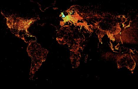
Dan Karran reports from the State of the Map conference held in the UK this past week, mentioning that Google’s Ed Parson’s showed off this map detailing where the most user-generated content was posted on Google’s geodatabase:
Quite by coincidence, this past week also saw Microsoft’s Danyel Fisher show off a map of something not entirely unrelated: Usage patterns for Virtual Earth, based on how often a tile is requested:
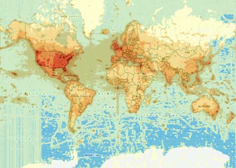
That’s an image I grabbed from Hotmap, Microsoft Research’s resource for this data that just right now appears to be down.
What can we tell from these two maps? That the UK is a popular geosurfing destination and simultaneously a major location for user-generated content, whereas India and China are woefully undermapped by users relative to the population — certainly relative to Southeast Asia — although viewing interest in those two regions appears healthy.
i only get an runtime error!
@ the ms site… of course!
Well, what these hotmaps do not show – and what would be much more interesting – is the relation between population density and usage/placemarks. This would give a much more significant interpretation, because it would highlight the places with above average importance. The maps above are kind of what has to be expected: Usage follows population and internet connectivity.
I agree, there is much more data here that could be mined but that we don’t get to play with. Presumably, this stuff is valuable business intelligence, but hopefully that doesn’t stop them from publishing geo-zeitgeists in the near future:-)
It’s a very similar image to basic ‘built-up areas’ population maps.