- My new object of lust? The Hasselblad H3D DSLR: 39 megapixels for 26.5 kiloeuros (USD$37,500) in a full-frame medium format camera. Obviously, it comes with integrated GPS and the ability to export the data as KML. Alas, it will remain the stuff of dreams.

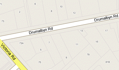
- House numbers down under: Michael Smalley notices that streets in Australian cities get house numbers. Only in Maps (not hybrid) and not (yet?) in Google Earth.
- Xplage: “Convert X-Plane [flight simulator] datagrams to Google Earth ‘moving map’ displays.” For Mac and Linux…
- Google Sky orrery: Barnabu.co.uk adds a virtual orrery as a screen overlay to Google Earth, so you see the relative positions of the planets as they orbit the sun corresponding to the view from Earth at a given time.
- Superoverlay 2.0 Beta: Valery Hronusov’s Superoverlay application for making Super-Overlays reaches version 2.0 beta.
- North Korea watched: Here is a gem, found while trawling through the internets for georeferenced human rights material: North Korea Uncovered, “The most authoritative, publicly available map of North Korea on Google Earth”. Check out the high-resolution overlays for some of the prison camps. By North Korean Economy Watch.
- 3D UI alert: CrunchGear has a video preview of XTreme Reality 3D, as-yet unreleased software that lets you use hand gestures in front of your webcam to control applications, including Google Earth. It’s like Atlas Gloves, blogged last year, but without the need to to use lights, as the object recognition algorithm seems to have gotten better in the meantime. (Thanks Johnathan!)
- EditGrid collaboration: Another way to engage in collaborative mapmaking: Using the access controls of online spreadsheet applications and then converting the contents of a spreadsheet to KML. Here’s an example of how it’s been done using EditGrid to map POIs in Croatia.
Pleiades: Georeferencing ancient history
Pleiades “is an international research community, devoted to the study of ancient geography.” All the objects in its fast-growing database are referenced as GeoRSS and KML. Import Cartography‘s Sean Gillies is Pleiades chief engineer, and he has been busy stuffing the database. In high-resolution areas, placemarks often do correspond to interesting features on the ground:
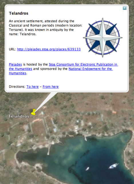
There’s hours of hunting here for ancient world buffs, and especially so if you live in the area:-) Given that these placemarks have time-based period data for when they were inhabited or relevant, it would be great to eventually be able to integrate these into the Google Earth time browser via KML’s <TimeSpan> tag, so you could surf through history, seeing places appear and disappear as civilizations rise and fall.
360Cities does KML 2.2 panorama spheres
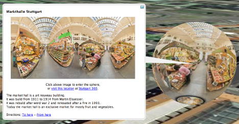
360Cities, one of a new crop of georeferenced city panorama photography sites (see also Arounder and ViewAt, reviewed here), is now using Google Earth 4.2’s ability to render embedded spheres using KML 2.2’s PhotoOverlay tag, writes 360Cities’ Jeffrey Martin. All 2,700 panoramas are being converted, but work has just started, so it will take a while. One city that is ready is Stuttgart. Check out its KML file.
Jeffrey adds:
We’ve updated the 360cities.net homepage also – 27 cities now and many more to come. It is really turning into a monster ;-)
(See also the Gigapxl and Gigapan default layers in Google Earth for more PhotoOverlay goodness.)
Sea ice Day, collaborative mapping, privacy and access controls
Today is Sea Ice Day — sea ice being the stuff that is disappearing so rapidly from the poles. Just like when International Polar Year was launched on March 1, www.IPY.org turned a Google Map into a geographic bulletin board, where schools or institutions participating in Sea Ice Day (conduct a sea ice experiment, why don’t you?) could leave a georeferenced note — a “virtual balloon”:
ipy2007seaice tagged map – Tagzania
Some observations:
- These social maps have proven very popular with schoolkids and teachers. They practically fill themselves up. They are an incredibly compelling medium because within that small rectangle on the screen is an ever-expanding canvas that draws people in. We all know this, but sometimes I get jaded because it is so ubiquitous. It’s good to be reminded sometimes about the giant leaps online maps have made in the past three years.
- You don’t need to use the an API any more to build a social mapping application. We had users sign up to Tagzania and then told people to tag their location with a predefined tag. We then use embedded maps on IPY.org to show all the places that have the tag attached. It costs nothing and it has quite the impact — perfect for scientific outreach projects on a budget. And the Tagzania team have been very helpful in adapting the embedded maps to display more placemarks in one go, even though we’re using their site in a way it was not originally intended for.
- One vulnerability: We can all agree beforehand on what unique tag to use, but we cannot control who ends up using it. Currently we can’t “own” a tag or create closed groups whose user contributions we exclusively display. This opens up the possibility that somebody might want to act parasitically, attaching “tag spam” to the map.
All this leads to a wish list for social mapping sites like the already excellent Tagzania. I would like to see advanced collaborative features such as access controls and privacy controls. Perhaps some features could be free, and some you would pay for. Letting a predefined group of contributors collaborate on making a public map might be a free feature. Giving users the ability to keep such maps private or shared with specific clients (for example, for NGOs in the field) might be a pay service. It would be nice to see the same kinds of granular privacy controls that Facebook has (just to name a topical example) and apply it to geographic data. Another example: Flickr lets you have groups that are public, invitation only (but visible) or completely private. Why not do with all sorts of georeferenced data what Flickr already does with photos?
In some cases, we’re already seeing such kinds of granular privacy tools applied to online maps — especially when it comes to live tracking applications. Here is what the GMap-Track control panel looks like:
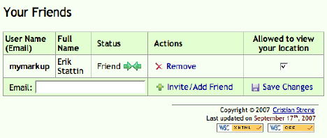
If anybody has other examples of how privacy and access controls are being implemented on mapping services sites, please do chime in with examples in the comments.
In the longer run, then, I suspect there will be more sites offering sophisticated social mapping services on top of existing mapping APIs, for inclusion on users’ own websites, so that the non-programming masses gain the use of tools that are currently only available to those rolling their own geospatial websites. The sooner that everyone’s a neogeographer, the better:-)
Google Earth gets preview layers
New today: Google Earth gets preview layers. Because too much information can be a bad thing:-)
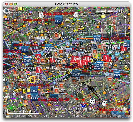
(Via Google Earth Blog, where Frank also lists updated layers.)
Links: Cosmos Globalbase Browser, Space Shuttle sim, Barnabu’s real-sized planets
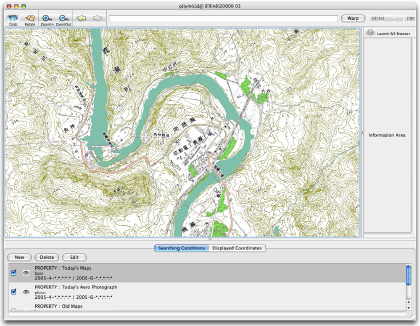
- New geobrowser alert: The Cosmos Globalbase Browser, out of Japan. There are instructions in English, but language remains a bit of a barrier, and often I’m not quite sure what I’m supposed to be doing. Still, it’s all brand new, there appears to be open-source origins, and the premise is an interesting one:
Is it possible to build a system that allows creating maps in a way more like the World Wide Web and delivering them through the Internet? An architecture that involves no central server, no concentration of data and traffic at any one particular place, but where any information can be delivered from any server incorporated into one single world-spanning network. Such a system can become a reality with your cooperation.
For Windows, Linux, Mac, Solaris and FreeBSD. Perhaps the NASA World Wind guys might want to talk to them? Or OpenStreetMap?
- Space Shuttle sim: Space Shuttle Mission 2007 is a just announced Space Shuttle simulator that comes with a drool-inducing teaser video on its home page. With a feature set that includes historical missions and TerraMetrics’ TrueEarth imagery, this looks to be a simulator verging on an augmented reality application:-) (Not out yet, for Windows) (Via FlightSimX)
- Real-sized planets: There’s Google Sky’s built-in icons pinpointing the locations of the planets. There’s HeyWhatsThat’s icons for the locations of the planets and the Sun. Now there is Barnabu’s real-sized overlays for the planets and the Sun. Unlike icons, you can precisely control the sizes of an image overlay, so I really like this solution. I haven’t checked the accuracy, but if this pans out then you can definitely use Google Sky to go planet hunting.
All three options do the phases of the moon. So far, Mercury, Venus and Mars do not show phases.
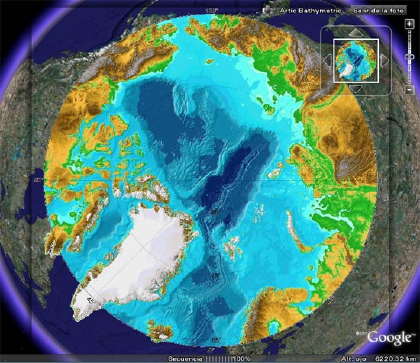
- Polar data in GE: Got GIS that stretches across the poles? Google Earth can’t help you, but you can fake it by applying Gerardo64’s hack: Add your polar projection as a PhotoOverlay, like so:
- Google Maps API Blog‘s Pamela Fox touts the newly improved ability of Google Spreadsheets to geocode, and uses this wizard to turn the result into a Google Map. What all this means is that you can easily do the same and then turn that spreadsheet into KML, using Valery Hronusov’s CONCATENATE trick.
- Oops, I did it again: Iran “accidentally” blocked Google domains on Sunday. Briefly.
- Sailing videos: Virgil Zetterlind over at EarthNC Blog georeferenced 300 YouTube boating videos from around the world and turned the result into KML. Writes Virgil:
This will continue to grow quickly as we process through YouTube and other sources and hopefully start to get link submissions via our forum. Part of the exercise has been in working out a simple user-interface to review and geotag the videos (given that it will be a while, or possibly never, before we can fully rely on up-front geotagging by the authors).
(For PC; For Mac and Linux click on the link through to the YouTube page and watch it there.)
XML. Or, the coming transformation of observational astronomy
After a series of posts documenting the process of converting the contents of the Ukraine Russia Radio Telescope Database into KML, L. Van Warren posts the results (Direct link to the KML file for the impatient). And it sure is pretty: The locations in the sky of 1855 prominent radio sources, including 118 quasars, with relative radio brigtnesses depicted by circle size:
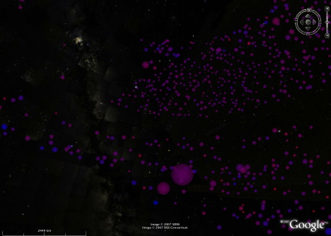
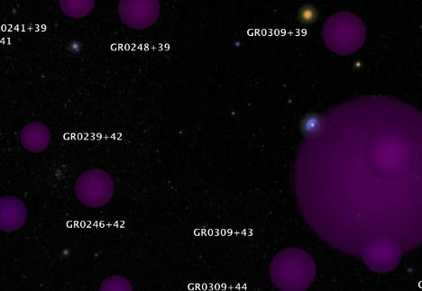
It’s fun to go see if a particular source also has a visual component — it isn’t always the case.
So why was Van’s task so Herculean? Because the raw data looked like this:

It takes quite a bit of regex gymnastics to turn the above into KML that looks like this:

The Ukraine Russia Radio Telescope Database is not the only place where data is available online but in a format unfriendly to machines. The Aerith site, which houses a wealth of ephemeris data on comets, has a similar handicap. Click through to an individual comet to see the orbital data in a space-delimited format, with the actual positions generated for you in a graphic.
This is how astronomical data has often been shared in the past, but not how it will be shared in the future. There is a better way: XML.
This is not a new idea. We’ve already run into the Virtual Observatory Event (VOEvent) XML specification, and over on Astronomy Blog, Stuart is working on an XML schema that would allow telescopes to have “an RSS-like XML feed” showing what’s been viewed and when. Oh Inverted World blog gets it immediately:
There are a myriad of benefits to such an approach, the main one being that it will be easier to collaborate globally on projects, particularly those which can be aided by numerous observations and ancilliary data.
What’s changed recently is that there is now an astrobrowser, Google Sky, that is can understand and render XML. KML descriptions of astronomical objects are now a simple XSL transformation away from any other XML format, such as VOEvent XML or Stuart’s XML. As a consequence, the incentive to provide machine-readable astronomical metadata instead of text tables just got a lot stronger. There’s no more need to peer at static charts — just load the data in Google Sky, and mash it up with anything else you like.
In an ideal world all such observational astronomical data would exist in a machine-readable markup format, and I’m willing to venture it soon will. Just as it took the geospatial web a year or two to re-orient itself towards making its data available in a format compatible with KML, the astronomical web will take a while to provide its data in a similar format.
But I have little doubt that in the very near future, you’ll be able to download position data for all new comets as KML, which in turn has been generated on demand, perhaps as a network link, from ephemeris data provided as an RSS feed. And who will come up with the astronomical equivalent of Panoramio, where amateur astronomers can upload time-stamped comet imagery? Imagine being able to chart the progress of a bright comet in Google Sky over the course of a month by playing in quick succession the accumulated contributions of hundreds of amateur astronomers. I can’t wait to see it:-)