ESRI released its ArcGIS Explorer (AGX) virtual globe as a Beta a month ago in a soft launch, but I haven’t reviewed it until now because real life got in the way in the form of deadlines and business trips (how time flies!). To make the task a bit more manageable, I’m going to leave a proper look at KML rendering till later, when I also include SkylineGlobe and the upcoming NASA World Wind 1.4 in the comparison.
ESRI has said that AGX is not meant to compete with Google Earth in the geobrowser stakes, but that it exists primarily as a free client to which users of ESRI ArcGIS products can publish their work — a kind of geospatial Acrobat Reader for ArcGIS-produced content. Still, ESRI did include features that are clearly aimed at bridging the gap between purely professional tools and Googlesque edutainment — witness the downloadable Rumsey antique maps, the cloud overlay, solar positioning and support for KML — so I am also going to compare these features with their implementation in Google Earth and NASA World Wind.
Let’s first look at the things I like about ArcGIS Explorer:
Options aplenty
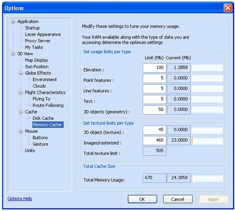
AGX is plenty customizable — including options that are absent in Google Earth. You can (of course) choose your own default server in AGX, but also turn on sun lighting if you like, as well as a cloud layer. You can micromanage your cache, and the globe’s behaviour as you navigate around the poles is yours to choose (though the choice is between sane and are-you-kidding-me). Google Earth does not have sun lighting or clouds by default (NASA World Wind does) but more about those cloud layers in AGX a little bit later.
Some cool tools
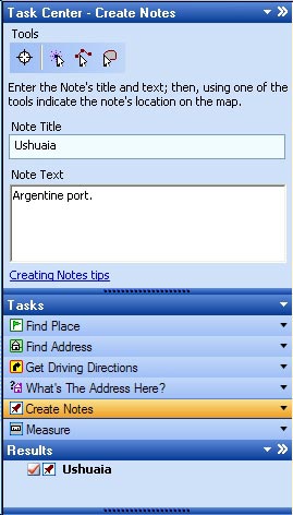 There is no doubt about it: The concept of “tasks” — client side analysis tools — is a very cool idea, and shows much promise. ArcGIS users can create tasks, AGX can load them, and then these tools can be made to operate on a dataset in AGX. ESRI includes a few basic ones that are also replicated in Google Earth (find driving directions, measure distances) and one that’s kinda neat and unique: “What’s the address here?” Click on a spot on Earth, and you’ll be told the nearest house address.
Still, I wish ESRI had added a non-trivial task, something that gives us a real taste of what this capability can do. A bit disappointingly, in the weeks since AGX’s release, nobody in the GIS world who blogs that I know of has produced tasks for wide release that show off the promise of AGX’s expandability. Without these, AGX is quite barebones. And after a mouthwatering AGX showcase page, realizing that these functions aren’t actually included with the program is something of a letdown.
3D placemark icons
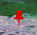 If you choose the “Create Notes” task, you get to create a placemark, line or area and annotate it — though you have to write the note’s title first, and only then do you get to use the tool to make your mark on the map. While this feels backwards to me, once you do create a placemark, you get a real 3D thumbtack back, with real shading, and that’s a nice touch. Also nice is that you can edit these notes inline, and attach files to them, so that architects and town planners have an easy way of organizing documents geospatially.
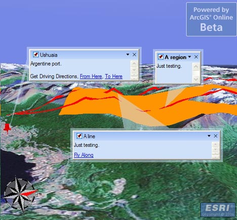
Not so nice is that if you decide to draw an area, your tool is vector-based, but as soon as you’re finished, the resulting area is converted to a raster image, which proceeds to download, from who-knows-where, s.l.o.w.l.y. W.h.y?
Broad file format support
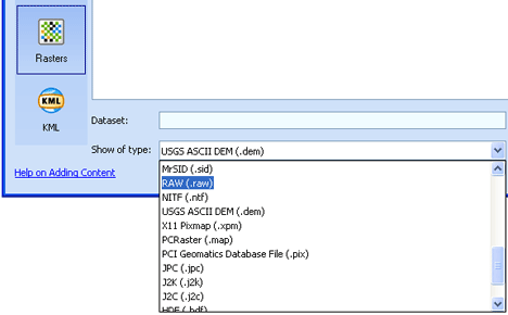
Click on File > Add content, and there are plenty of options — if you have them, you can load tasks, geospatial database files, shapefiles (SHP), heaps of raster file formats (including MrSID) and KML files. If you have access, you can also connect to ArcGIS servers. To open these kinds of files on Google Earth, you need to buy the $400/year Pro version. I’ve only tested the quality of the KML support — more about that below.
You can also open files that are in AGX’s native NMF file format. Like KML, NMF is XML-based, and can describe both layers and notes/placemarks. Unlike KML, NMF can additionally describe tasks and results, so that you can open an entire globe and related tools in one go, like a workspace. Some sample globes are available for download on AGX’s home page.
Again, though, I’ve only seen one “third party” NMF file released into the wild in the weeks I’ve been checking up on AGX, and that was an example posted to the ArcGIS Server Development blog. Without the widespread adoption of the NMF file format by GIS pros there will be less incentive to download AGX, and that’s a vicious cycle, especially as KML is available as a simpler but ubiquitous format.
Now for the dislikes:
It’s slow
Zoom in on a region, and the wait starts. Not only are you downloading the base raster imagery, but raster images of borders and roads as well (if you turn them on), and these often load more slowly than the imagery underneath, so you get an effect like this:
The more you zoom in, the worse it gets, until the server catches up. Again, ESRI says it is not trying to compete with Google’s server farms, but if the open source NASA World Wind can return perfectly respectable imagery within seconds, then why can’t the Microsoft of GIS, ESRI?
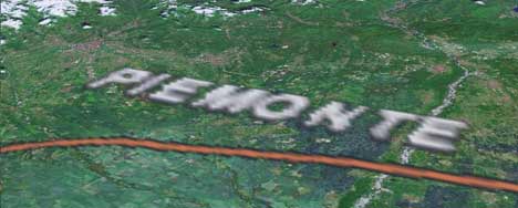
Rasterized roads, borders and labels???
Pardon my punctuation, but I’ve already ranted about this in an initial impression of AGX: Rendering labels as rasterized images just seems bizarre in an age of virtual globes, where you can look at the world from just about any angle — so why maintain the north-up alignment of labels, as if it is a conventional paper map?
James Fee actually found an answer from ESRI regarding this very point. AGX can do both vector-based labels and rasterized labels, it turns out — indeed, labels for KML placemarks opened in AGX are vector-based — but the current globes ESRI supplies use rasterized images by default. The stated reason:
In general, raster labels offer the advantages of better font placement (e.g. stacked labels, angled text on physical features like mountain ranges, better label de-confliction) and better performance where text is dense. Vector labels offer the advantages of rotating and billboarded text when rotating or tilting the globe and sharper labels at some scales.
While I agree with the listed benefits of vector labels, I disagree with the idea that raster labels have any advantage whatsoever, especially if you look at Google’s implementation of vector labels. Check out how Google Earth’s labels deal with crowding:
NASA World Wind and SkylineGlobe also choose vector-based labels, though without the nifty algorithms for prioritizing and shifting, while Microsoft Virtual Earth 3D settles for rasterized text. The upshot for VE3D and AGX is that I get upside down maps on my screen. As a UI-sensitive person, I don’t understand why this isn’t regarded by ESRI and MSFT as an obvious, glaring mistake. But also: How exactly is rasterized text draped across mountain ranges supposed to be easier to read when I’m flying across them? And since when is a rasterized image of text a faster download than the text itself? (I’m assuming that’s what the quote refers to when it mentions “better performance”.)
Usability oversights
I create a note and place it on Japan. I then pan to Hawaii. I right-click on the Japan note in the list of notes in the console to the left of the screen and choose “Zoom”. What does AGX do? It flies to Japan via the Americas, Africa, India and China. Why must the dateline be avoided at all costs? Whatever happened to great circle distances? This is not virtual globe-thinking; this is paper map-thinking, where the world ends at the edge of the paper.
Basic KML features not supported
A KML file containing a collection of placemarks will load and have its icons displayed with vector-based labels, but clicking on the placemarks does not bring up the popup-box and its contents. At first I thought I was doing something wrong, but I’ve tried everything, to no avail. Considering that nearly all the context for a placemark (photos, address, story, link…) is in the pop-up box, this is an oversight that makes most KML placemark collections unusable. Since the bulk of KML content on the web is comprised of placemark collections, this severely limits AGX as a KML viewer for now. There is also no way to disaggregate a KML collection of placemarks. It’s all or nothing. Seriously, did nobody with access to the earlier betas notice this?
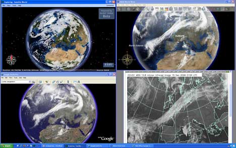
Cloud layer is a placeholder
I was comparing cloud layers implementation between NASA World Wind, AGX and a third-party network link for Google Earth, only to notice that while World Wind and Google Earth’s clouds always correlate with each other and an actual live image, AGX just seems to be making it up. I’m guessing the cloud layer you get when you turn this on in AGX is just a placeholder. You have to roll your own weather server if you want clouds, apparently.
Click to enlarge
So, to conclude:
AGX shows promise as a tool for looking at somebody else’s GIS work, but it’s very much in Beta and it shows — a lot of basic functionality is still only half implemented. I don’t want to complain about the lack of compelling high resolution imagery — ArcGIS users are supposed to provide the maps, after all — but the slowness of the downloads of ArcGIS Explorer’s default globes really makes the application a chore to use out of the box.
At this stage, it is difficult to see AGX ever being anything more than a niche player among virtual globes. There’s nothing wrong with that, but after a year of anticipation, fueled in part by comments from ESRI that certainly didn’t disabuse us of the notion they were building a “Google Earth Killer” (for example Jack Dangermond’s comments in June), AGX disappoints. I can only speculate that ESRI’s priorities, after an initial jolt in response to Google Earth’s apparition in June 2005, soon refocused on getting the ArcGIS 9.2 cash cow out the door, and that work on AGX languished as a result.