Google Earth conspiracy watch — Sri Lanka war edition

When this Oregon’s Salem News article crossed my radar screen, I felt it was a sufficiently over-the-top case of conspiracy mongering so that it did not merit a retort beyond a line of snark on Twitter.

Is Google Earth Hiding Sri Lanka’s Ghosts?

Tim King Salem-News.com

Google, are we misreading this? Haven’t Sri Lanka’s Tamils been through enough?

(SALEM) – Does Sri Lanka’s ongoing lack of transparency over its recent Genocide of Tamil people extend to Google Earth?

It’s disturbing. Google Earth appears to be be using an unusual series of photographs to comprise its image of Sri Lanka as the regime stands accused of war crimes in Geneva.

It’s a question that deserves to be asked; why is the exact area where so many were killed by government forces hard to make out, and why is that image specifically from 2005, years before the intense attacks on civilians in this area, while adjacent images are from May 2009, in the middle of the worst of the ethnic cleansing?

The number one online resource that people turn to for research should refuse censorship to any government that stands accused of grave violations of international laws regulating war, and crimes against humanity.

Etc. It goes on like that for many more paragraphs.

But then I noticed that others in my Twitter stream, people who generally know better, did not treat this story with the contempt it deserves:


So suddenly the narrative becomes: Why hasn’t Google posted satellite imagery of the endgame of the civil war in Sri Lanka on Google Earth — specifically from May 2009, when civilian refugee camps were bombarded by government troops. Is it callous negligence, or is Google somehow shielding Sri Lanka’s government from bad PR?

It shouldn’t come as a surprise that satellite imagery is available in Google Earth, and has been in one way or another since June 2009.

It was first available as a downloadable overlay within weeks of the events, created by Amnesty International and the American Association for the Advancement of Science (AAAS). (I know because I was involved in the production of one component of it — the aerial imagery popups.)

AAAS had asked the satellite imagery provider DigitalGlobe to take these images within the framework of their Scientific Responsibility, Human Rights and Law Program, which puts scientific resources to use to uncover and publicize human rights abuses, specifically through the use of satellite imagery. (The program has also highlighted abuses in Zimbabwe and Darfur.)

Then, sometime between 2009 and now, these DigitalGlobe images automatically became part of the Google Earth base layer — because Google’s contract with DigitalGlobe stipulates that all imagery take by its satellites ends up in Google Earth. (There are exceptions: Iraq and Afghanistan are not being updated due to the ongoing security situation there. Imagery of Israel and the Occupied Territories is reduced in resolution, as per US law. Overcast imagery is also rejected.)

So how does Salem News’s Tim King get to pen an article in such accusatory tones? If we rule out malicious intent, the only other explanation is ignorance of how Google Earth works, coupled to a conspiratorial mindset that prejudices Google.

The imagery that Tim King thought lacking is in fact part of the historical imagery dataset in Google Earth, and can be accessed by clicking the historical imagery button in the top button bar of the application. If he were to do this over the specific area where he complains the imagery is from 2005 (view in Google Earth here), he’d see imagery from May 27 2011, January 23, 2010, September 8 2009, and June 15, 2009, in addition to 2006 and 2005. In the areas immediately to the north, he’d find imagery from May 24, 2009.

Google doesn’t alway show the most recent imagery in the default layer; sometimes there is more recent imagery available in the historical layer. This is because the default layer is meant to be a reference layer, so older imagery that is clearer will sometimes trump more recent imagery containing clouds, long shadows or snow. The satellite- and aerial imagery used by Google Earth carries metadata such as cloud cover percentages, image resolution and acquisition date, and the resulting image mosaic uses this information to construct the “best” default snapshot of Earth.

When time-sensitive satellite imagery is taken in the immediate aftermath of humanitarian crises such as the Haiti quake or Hurricane Katrina, imagery is often cloudy, because the weather does not always cooperate and cloudy imagery is better than nothing. Google will include such imagery in its dataset, but it tends not to remain in the default view for long. In any case, the default dataset is reconstructed every time Google Earth has an imagery update — these days every two weeks or so — and newer imagery tends to crowd out older.

There is one final question to address: What if Google Earth had not had this data? Would Tim King’s complaint have been justified? Is it Google’s responsibility to commission satellite imagery itself every time it suspects some humanitarian disaster is in the offing? Google promotes the work of advocacy groups in support of human rights, as evinced by the Global Awareness layers available in the sidebar of Google Earth, and it also collaborates with DigitalGlobe and GeoEye in specific cases where getting time-sensitive satellite imagery to first responders via Google Earth will help the rescue. But Google should not be in the business of vetting every cause — that is the job at which the likes of Amnesty International and Human Rights Watch excel. Much better is for Google to focus on building an ever more accurate geospatial platform for the work of of such groups. And finally: Whenever a monitoring group commissions imagery from DigitalGlobe (such as what ISIS does when it monitors Iran’s nuclear program) that imagery ends up in Google Earth automatically, over time. Any cause can play, for a few thousand dollars.

Google Earth is a powerful transparency engine — so it is best to read the manual before penning embarrassing conspiracy theories that at best are a waste of the reader’s time, and at worst succeed in subverting initiatives that Google actually deserves praise for.
Is Google showing India’s Assam state as part of China? (No.)

The border between China and India is contested in many places, and is a matter of prickly national pride for both countries — the month-long Sino-Indian War in 1962 was triggered by an escalation of a border skirmish on the northern edge of the present-day Indian state of Arunachal Pradesh, a large part of which China insists belongs to Tibet. In that war, China quickly advanced to its claim line on the southern edge of Himalayan foothills, where the line skirts the Brahmaputra river plain. Having met little resistance from the Indian army, China then unilaterally retreated to the pre-war line of control, approximately the McMahon Line, possibly because winter was looming. China’s claim remains, however — and the border has since been the topic of much fraught bilateral negotiation.

Not surprisingly, mapping the China-India border has proven something of a thankless task for Google. Both China and India prohibit the publication of maps that do not draw their respective official claim lines as the ground truth, so Google has created three distinct Google Maps datasets — one for the Chinese market at ditu.google.cn that shows the area north of the claim line as unambiguously Chinese, one for Indian users at google.co.in/maps that shows the border along the McMahon Line, and one reference set for the rest of the world at maps.google.com which shows the area as disputed; this is also the dataset used in Google Earth.

Google has on two occasions (in 2007 and in 2009) messed up its depiction of the area around Arunachal Pradesh, and each time India’s media was outraged at Google’s perceived nefarious conspiracy to undermine Indian sovereignty, when in fact the error was an honest mistake that Google quickly rectified. Still, India’s media now keeps an eagle eye on Google’s depiction of its border.

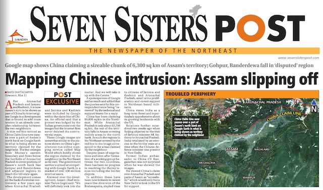
That eye once again saw cause for complaint when the the northeastern Indian local paper Seven Sisters Post this Monday ran the story — on its front page, above the fold — that Google Earth is now showing parts of the neighboring Indian state of Assam as being claimed by China:

This story was subsequently taken up by other Indian media outlets, where the headline soon read: “Google shows Assam as part of China”.

What happened? If the papers had kept to watching Google’s India-facing map dataset, they’d have nothing to complain about — it still shows India’s borders in conformity with Indian law. But Seven Sisters Post went looking on Google Earth, which shows both the Chinese and Indian claim lines for that section of the border.

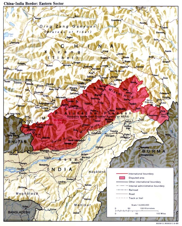
That Chinese claim line is not, in fact, identical to the internal border between Arunachal Pradesh and its neighbor, Assam. In the region close to Bhutan, China has since before the 1962 war claimed an area beyond Arunachal Pradesh in Assam. Close to Burma, there is a large part of Arunachal Pradesh that China does not claim. The divergence is visible on this map:

As recently as 2009, Google Earth still showed the Chinese claim line near Bhutan as equivalent to the internal border between Arunachal Pradesh and Assam. (Note the jagged indentations of that borderline.)

apge2009.jpg

That depiction was not, in fact, correct. At some point since then, possibly quite recently, a more accurate representation of the claim line was added, though at a far coarser resolution than the internal state borders or the McMahon Line that depicts India’s claim.

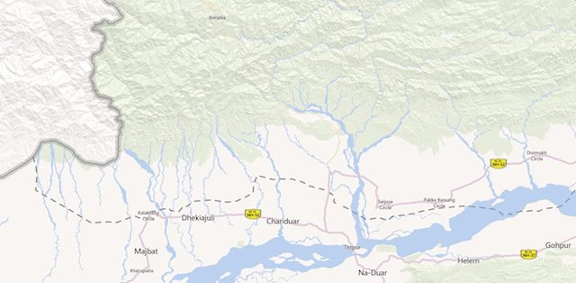
On the international version of Google Maps, both the internal border and the Chinese claim line are visible. Here is the map near Bhutan, with the short dotted lines depicting the Chinese claim line and the longer dotted lines the internal border between Assam and Arunachal Pradesh; the solid line is the border with Bhutan:


View Larger Map

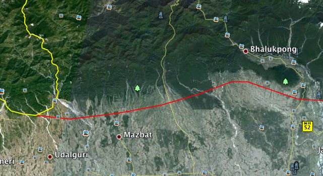
On Google Earth, however, something is gone from the dataset: The internal border between Assam and Arunachal Pradesh is missing when it runs to the north of China’s claim line:


Screenshot from Google Earth on 13 March 2012

Why is it missing, and since when? I don’t know, but I assume the representation on Google Earth is a mistake that will soon be rectified, because Google has long argued that more — and more accurate — information in the pursuit of context is always better. Here is the relevant policy statement from December 2009:

We work to provide as much discoverable information as possible so that users can make their own judgments about geopolitical disputes. That can mean providing multiple claim lines (e.g. the Syrian and Israeli lines in the Golan Heights), multiple names (e.g. two names separated by a slash: “Londonderry / Derry”), or clickable political annotations with short descriptions of the issues (e.g. the annotation for “Arunachal Pradesh,” currently in Google Earth only […])

This annotation makes clear that Arunachal Pradesh is wholly administered by India. I’m adding it here for the sake of completeness:

Arunachal Pradesh (Hindi: अरुणाचल प्रदेश Aruṇācal Pradeś) is administered by the Indian government as the easternmost state on India’s northeast frontier; Itanagar is the capital of the state. Meanwhile, it is also claimed by the People’s Republic of China as an integral part of its territory, as a part of South Tibet (Zangnan 藏南) and integral with the Chinese prefectures of Ngari, Shannan and Nyingchi. The dispute originates with the 1913 establishment of the McMahon Line which divided British-controlled India from Tibet; however China did not recognise the line’s authority. After India became independent in 1947 and the PRC was established with full control over Tibet, India asserted the McMahon Line as the India-China boundary in 1951 and forced Tibetan authorities to withdraw from the area. During the Sino-Indian war of 1962, China recaptured most of Arunachal Pradesh (then called the North East Frontier Agency or NEFA) but voluntarily withdrew back to the Line of Actual Control (LAC) in 1963 which approximates the McMahon Line’s location. Indian and Chinese forces clashed in the region in 1986-87, but the countries signed agreements in 1993 and 1996 to respect the LAC. Despite several attempts to reconcile, including discussions as recent as January 2008, India and China remain in dispute over this territory.

How do other online maps fare? OpenStreetMap draws the International border as India would have it, with no sign of China’s claim line. Microsoft’s Bing Maps, on the other hand, has China claiming a much larger area than on Google Maps, with the claim line even crossing the Brahmaputra river at one point:


(Note, you need to zoom in to see this border. if you zoom out, the map reverts to a more vague border that approximates the internal border between Assam and Arunachal Pradesh.)

In addition to showing the border between Assam and Arunachal Pradesh, could Google Earth be even more complete in its depiction of the region? Yes, by drawing an orange Line of Control between China and India along the McMahon Line, just as it does for the de facto border between India and Pakistan in Kashmir. This would make it clearer that the region is administered by India, which matters, as possession is a great advantage in territorial disputes.