Perhaps you’ve read about the spate of confirmed cases of the avian flu virus being transmitted to humans this past month, in Egypt, India, Vietnam and China, with the H5N1 virus claiming several lives after a period of inactivity.
One reason is that the northern winter always sees an increase in influenza activities of all kinds, according to medical researchers. But today’s big health story is about the release of a new study by the University of Colorado Boulder showing that “the resistance of the avian flu virus to a major class of antiviral drugs is increasing through positive evolutionary selection, with researchers documenting the trend in more than 30 percent of the samples tested.”
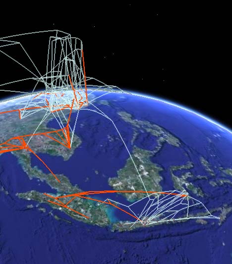
The study comes with a phylogenetic visualization of the avian flu virus for Google Earth. That’s not surprising, because the lead study author is Andrew Hill, whom Ogle Earth originally blogged way back in 2006, when he first experimented with KML phylogenetic trees, and again in 2007, when Andrew first published his phylogenetic visualization technique.

Here’s how the press release describes today’s KML file:
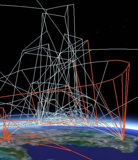
The research team used an interactive “supermap” using Google Earth technology that portrays the individual gene mutations and spread of the avian flu around the globe, said Guralnick of CU-Boulder’s ecology and evolutionary biology department. By projecting genetic and geographic information onto the interactive globe, users can “fly” around the planet to see where resistant H5N1 strains are occurring, said Guralnick, also Hill’s doctoral adviser.

The KMZ file is available online here, so you too can take a look. It’s not just pretty lines: Each node/placemark on the ground corresponds to an actual case (animal or human), and its popup contains data that describe the strain’s resistance at that point, as well as links to the nodes of related strains — click on those and Google Earth will fly you there. By letting you travel along the nodes in this fashion, this phylogenetic tree lets you see the evolution of the virus over time (the vertical dimension) as it travels (the horizontal dimensions.)

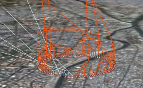
One immediate observation: In densely populated areas such as cities, you see the virus evolving rapidly into a succession of related strains. At this scale, exact georeferencing would just confuse (and is likely unavailable) so it is much better to arrange the nodes in a circle, giving prominence to the ancestral relationships between nodes. Very neat.