Bahrain in Google Earth, unplugged

Want an example of how the internet regards censorship as an obstacle that needs to be routed around? Take this PDF (4MB), 45 pages of annotated Google Earth screenshots of Bahrain, apparently being emailed around the Persian Gulf. While it would be nice for us with access to Google Earth to have this content labelled in the Google Earth Community layer, the whole point about the PDF is that you don’t need access to Google Earth’s servers to see the pictures in the PDF.

The main thrust of the PDF is that:

Illegal distribution of property is estimated be 200 square kilometers since independence (out of 665 square kilometers total land area) = 30% of Bahrain’s total areas total area = USD 60 Billion!

bahranpdf.jpg

Pamphleteering doesn’t get much more visceral than this (even if I have no easy way of verifying if it is true). If Bahrain’s government wants to prevent the spread of this kind of information, it will have to ban email. (Via The Skeptic)

(Previously: Bahrain bans Google Earth, Bahrain Censorship redux)

Belgium vs. Google: Google Earth’s turn

What is up with Belgium?

First, Belgian francophone newspapers throw a legal hissy fit about Google’s links to their articles being accompanied by snippets of context so that users might actually want to click on them. It’s obviously fair use on the part of Google, but a luddite Belgian court found otherwise, and now Google has complied by removing Le Soir et al. entirely from Google.be. Le Soir must really hate the hassle of serving all that traffic that Google sends them, and then there’s all those bloggers that find their stories via Google and insouciantly post excerpts with links to them! The gall of some people!

Second, and far more relevant to this blog, on Tuesday a Flemish TV channel’s evening news reported that the Belgian military now wants high resolution images of their bases removed or obscured on Google Earth and Maps, according to the always reliable Belgeoblog (in Dutch). Apparently, “the strategically important images should not be available to everyone.” Presumably, they should just be available to people who really really want them for some reason and will thus buy them directly off the vendor.

As recently as May this year, the Belgian military said the exact opposite, and this was proudly reported on Ogle Earth (I’m Belgian, see?). Then, the military said it was “not afraid” of such imagery being useful to terrorists, that such imagery was already public anyway, and that without context it was meaningless. All of those arguments are as true now as they were in May — for example, here is some publicly available high resolution imagery of nuclear weapons bunkers in Belgium that is not served by Google, as an overlay on Google Earth, again courtesy of Belgeoblog.

So what changed between now and then? Well, Belgeoblog thinks that this institutional schizophrenia points to disagreement within the military establishment on how to deal with the ongoing democratization of geospatial data. But something else changed since May: Belgium got a partial upgrade to its imagery in Google Earth, so that now a non-trivial chunk of the country is at the same high resolution as the Netherlands. Indeed, much of Belgium’s new (aerial) imagery is taken by the same company that scanned the Netherlands in its entirety — AeroData. (AeroData happens to be Belgian, operating out of Antwerp’s Deurne airport.)

My guess, then, is that some general nearing retirement discovered Google Earth last week, zoomed in on his barracks, saw the new imagery, and got yanked into the 21st century a tad too forcefully.

The Dutch government’s censorship of AeroData’s imagery has been well documented on Ogle Earth. It’s deplorable, but the Dutch have laws dated from the cold war that allow them to censor the imaging taken by planes in its airspace before the vendor is allowed to take it into the public domain. Belgeoblog says that Belgium has no such laws on its books, and that therefore all the military can do is whine. I hope that’s true (though it’s hard to verify), but I’m also not putting it beyond the abilities of Belgian courts to come up with some completely spurious argument as to why if Google is doing this, it should be banned. If there is no fair use in Belgium, what else is fair game?

Short news: SketchUp models & time, RoboGeo 5.0

  • If you’re wondering if you can attach SketchUp models to the new Google Earth timeline, the answer is Yes, as this proof of concept shows: An imaginative recreation of the evolution of a building complex in Ur. Plenty for historians and educators to play with here. I can’t wait to see historical battles played out on Google Earth.
  • The fully featured photo georeferencing tool RoboGeo v5.0 beta is out. Version 5 adds the ability to georeference photographs using Google Earth, just like in Google Picasa. The demo is free.

Timelines: Three suggestions

Is it too early to look Google Earth’s timeline gifthorse in the mouth? It’s an excellent new tool — so much so that I’m wishing I could do more with it.

Like what? I’ll illustrate by way of example:

1. Add periodicity: Some datasets have a natural periodicity to them — seasonal water temperatures, for example, or the tides, or the daily schedule of ferries in Stockholm. It would be very useful to be able to compare successive equivalent phases in the data.

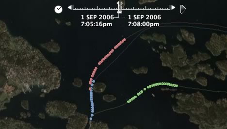
As it is now, events that happen in successive days, months or years will also appear in the timeline successively. For example, here are the time-enabled trajectories of the 6pm ferry from Stockholm to Sandhamn on August 30, 31, and September 1. Each trajectory leaves separately; but how would these trajectories look relative to one another, timewise?

To find out, I cheated, converting all the date stamps to Sept 1 but leaving the time component unchanged. Here is the resulting file. It’s lovely to look at, as if three caterpillars are racing through the Stockholm Archipelago (if you set your timeline parameters right — I suggest an interval of 2-3 minutes, played as slowly as possible):

ferry-periodic.jpg

It would be cool to build in such functionality into the timeline tool — an option that lets you choose the periodicity of the data (hour, day, month, year, and perhaps week?), and then an option that lets you choose whether you want to show the data for each phase simultaneously or in succession. For example, for the ferries it makes sense to show the data simultaneously, but for overlays showing global snow cover, it would make sense to show December data for successive years in succession, so that long-term trends become visible.

2. Fine-tuning controls: There is currently no way (that I know of) to advance from individual time event to individual time event in a granular way. This makes it harder to navigate precisely, or to ensure that something is always visible, especially if the timeline is set to show just an instant rather than a wedge of time.

By way of example, check out this really innovative use of the timeline, by Virgil Zettterlind at DestinSharks.com. He took a video of a drive through Death valley, associated some video stills to a GPS tracklog, and then plastered the stills onto Google Earth as a ScreenOverlay, to be played as a slide show with the timeline. (Here is the KMZ file directly.) The effect works very well. Just like with the ferries, you should really see this in real life, as a screenshot does not do it justice:

dvearly.jpg

dvlate.jpg

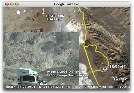
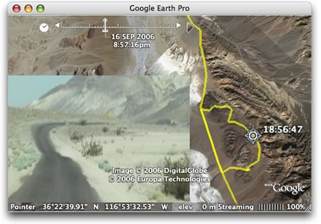
But Virgil had to “cheat” as well. As he explains, he chose to associate the stills with overlapping time spans rather than just the instant they were taken, so that there is no danger of the user seeing nothing at all. And the ScreenOverlay hack is a good way of forcing images to be visible, in the absence of a (documented) way to control the popup balloons.

How would such granular controls work? Well, I’d be happy with a simple keyboard shortcut, but otherwise two extra arrows in the UI would suffice, just as with current multimedia players.

3. A way of controlling timeline settings from within the KML. Virgil’s problem would also be solved if he had the ability to control the timeline’s settings via KML. How the data is presented can make a big difference to what information is highlighted. There should be a better way than telling users what the precise settings should be — as Declan Butler does in his recent post on the revamped avian flu layer. If a layer is best viewed with the the time wedge clamped to the left-hand side, then it would make sense to have the KML impart this preference.

A related topic is that the timeline stretches to incorporate all time-enabled KML files that are currently visible on Google Earth, even if they are far apart temporally, or of a radically different timespan. This means that one or more datasets will become difficult to navigate.

It looks like a more advanced Google Earth API may soon come to the rescue, however. This morning, Let’s Push Things Forward writes about some new undocumented enhanced classes for Google Earth’s component object model, including what sounds like the ability to pop up balloons at will. That would be useful:-)

(Finally, a bug report: On my Mac, the timeline does not seem to adjust itself after layers are turned off. I currently solve the problem by deleting folders in My Places and then restarting Google Earth.)

In sum, the timeline is a wonderful innovation, one for which the possibilities are just beginning to be explored.

Media watch: Google Earth, border guard? Mish-mash-ups

  • MSNBC has a story about how one of the many proposals for securing the Mexican border hunting down illegal immigrants would involve Google Earth:

    For Lockheed Martin Corp., blimps are a big part of the solution. And for Raytheon Co., the key is letting agents watch incidents unfold on Google Earth.

    I for one hope Google doesn’t license its software for this purpose. Borders are arbitrary; people’s aspirations are not. If terror abatement is the goal, then a far better use of the money would be to secure US ports. Feel free to use Google Earth for that. Sorry about the rant.

  • Forbes writes up “the mashup economy”, and of course Google Maps and Earth both feature. Unfortunately, they feature like this:

    In a little over a year, more than 30,000 people have downloaded the code to invent software using Google’s maps. There is no saying how many have built big mashups from the downloads, leveraging the 100 million people that have used Google Earth, the map service from Google itself.

    I really don’t mean to be nitpicky, but if you’re going to put in the details, then the details have to be right: The Google Maps API is not used to write KML for Google Earth. No, Google Earth is not Google Maps. One is round, the other is flat.

Short news: Time again, WMS bug reports, Picasa 2.5 out

  • Because time in Google Earth is still new: Watch the rise of the Costco store across the US. (Via this LiveJournal post) The possibilities are mind-boggling:-)
  • How to turn monthly Earth Observatory images available on the web into a time-enabled network link, by Valery Hronusov: 1) Using the EditGrid web-based spreadsheet, collect the URLs of the images in individual cells, one row for each year, one column for each month. 2) Build an XSL transformation that turns the XML version of the spreadsheet into KML. 3) When time arrives to Google Earth, just use the column and row values of the spreadsheet with XSL to create time tags in the KML. Voila, a network link that returns a playable time-lapse version of aerosol densities, snow cover, chlorophyll readings, what-have-you. Here’s Valery’s post to the Google Earth Community.
  • Some of those who regularly play with WMS for their work are finding Google Earth’s WMS support a bit rudimentary. Chris’s Tweedle posts a list of possible improvements, and commenters add some more. Adam Schneider adds a bug report here. In my own short experience, I find it can be hard to tame the image a WMS server returns to match the topography on Google Earth below it.
  • If you were wondering why Google Earth Plus and Pro’s KML output when importing GPS tracklogs looks identical to GPSBabel’s, that’s because Google Earth uses GPSBabel’s open-source code. (Thanks to Robert Lipe for the reminder.) This of course also means that you do not need to buy Google Earth Plus if all you want to do is use its GPS importing functionality — download and run GPSBabel instead. Both the Mac and PC version come with a GUI, or you can even use it as a web app, courtesy of GPSVisualizer.
  • Given the previous bullet point, why not just make GPS importing available in the free version of Google Earth?
  • Picasa 2.5, Google’s photo editing application for Windows that lets you georeference photos with Google Earth, is now available as a download (executable) for everyone, rather than just the beta group. (Via Documenting Picasa, which lists all the new features.)
  • University of Arkansas students push SketchUp to the limit and get their own press release.
  • France’s Le Monde runs a scathing article about recent French public sector attempts to launch web-based projects intended to compete with private companies such as Google. Exhibit A: GĂ©oportail vs. Google Earth. The nut graf (translated):

    The failures of GĂ©oportail caused more scorn than previous attempts. The reason is simple: the inevitable comparison with Google Earth is cruel. Launched one year before, without an ounce of publicity, Moutain View’s software has not experienced the smallest failure. After Katrina, Google even continuously updated imagery of the affected zone while millions of visitors came to consult the data several times per day. Google then apologized for an access delay to the images of… two seconds.

    The last bit about the two-second delay sounds apocryphal — I’ve certainly never heard of it. Google Earth has been down once or twice in Europe for a few hours, and that’s nothing to be ashamed of, but why let facts get in the way of a good argument?

  • Over at InfoWorld, Jon Udell fantasizes about a Google Earth-like HUD for airline travellers. As he suspects, something like that is possible now: Get Google Earth, a flight that features Connexion in-flight wifi (while it lasts), a GPS unit, a window seat, a live tracker like gps2geX for the Mac or Getrax for PC, and finally lots of semantically rich KML content like Wikipedia, nearby Flickr photos, FBOweb’s nearby flights. Plug it all in, and presto.