Now that Virtual Earth has launched for real, I’ve had a chance to confirm my first impressions. They all still stand. What I reviewed then is what we got this morning.
Some added notes: Where Virtual Earth really shines is inside many US cities. The multiple searches work well, and while both Virtual Earth and Google Maps often use the same images, Virtual Earth lets you zoom in all the way if the image allows it, while Google Maps maintains a constant maximum magnification across the globe. For those who visit many different US cities regularly, maintaining a scratch pad with favorite places for each city and then bookmarking these views does indeed add value. Google Maps does have far cleaner and better-looking maps, in my opinion — its hybrid view is especially well-designed.
In its current incarnation, Virtual Earth is useless outside the US. It offers no satellite imagery and no mapping details of any use. For the rest of the world, Google Maps is the way to go. For now, there simply is no point in building sightseeing sites like these with Virtual Earth.
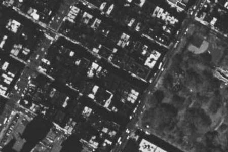
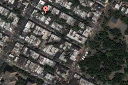
One inexplicable lapse for Virtual Earth is New York City, which contains no high-resolution imagery, but instead contrasty black-and-white pictures that look better turned off. For example:
The combination of dropping the ball in Europe and New York — the two places I consider home — went a long way to creating my initial negative impression of Microsoft’s effort. But if you live and work in Atlanta, initial impressions are bound to be a whole lot better.
Still, my second impression is that Virtual Earth is much more finely honed as a Yellow Pages on steroids, while Google Maps is first and foremost a robust mapping architecture on which services can be built √Ü la carte, or perhaps licensed to third parties who themselves go on to build scratch pads and multiple dynamic searches. We’ll have to wait and see how Google decides to make money off Maps. (Microsoft is also a lot pushier in the side-sell to MSN spaces et al. Nothing wrong with that — it’s a free product, after all.)
Some more Virtual Earth UI quirks:
1) Because Virtual Earth sometimes lets you zoom in especially close, you don’t always get proper feedback from the slider. You’ll think you’re zoomed in all the way, but you can in fact still get closer. This sort of defeats the purpose of having a slider.
2) Also, I keep on having trouble when I want to initiate a new search. My old searches continue to populate the other text box, which leads to bizarre results.
3) Finally, if after a search for pizza in my current view of New York I decide to head on over to the Caribbean, I end up with Florida’s Southermost pizza parlors listed to my left. Head on over to Europe, and I’m treated to Maine’s easternmost pizza parlors. These dynamically updating searches need to be restrained — they’re being a little overeager.


I recommend Pizza Rustica in South Florida – excellent pizza, very reasonably priced.
Oh you mean this Pizza Rustica?
http://virtualearth.msn.com/?sp=yp.10536565
I think I stopped by there to rob them a couple of times in my GTA3 days.
yeah, i got dinner from them last night.
It’s funny that I’ve been here almost a year, but still haven’t played GTA:VC yet.
Also, a quick look at the satellite images for the area show that the Microsoft images are a bit older- my parking garage doesn’t exist, according to MS…
Yeah, I’ve read other people say the same thing. Six years or older.