Crater in Qatar found with Google Earth? (Yawn)

An article in Qatar’s otherwise respectable daily, Gulf Times, dated 24 March, proclaims:

‘Meteor crater’ found in Dukhan:

A crater, believed to have been created by the impact of a falling meteor, found near Dukhan.

Sheikh Salman bin Jabor al-Thani, head of the astronomical department at Qatar Scientific Club, said yesterday the club believed that the meteor had hit Qatar in the 1940s. The club started a search for evidence three years ago because of stories of a “falling star” told by people of that era. The club took the help of Google Earth in the search. They succeeded in locating five craters, which were just visible on the surface.

There is an accompanying screenshot of a round feature in the desert in Qatar. You can see it for yourself here in Google Maps:


View Larger Map

A crater? From the 40s? I highly doubt it. Looks more like an old lake bed, like the ones further north. Were tests conducted on location before going public with this? Or can anyone join in this game in Qatar and get a pre-emptive mention in the Gulf Times? Is this what counts as science over there? The place is crawling with round features. Are they all craters?

PS: Googling “Sheikh Salman bin Jabor al-Thani” tells me he is in charge of determining when religious holidays start in Qatar and also executive manager of the Al Jabor Cement Company. What a polymath!

GRB 080319B: A cosmic salute to Arthur C. Clarke

In his work, Arthur C. Clarke often employed pathos to contrast the human scale against the immense scale of the universe. When he once mused on TV that the Star of Bethlehem had in fact been a supernova, now pulsar PSR 1913+16B, he added:

How romantic, if even now, we can hear the dying voice of a star which heralded the Christian era.

Clarke was also not averse to using electromagnetic bursts as plot devices for his fiction. We all know what happens if you dig up a monolith on the moon…

How romantic, then, to think that within hours of Clarke’s death in Sri Lanka on March 19, an exquisitely timed salute flashed past Earth in the form of a massive gamma ray burst, GRB 080319B, by far the most luminous ever recorded. It was even briefly visible to the naked eye despite having travelled 7.5 billion light-years. That points to a stunningly powerful explosion. NASA provides more context:

GRB 080319B’s optical afterglow was 2.5 million times more luminous than the most luminous supernova ever recorded, making it the most intrinsically bright object ever observed by humans in the universe. The most distant previous object that could have been seen by the naked eye is the nearby galaxy M33, a relatively short 2.9 million light-years from Earth.

Why was it so powerful? Phil Plait at Bad Astronomy blog suggests it’s because one of the twin jets of the explosion may have pointed straight at us:

And why was this one so frakkin’ bright? Was it a more energetic explosion itself, or were we, by coincidence, looking precisely down the center of the beam? If the beam of a GRB is pointed ever-so-slightly away from us, so that the edge nicks us, the GRB will look fainter. By staring down the throat of a GRB we’d see it as bright as it could possibly be. Maybe GRB080319B had us dead in its sights.

Clarke, a famous atheist, would never have mistaken a coincidence to be a meaningful event, but surely he too would have smiled at an alignment between his life, the Earth’s current location in the universe and an event that occurred half-way back to the big bang.

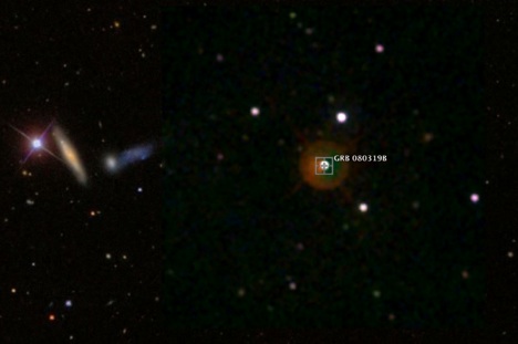
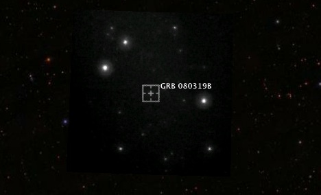
Here’s a series of time-lapse observations that show the burst occurring (check out frame 97-98), courtesy of the real-time data processing team “Pi of the sky”. NASA’s Swift satellite took a higher resolution image showing visible light.

grbclarke.jpg

Both the Pi and the Swift images are available online, though no-one has turned them into a KML overlay for a more immersive view. Viewed by themselves in isolation, it is hard to get a sense of the scale involved; anchored onto Google Sky, it all comes together. Notice UGC 9350 nearby?

So I made this KMZ file. It contains a highly accurate placemark for GRB 080319B as well as two positioned overlays, from “Pi of the sky” and Swift. It helps to turn on and off each layer in turn, and also play with the opacity slider.

grbclarke2.jpg

Here’s hoping that both scientists and mainstream media start supplying these kinds of overlays as an integral part of their output. Arthur C. Clarke would approve — it adds pathos:-)

[Update 20:17 UTC: on March 21, Larry Session suggested the burst be called the Clarke Event.]

Crater discovered with Google Earth in Western Australia

“Crater discovered with Google Earth” stories are among my favorites, and we’ve got a nice one today, right on my birthday:-) Via Australia’s ScienceAlert:

Satellite image reveals new crater
Tuesday, 18 March 2008
By Michelle Ridley

[…] Dr Hickman, from the Geological Survey of Western Australia, was using Google Earth to look for iron ore when he noticed an unusually circular structure.

He sent a Google Earth picture of the structure to his colleague Dr Andrew Glickson at the Australian National University, who later visited the area and confirmed that Dr Hickman had found a particularly well preserved meteorite crater.

There is no placemark included in the story (a pet peeve) but the directions are clear: “just 35km north of Newman”. Go looking there and the crater pops out at you — once you know that you’re looking for it, of course.

Here is the link in Google Earth, or check it out on the map:


View Larger Map

Yet another example of what happens when you democratize access to geodata:-)

Links: Geodeer, historical geomagnetism visualized

  • Go Geodeer!: This is awesome: Take one GPS-collared white-tailed deer named Thor. Have his (presumably) coordinates sent regularly via SMS to your email account. Forward email to a blogging service like blogger.com that will publish emails as blog posts. Import resulting RSS feed into Google Spreadsheets. Convert XML to KML using Google Spreadsheet functions. Follow Thor in Google Earth. Hack by Siberian who writes, “I believe this is the fist successful solution of Mail-to-Map service which is based entirely on free web services.” (Thanks to Valery Hronusov for the heads-up.)
  • Historical geomagnetism: The location of the Earth’s magnetic poles changes over time. Using ships’ logs from as far back as the 1590’s, the Earth’s historical magnetic field has been reconstructed… and now also visualized as time-enabled KML overlays made by Stefan Maus. (Thanks to Peter Selkin for the heads-up.)
  • Israel does KML: Israel’s tourism agency publishes a collection of tourist attractions in Israel, the West Bank and the Golan Heights. Fantastic. Does this mean we can imply a shift in Israeli policy away from suspicion of neogeography to an embrace of the good Google Earth can do?
  • New Blog I: Thematic Mapping Blog (“Using geobrowsers and open source toolkits for thematic mapping”) (via Slashgeo)
  • New Blog II: The Intellog Blog, a developer’s blog about a KML application that maps oil wells.
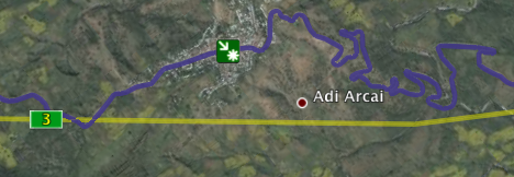
  • Update: 12:59: Oops I forgot: Google Earth gets a vector update, reports Google Lat-Long Blog. Stay away from the new default road layer in Africa however. Use the default Tracks4Africa layer instead — it is much more accurate. For example, in the screenshot of a bit of Ethiopia below, blue is Tracks4Africa, yellow is the new road layer. The blue line follows the actual course of the road exactly. Also: Cairo’s street network may be in Google Maps, but it’s not in Google Earth… though this is a good thing, as the one in Google Maps is built from the wrong datum, which means that everything is misplaced about 100 meters to the left.

newvector.png

Visualizing Egypt’s Elephantine with Vienna University of Technology’s gePublish

In the run-up to the talk about Google Earth and Egypt, Peter Ferschin at the Institute of Architectural Sciences, Digital Architecture and Planning at the Vienna University of Technology got in touch to show what he and his colleagues have been working on in association with the German Archaeological Institute (DAI) in Cairo: A KML and COLLADA content management system called gePublish that really pushes the envelope in helping archaeologists visualize how ancient settlements evolved over time.

heqaib1.jpg

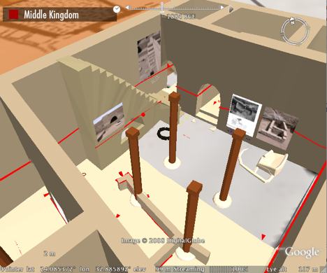
Heqaib Sanctuary on Elephantine, reconstructed in Google Earth

Peter, who is a computer scientist with a computer graphics background, has developed gePublish in an interdisciplinary team with architect Andreas Jonas and egyptologist Iman Kulitz. For the example you see shown on this post, they teamed up with DAI’s Dietrich Raue, a specialist on Elephantine, one of the most important archaeological sites in Egypt.

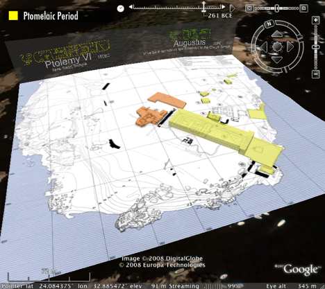
timesl1.jpg

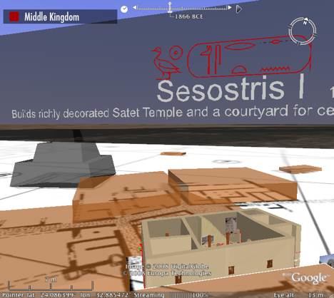
Dragging the time slider changes the maps, the buildings and the backdrop:

timesl2.jpg

timesl3.jpg

I sent Peter some questions that he was happy to answer, so I’ll let him do the explaining. (Screenshots are from the downloadable Elephantine network link.)

The background of the project is that we started around 3 years ago (in collaboration with the DAI/Cairo) to establish digital methods or what we like to call “Virtual Archaeology” with several pilot projects that explore several technologies and concepts with the aim to create a workflow “from the excavation to the museum”, with the idea to use the same methods for public access (e.g. exhibitions) as well as for scientific use. We also tried to adapt our methods to excavation site conditions (which you underestimate if you work in an university environment).

Here is a network link to a collection of data about the island of Elephantine (maps, images, panoramas, literature references, 3D models…) Most of the objects have time tags. Unfortunately you will need a rather good internet connection, as the amount of data is huge (some 3D models are highly detailed). [Peter says you are welcome to download it and help “stress test” their server. No guarantees for uptime, however:-)]

One of our main goals is to have something like a 4D GIS system (which means real 3D models with complex geometry + textures + the possibility to use time attributes) to show architectural or urban development and future plans: processes in time and space… So when GE integrated COLLADA support we were very excited that we can now publish complex reconstructions. The 3D polygons that were possible in KML [before COLLADA] were not sufficient for our work.

There are also some other reasons why we like COLLADA. One is that it allows to use local orthogonal coordinate systems, which is the case in architecture construction anyhow and also for excavation sites — as archaeologists have their own local grid system for spatial reference. (Of course COLLADA was also interesting because it started to become very popular…) When time tags were introduced to KML we were even more excited, because it allowed us to use historical references.

The next idea was that we could use gePublish in combination with our own KML and COLLADA exporters from Cinema4D. For example, if we do a new version of a reconstructed building we can publish the 3D model to the server and the previous version gets updated. I have shifted more of the tasks like detailed georeferencing and time-attributing into Cinema4D because you can do better layouting there.

So at the moment [gePublish] is a proof of concept hack; it is also not a “real” server with dynamic KML generation — but more like a KML and COLLADA content managing system. This means that at the moment we don’t use any database behind our data — but this will be part of a future extension.

heqaib2.jpg

heqaib3.jpg

Heqaib Sanctuary on Elephantine, some closeups

gePublish is built in JAVA. I asked why:

The reasons for JAVA are several… First, I am a Mac guy — but I know that many others are not — and JAVA was a choice to make it cross-platform… Second, there exist a lot of free JAVA libraries like for XML processing which is useful for reading and writing KML and COLLADA, as well as a SFTP library which I use to exchange files with the server.

I asked if they were planning to sell this or open-source it:

Well at the moment neither open source nor selling is planned… First I like to make the system more useful and extend it with more features (but before that the code needs to be rewritten; it’s not very homogenous — a “real hack” in the best and worst sense…) Selling is not planned either, as we are an university institute, so we can live with some workarounds and implementing new ideas is more important to us than creating a commercial product. But if there is more interest in such a system, well…

house701.jpg

house702.jpg

“House 70”, with a close-up.

I asked him to explain the concept of the “visual index” which underpins the development of gePublish.

One of our main tasks is to do 3D reconstructions of architectural objects… When you start to do that you do a lot of research in the relevant literature, and this means for example studying all the excavation reports, digitizing maps and photographs (as earlier excavations did not use any digital survey techniques).

Considering the meters of book publications (these large red volumes the DAI publishes and also the other publications of other institutions), and if you are not an expert of the site (and if you are not Dietrich, who probably knows every stone of Elephantine, its name, date and use) you will have a hard time to get an overview of the material.

So we like to combine all relevant information into one visual display; it’s called an “index” because it is necessary to also include references to the original publication. (See “House 70”, which is the example of a visual index as a so-called “working model” of the reconstruction.) It also allows the integration of open questions at the process of reconstructing, as well as missing data. (If you start to do a reconstruction it might happen that you discover that not “everything necessary” is inside the publication report — although they are REALLY detailed). So gePublish should also work as a discussion medium for doing reconstructions.

When you download the file, do give it up to 10 minutes to download some of the amazing textures for the lifelike 3D statues and wall carvings. Also, if you want to navigate inside one of the 3D buildings, try turning off terrain if you’re looking for more control or if your copy of Google Earth starts complaining. Enjoy.

Explore Egypt with Google Earth… and vice versa

A few days ago I gave a talk “Explore Egypt with Google Earth” here in Cairo at the Dutch-Flemish Institute. How to bring a semblance of structure to such a topic?

The talk would not just be a good opportunity to show off Egypt’s charms using Google Earth; it would also a great way to show of Google Earth’s capabilities using Egyptian-themed content. Two ways into the talk… I felt a table coming on.

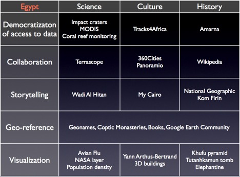
Along one axis, I sorted the content by subject matter into three themes — science, culture and history. Along the other axis, I listed some of Google Earth’s broad capabilities/functions: Democratization of access to data, collaboration, storytelling, geo-referencing and visualization. Then I populated the resulting cells with some favorite examples, like so:

nvictalk.jpg

It’s remarkable how quickly I found 25 different relevant items; even with each item getting on average only two minutes of limelight, my talk easily filled the hour.

I ended up doing my talk row by row, rather than column by column, but I think either works depending on the audience. And of course, this format could work with any country — just do a search on Google Earth Community and on a couple of the Google Earth blogs and KML repositories for a country name, and you should have a good selection. I also used some default layers and global content that is relevant to any country.

For reference’s sake, here are the links to the content I used:

Democratizaton of access to data

  • Craters: New crater discoveries in Egypt is one boon of free access to large amounts of satellite imagery.
  • Daily MODIS imagery including of Egypt.
  • Coral Reef monitoring: Monitor damage to coral reefs in the Red Sea.
  • Tracks4Africa (Default Gallery): A remarkably accurate crowdsourced mapping initiative for a continent often lacking good maps.
  • Amarna – new sites (GEC): Free satellite imagery helps archaeologists scour the region for new finds.

Collaboration

Storytelling

  • Wadi Al Hitan: Exploring a paleolithic site with GPS and a camera.
  • My Cairo: A collection of walks with georeferenced photos from Cairo.
  • National Geographic: Egypt’s hidden tombs, Gospel of Judas (Default Gallery)
  • Kom Firin: An archaeological dig in the Nile delta.

Geo-reference

  • Geonames: The first line of attack for identifying places in Google Earth.
  • Coptic monasteries
  • Books (Default Gallery): Despite its rough edges, this layer works remarkably well on villages along the Nile, because every 19th century explorer of these parts mentions these towns.
  • Google Earth Community (Default Gallery): The first line of attack to identifying objects in Google Earth.

Visualization

  • Avian Flu: Via which route did bird flu arrive in Egypt?
  • NASA Layer (Default Gallery): I used the example in the desert near the Sudanese border, where you can see an irrigation project expanding.
  • Population density (Default KML Gallery): See where Egypt’s population is concentrated (no surprises).
  • Yann Arthus-Bertrand: Georeferenced photos, but also “geopositioned” photos.
  • 3D Buildings (Default layer): Cairo, Luxor, St. Catherine Monastery
  • Khufu’s Pyramid in 3D
  • Tutankhamun’s tomb in 3D
  • Elephantine, by the German Archaeological Institute and the Vienna University of Technology: I left the best one ’til last. But this one needs a whole post to itself — coming up.

Google Sky (web): The review

gsintro.jpg

The web-browser version of Google Sky has gone live. It’s announced on the official Google Blog, where we learn that it is the the labor of love of Google’s Latin America Code Jam finalist and winter intern Diego Gavinowich, and on on Google Lat-Long Blog, where we find a run-down of the features.

The Good:

Much of Google Sky (web) involves applying the well-honed technology of Google Maps to a new data set: Instead of Map/Satellite/Terrain we get a base dataset plus Infrared/Microwave/Historical, though it comes with a big big new feature that Maps doesn’t have: Opacity sliders! While this isn’t a first (Yahoo Maps came out with layer opacity sliders last September) it makes absolute sense when playing with wavelengths.

opacitygs.jpg

You can blend microwave and infrared imagery over the light layer to your heart’s content… but what about X-ray and ultraviolet wavelengths? These are part of another new feature: a strip along the bottom of the screen that contains collections, “showcases” of smaller, detailed overlays of objects (as opposed to the whole-sky layers for microwave and infrared). These collections roughly correspond to the default layers available as overlays in Google Sky (app), but what’s really nice is that each object gets a little preview image that is good enough for you to recognize and choose favorites. Just as with the standalone application, the web version lets you change the opacity here too (where applicable.)

collecitonopacgs.jpg

In fact, the web version’s ability to show infrared data by default improves on the standalone application, where you’ll need to add infrared data through a network link developed independently by Robert Simpson at Orbiting Frog. Oops, in fact Google Sky (app) now shows this layer, and also a layer called Sky Community, where user-contributed placemarks are visible.

Finally, just as with Google Maps, you can paste a subset of KML files into the search text box, and display the file. There isn’t much eligible KLM out there yet, so feel free to use this outline I made in Google Sky (app) of a recently created constellation and saved as a KMZ… Ah, the wonders of user-generated content.

The Bad:

Unlike Google Maps, where labels are part of an image tile, Google Sky (web) only places icons n the viewer. All text is found in popups. This becomes a bit awkward when you turn on the constellation collection and get balloons that serve as labels for constellations — you have to click on a balloon to see its name in a popup, which is much less useful than just giving us the name.

By the same token, there is no layer showing constellation boundaries or a layer for grid lines — without these, I have trouble placing myself in the sky, both in terms of orientation and scale. I don’t know why such layers are not available, but I’ll hazard a guess: In the standalone Google Sky, these grid lines are vectors; on the web these would have to become image overlays (much as the labels overlay in Google Maps), and with the addition of several new opacity layers, I suspect it becomes a technical limitation.

The Ugly:

Another technical limitation inherited from Google Maps: No sky near the poles! Instead, you get “sky substitute”:-)

skysub.jpg

There is another new feature in Google Sky (web): A collection of podcasts about the sky from Earth & Sky. They are indeed entertaining, but they are embedded in popups that are referenced to random coordinates in the sky. In that case, I’d rather just listen to them in a non sky-referenced manner — especially as you’ll break off the podcast mid-sentence if you start panning the sky while listening. That’s a usability no-no.

(And another peeve: The sky imagery on the web is watermarked, which it isn’t in the standalone app. When meditating on the immensity of the universe while staring at the Sombrero Galaxy, it jars a little, even though I know why the watermarking is necessary.)

In Sum:

Of course, now I’m feeling ungenerous, critiquing a programming tour de force that is completely free. Still, we need to compare it to Microsoft’s free Worldwide Telescope, the Windows standalone app due out by the (northern) summer (and also to Sky-Map.org, the incumbent web-based sky imagery viewer.)

Pros:

  • Platform agnostic — a true universal sky browser usable on billions of browsers (is it billions yet?) (same for Sky-Map.org)
  • Unlike Worldwide Telescope, it is available now, not later (same for Sky-Map.org)
  • Easy to add user generated content via KML (unlike Sky-Map.org)
  • Permalinked URLs for Sky locations (same for Sky-Map.org)

Cons:

  • No smooth zooming (same for Sky-Map.org)
  • No touring feature (same for Sky-Map.org — Google Sky (app) has a rudimentary touring feature)
  • No polar content (unlike Sky-Map.org)
  • Difficult to orient (WWT has a little mini map that indicates what constellation you’re in). (unlike Sky-Map.org, which also has constellation boundaries)

As a result, I think all these sky viewer competitors inhabit slightly different spaces. For Google Sky (web), it’s most convincing feature is its universal accessibility, the permalinkability of specific views and the ease with which you can browse to objects using the gallery strip at the bottom of the screen — if that tool’s learning curve were any flatter, it would be going downhill.
Notes on the political, social and scientific impact of networked digital maps and geospatial imagery, with a special focus on Google Earth.