Links: Google Ocean soon? Scilly, Cove, bathymetry redux, Digital Karnak…

Unfortunately, it looks like I’m coming into another busy period, so the following is all too brief, but that’s better that than all too old…

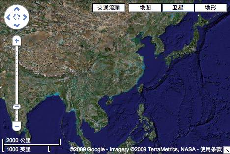
  • Google Ocean coming soon after all? Perhaps the new 2D shaded bathymetry layer does not mean we’ll have to wait a while for the real 3D thing: AppScout and WebProNews both report that a “special announcement about Google Earth” is due on February 2, and in addition to the usual suspects speaking, also in attendance will be noted oceanographer Sylvia Earle. Both sites speculate Google Ocean is coming.

    What might Google Ocean entail? Considering how a combined land and ocean dataset might be problematic from a realism perspective for Google Earth (after all, the oceans aren’t empty), it could well make sense to add another separate dataset, in addition to Google Sky and Google Earth. You could then switch between Google Earth and Google Ocean for a certain view, much as you can now switch to Google Sky.

    But all this is speculation — Google Lat Long hasn’t announced this week’s 2D bathymetry update yet, so maybe that’s what people are gathering for in San Francisco next week.

  • Scilly Google: More feedback on the new bathymetry layer, which erased some islands where the base imagery was 15m per pixel. Richard Treves finds that the Scilly Islands off the UK coast are gone — leaving just ghostlike roads to service the estimated 2,000 people who live there. Richard makes an overlay available that puts the islands back, and notes that he refrained from making a scilly pun. I have no such qualms:-)
  • Cove: In the aftermath of the 2D bathymetry update this week, a commenter alerted me to Cove, for Windows and Mac, that looks very much like what I imagine Google Ocean might look like.
  • Behind the new bathymetry: Kurt’s weblog has an interesting correspondence with David Sandwell from the Scripps Institution of Oceanography, who was involved in the making of the 30 arcsecond bathymetry layer and who confirms that this is the one Google used. He also points to the dataset’s signature, etched into ocean floor near Indonesia.
  • DEM resolution I: Google used the SRTM30_Plus DEM for the new ocean bathymetry data, but this DEM also uses Space Shuttle topography data for land areas, which is not at as high a resolution as some topographical data that’s been used in Google Earth. Could this be why I got an email this week from Jonathan de Ferranti, who writes re Google Earth:

    I do not know if you have noticed, but the improvements to the French, Italian, Austrian, German and Slovene Alps, and the Andes […] have been wiped out. Can you suggest any explanation for this?

    Perhaps the SRTM30_Plus DEM layer has something to do with it? However, Jonathan adds that there have been some major terrain improvements in other areas, including Iceland, the Ural mountains, Reunion, the Central Siberian plateau.

  • DEM resolution II: Two weeks ago (how time flies) I got a note from Andy Fin regarding an improved DEM for the UK:

    Previously all coasts gently sloped to the sea from a half-mile or so inland. Places like Dover Cliffs and Beachy Head etc. were just rubbish. Still not 100% perfect as not completely vertical where required, but still much better. I have a suspicion that all terrain data has been improved as the inland stuff seems to fit better and be a bit more detailed too.

  • Inaugural gigapan: 14 1.4 Gigapixel photograph of the US presidential inauguration earlier this week in Washington DC. Remarkably few stitching artefacts.
  • Digital Karnak: I’m surprised I hadn’t seen this earlier, but happy to have found it now, via Vincent Brown’s digital Egyptology resource Talking Pyramids: UCLA’s Digital Karnak, a 3D rendition of the Temple of Karnak as textured KML. Warning, this is a time waster, especially if you’ve been to Karnak.
  • KML in games: A regular reader and sometime contributor who shall remain anonymous unless he makes himself known writes:

    I’ve been playing Burnout Paradise which is an online ‘open world’ racing game for the Xbox 360 (hate Microsoft/vendor lock-in but love the game) and thought the KML maps where an interesting use of KML to describe game world content.

    I keep hoping racing/flight or other open world sim games will converge more with actual real-world environments/cities, etc. Maybe I should try to write an application similar to the ‘milktruck’ GE demo to allow some competitive ‘racing’ in GE :)

    Yes please!

  • Google Earth gadget: Better mentioned late than never on this blog: Google now lets you create an embedded Google Earth gadget on a web page that loads a KML file of your choice.
  • Microsoft Flight Simulator developers axed? Gamasutra reports they are hit badly by the layoffs, via All Points Blog. Weird. Why not just sell the unit, then, even if on the cheap?

Looks like my flight is leaving. I guess there will have to be a part II…
Note on the satellite image of Obama’s inauguration

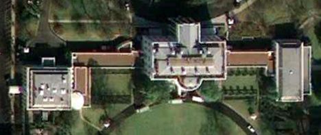
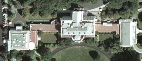
Some notes on the satellite image of the Mall and the Capitol taken just before the US presidential inauguration yesterday, at 11.19am ET, and released just a few hours later (here is the KML file for Google Earth):

1. The fast turnaround from the GeoEye-1 satellite is a harbinger of how we will soon expect to see satellite imagery — not quite real time, but with a delay of just a few hours (weather- and satellite-positioning permitting). The impact of seeing momentous events as they unfold — not just celebratory ones like an inauguration but also natural and man-made disasters — will have the power to rally public opinion in new ways, I think, especially in places from where there is no live media access.

2. Instead of an image of the White House taken in 2002 — from Google Earth’s default view — we now have ourselves an brand-new image from 2009:

2002:

whold.jpg

2009:

whnew.jpg

Not much has changed on the roof of the White House; a lot of the features are the same. Considering that the 2009 image was release mere hours after being taken, I think it’s highly unlikely any doctoring occurred here or anywhere else on the image — nor on the odler image, as some conspiracy theorists have mooted.

3. The version used by CNN is at approximately 1 meter per pixel. The “high-resolution” download at the GeoEye website has a resolution of 2 meters per pixel, or 4 times worse. Only the KML file released by Google contains information at 50cm per pixel.

4. Don’t humans just look exactly like ants from high up enough?

needle.jpg

Bathymetry update: The Good, the bad and the ugly

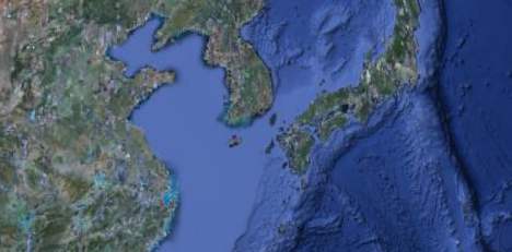
The Google globe looks a lot nicer today, at least from afar, because the faux 3D bathymetry painted onto the ocean surface just got a lot more detailed. It’s now a lot clearer, for example, that while the Mediterranean is a deep sea, the Yellow Sea/West Sea a shallow sea.

seaofjapanchina.jpg

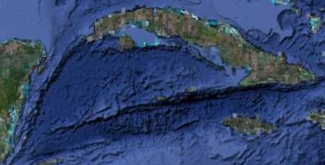
And it is now also a lot clearer how islands connect below the surface of the sea, for example with the Cayman Islands and Cuba.

cuba.jpg

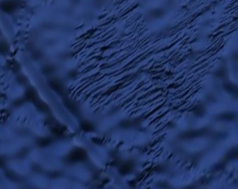
And finally, in many places the ocean floor appears to be rendered in as detailed a fashion as is currently available — you can see clear evidence of where bathymetric surveys were taken and of survey ship paths in the Southern Ocean, where high resolution mapping of the ocean floor is otherwise still scarce:

bottomfloor.jpg

Google credits the data to SIO, NOAA, the US Navy, the NGA and the GEBCO.

But what this layer also hints at is that the mooted and hoped-for true 3D ocean landscape is likely not arriving anytime soon to Google Earth. A true bathymetry DEM for the globe would have been a real feat, but instead we’ll be looking at a 2D rendering of it for a while yet.

(BTW, In November 2008 GEBCO released a 1-minute resolution global grid to the public as a free download, with 2D viewing software (for Windows). I suspect this is the same data as is now viewable in Google Earth in 2D (though a 30 arcsecond resolution dataset was due to be releasedin “early 2009” as well). To view it, start here on the GEBCO site; the actual registering and downloading is done from the British Oceanographic Data Centre (BODC). The complete dataset is a 274MB download. There is software that lets you view this data in 3D as well, but I believe you have to buy it.)

Some have not been so happy with what Google hath taken away with this update: Commenters on Frank Taylor’s Google Earth Blog report that pacific atolls previously rendered at the global base resolution of 15m per pixel have now gone missing wholesale.

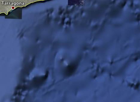
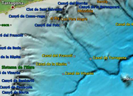
And another commenter, who knows the bathymetry of the Catalan coast quite well, reports that the data sports four fictitious sea mounds there. Indeed, an overlay for Google Earth lets you do a direct comparison:

catalunyage.jpg

catalunyape.jpg

That’s likely the result of some erroneous original data being processed and ultimately rendered as a undersea peak.

Meanwhile,Barry Hunter isn’t impressed with how the bathymetry visualization melds with the satellite imagery along the coastlines. And Kurt’s Weblog notes that discrete contour lines are visible on some parts of the US coastline.

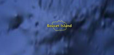
I went looking for some of my own favorite small islands, and noticed that they too have gone missing: The most remote island on Earth, Bouvetøya, has disappeared…

bouvet.jpg

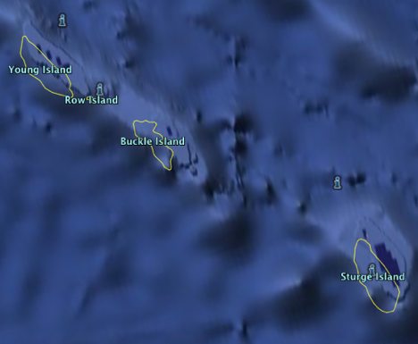
And so have a number of other sub-Antarctic islands, such as the Balleny Islands:

balleny.jpg

These islands are uninhabited, yes, but Sturge Island alone is 30km in length. To be fair, none of the other online mapping services have anything useful on the Ballenys, but that is no reason to lose them in Google Earth:-)

Google Earth gets a clear view of DC

Very interesting: As Google Earth Blog and others have pointed out, Washington DC gets newly updated imagery in time for the US presidential inauguration on Tuesday, and included in the update is a high resolution view of Observatory Hill, which until now was pixelated in Google Earth (though not in other mapping services such as Ask.com).

vicepresnew.jpg

As conspiracy theorists everywhere know, Observatory Hill is also the location of the vice-presidential mansion, and thus the home of Dick Cheney, at least for another 24 hours. While it is a coincidence that the imagery is finally updated right as he’s leaving the place, no doubt this will further fuel suspicions that the censorship was his doing. Still, the clear view provides interesting symbolism for what many hope will be a return to transparency and accountability in US government:-)

A closer look at the metadata, however, shows that the Google geoteam had to do a bit of extra work to bring us the current seamless-looking results. All the imagery around the the Observatory Hill circle is uncredited aerial imagery taken on an unspecified morning in 2008, but the hill itself is credited by Google to a DigitalGlobe satellite image taken Feb 6, 2007.

Meanwhile, over at the White House, here too the uncredited aerial imagery gives way to a square of what I believe is satellite-resolution imagery, credited to Sanborn from 2002. That’s about as old as imagery gets on Google Earth, on par with pre-war imagery from Basra in Iraq, but at least it is in high resolution.

I suspect that the aerial imagery was indeed censored by US authorities before being released to the public (as is done by the Netherlands, among others), but that Google then pasted in uncensored satellite imagery (even if older and/or grainier) in those places where otherwise we’d have seen ugly pixels and then accusations of Google cowing to government censorship demands. Let’s hope this kind of creative workaround by Google gains currency on other censored spots on the planet as well.

Gaza maps updated (and a suggestion)

Several new Gaza maps were released today, which I’ve added to the KML network layer for Gaza:

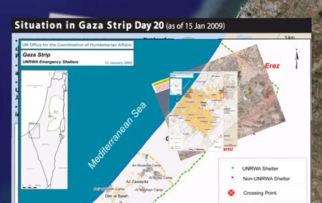
Three maps from the United Nations Office for the Coordination of Humanitarian Affairs (OCHA), posted to Reliefweb: A map of UNRWA emergency shelters, an updated situation map of Gaza that shows the UNRWA compound that was hit yesterday, and a map of Gaza City street names.

UNOSAT today released a new damage assessment map for the Gaza Strip, based on WorldView-1 satellite imagery taken on January 10. There is also a Gaza city closeup.

gazaupdatedmini.jpg

Both UNOSAT and Reliefweb have RSS feeds for the new maps they release each day, and ever since I subscribed two weeks ago I have been impressed by the constant updates — not just with maps of Gaza, but of floods in Colombia, weather forecasts in Afghanistan, fighting in Somalia, an earthquake in Costa Rica, cholera in Togo, Ebola in the DR Congo, piracy in the Gulf of Aden…

And yet, the result, always, is a PDF map, which is great for printing out but not any good for any other kind of use. In some cases, the PDFs are locked against everything but printing, which means taking screenshots in order to rasterize them for placement in Google Earth. The closed nature of these maps is especially ironic when it comes to the damage assessment map of UNOSAT: Every crater found on the satellite imagery is neatly covered by a colored rectangle — a censor couldn’t do a better job.

The solution, of course, would be to also release the information on these maps as vector-based objects on top of base layers of imagery. And KML would be the perfect open distribution format for this; you could just turn off the layer with crater placemarks and look for craters yourself if you wanted to.

An ideal solution: Given the global scope of these maps, their timeliness and usefulness, wouldn’t it be great if these were automatically published as KML to the Global Awareness default layer in Google Earth? People wouldn’t even need to go look for maps when they zoom in on a region hit by an emergency. The maps would be there, waiting for them.

[Update 10:45 UTC: Just to clarify, I’m not the first or the only one to lament the exclusive use of PDFs for these maps.]

Is China opening up to neogeography?

News item one: The People’s Daily Online reports today that China’s government will develop a national GIS platform “inspired by” Google Earth, aimed in part at the general public.

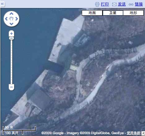
News item two: While fact-checking a cynical take I was about to write on the above, I noticed that Google’s Chinese-language mapping site, which long had no satellite imagery layer, now does. Moreover, it is uncensored! That’s surprising and encouraging, and must have happened in the last month or two. Here’s a “secret” Chinese underground submarine base from the Chinese site:

secretsubchina.jpg

But first, here’s more about that new national geographic platform. Reports the People’s Daily Online:

The move, disclosed at a national conference for directors of surveying and mapping bureaus held on January 14, marks fundamental changes in China’s traditional services to supply basic geographic information. Upon completion, the program will provide comprehensive online geographic information services similar to “Google Earth” and “Google Maps” to all types of institutions and to the general public.

What’s the official motivation?

Because the needs of the society are getting bigger, and because the demands coming from Government institutions, enterprises and individuals for authoritative and reliable online maps and geographic information services are increasing on a daily basis, there is now a pressing need to provide online national multi-scale and multi-type geographic information resource services for a comprehensive use.

Reading between the lines, I can think of two specific reasons for this change of heart:

  1. It was embarrassing that everyone but the Chinese could see satellite imagery of Beijing transformed by glorious new stadiums during the Olympics. In fact, there were plenty of informal ways for those behind the Great Chinese Firewall to see the imagery — just not officially.
  2. The earthquake in Sichuan on May 12, 2008, drove home beyond all doubt to Chinese leaders what a huge boon easy access to satellite imagery is in disaster relief operations. (That earthquake struck just a week after China announced it would investigate Google Maps for maps “that wrongly depict China’s borders or that reveal military secrets.”)

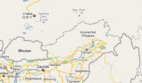
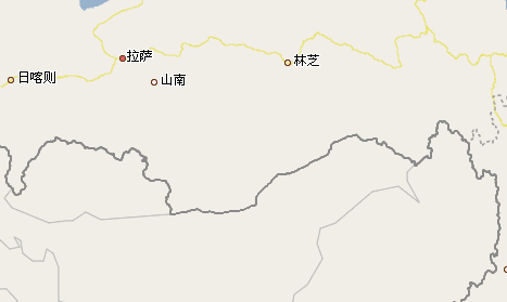
So why not use Google Earth, like the rest of the world does? Just as with India, which is also building a Google Earth clone, China still has issues about borders on maps that it disagrees with. Both in China and in India, publishing maps with the “wrong” borders and labels is illegal. As Google serves its Chinese maps from servers on Chinese territory, where they are beholden to Chinese law, Google has accommodated this problem by producing one government-sanctioned version for inside the Chinese firewall, and one for the rest of the world, which shows disputed territories properly. For example, Here’s how Arunachal Pradesh looks in Google Maps outside China:

And here is the same view for inside China:

Google Maps, then, is adaptable to the Chinese market, but Google Earth is not served from within China, and shows just one universal set of border data. Google Earth isn’t blocked in China, so Chinese citizens do have access to it, but I suspect it just won’t do for government-sanctioned use, as that would be tantamount to accepting an outside view of its borders.

Another hint that China remains worried about borders but not any longer about satellite imagery is that the imagery layer in Chinese Google Maps comes without any border/label overlay option at all. It is just pure satellite imagery — you can’t even tell where China ends and India begins. It’s clear that a straight port from the international border/label overlay would not be acceptable; best not to have any information at all than the “wrong” information.

chinasat.jpg

In sum, all this news implies progress towards a more open and relaxed attitude by China’s leadership when it comes to mapping tools not crippled by government controls and censorship. It’s a step in the right direction, though in other domains the road remains long.

Immersive Bosch, Goya, Rubens… Gigapixel art hits the mainstream

I was ready not to like the idea of rendering gigapixel photographs of the Museo del Prado paintings inside Google Earth, at the location of the real-world Prado. After all, the physical location of a painting is usually a product of historical happenstance; it is an attribute that only matters when you want to see it in real life. On the internet, the tyranny of distance has been vanquished — so why re-introduce it as an artificial constraint in Google Earth, where you are forced you to navigate to Madrid to view content that is much better searched for by title or by painter?

My preëmptive criticism tuned out to be a rather pathetic quibble, however, in the face of some stunning extreme close-ups of these 14 masterpieces. Hieronymus Bosch’s Garden of Earthly Delights in particular is ready for its closeup:

hbcouple.jpg

Take that, John Ashcroft.

In most paintings my attention headed for the eyes, and then for the background landscapes. I wonder if there is attention-datamining being done here, and whether it will be shared… I’d love to get to see it as heatmaps overlaid on the paintings sometime.

This sudden availability of beyond-archival grade gigapixel imagery poses some new challenges, however. Bosch’s painting in particular highlights the fact that we now have in front of us these whole new worlds to explore… but no easy way for us to share our finds. If I wanted to reference the acrobatic couple above (in a scholarly monograph on medieval depictions of sin, obviously), I’d have no other recourse but to point you in the direction of the gold ledge, blue globe, back pond, center panel. That’s a sub-optimal addressing system. It would be much better if I could just give you a coordinate pinpointing the location on the image in a URL, or even embed the specific view on the web page, like you can with Google Maps.

So perhaps my quibble still stands: Google Earth is certainly well-equipped to quickly render gigapixel images with evident ease, but is it really the best platform for making this imagery widely accessible? Shouldn’t Googling “bosch garden delights” return web-accessible version of this gigapixel image? And wouldn’t it be great if the image were annotatable, in the same manner that Wikimapia lets you annotate the Earth or Flickr and Facebook let you annotate everyday snapshots? [Update: And the way Gigapan.org lets you annotate gigapixel landscapes via snapshots!]

hbanimal.jpg

I know, I am looking a gift horse in the mouth — extremely closely. But technologies like Microsoft Live Labs’ Deep Zoom show that web-based immersive gigapixel image browsing is feasible, with the added benefit that browsers support the kind of scripting that makes embedding and annotating possible. (Others have previously brought gigapixel art to the web as well — remember the 16 gigapixel Last Supper from 2007?).

So consider this post a plea to “free” this great new content, so that these paintings can finally become shared, interactive social web objects after a few centuries of being kept at a safe distance. Also, please let this be the start of a trend where all museums place their crown jewels on the web in the best possible light, simply because it is the public-spirited thing to do, even if I am sure it is also good for business. People haven’t stopped queueing for the Mona Lisa because its image is everywhere. Au contraire.

Notes on the political, social and scientific impact of networked digital maps and geospatial imagery, with a special focus on Google Earth.