Collaborative mapping: How does Google stack up to Tagzania?

The new collaborative maps feature for Google Maps is an yet another example of how previously third-party-only API-based extensions for maps inevitably become folded into Google’s default offering. That’s progress.

But how does this new feature stack up to Tagzania, my current workhorse for collaborative mapping? Before today, we were planning to use Tagzania as the collaborative mapping solution for IPY.org’s next International Polar Day, focusing on ice sheets, coming up on December 13. Should we switch to Google’s tool?

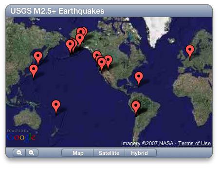
It’s important to realize that Google’s collaborative tool is not in exactly the same space as Tagzania’s. Google Maps now excels at inviting people you know and trust to edit your maps. Tagzania works differently: Everyone can contribute their own placemarks and assign to them a common tag — perhaps a pre-agreed tag, but not a tag that is exclusive to anyone.

Once you do get editing privileges in Google Maps, those privileges go all the way — you can move other people’s placemarks, and alter the text in popup bubbles. That’s powerful, unless of course you set the collaboration preferences so that anyone can edit the map. I accidentally moved a placemark on the collaborative map of surf spots touted by Google Lat-Long blog… sorry! Other people, no doubt, will see this as an opportunity for mischief.

With Tagzania, spammers could conceivably rain on your parade by adding spam placemarks and giving it loads of irrelevant tags, but they wouldn’t be able to destroy your own hard work. In the case of IPY.org’s needs, where we want anyone to be able to note their participation in the International Polar Day, the indestructibility of content is very important.

Ideally, we’d have a tool where an owner is in charge of a map to which anyone can contribute their own placemarks, no-one can alter others’ placemarks, and where the owner can weed out the spoilsports. In Tagzanian parlance, that would be the equivalent of “owning” a specific tag name, and being able to disallow inappropriate placemarks from using it. Neither Tagzania nor Google Maps gives us that kind of tool at the moment, but Tagzania’s comes closest to what we need.

That doesn’t make Google’s offering worse in terms of collaboration — just differently focused.

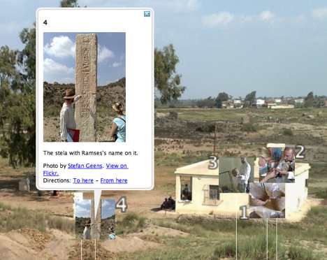
One more thing: Both Google Maps and Tagzania offer KML network links to their collaborative maps, so that they are always up to date.

PS: Google has also just announced you can now upload KML files from your computer to Google Maps, in addition to visualizing those accessible via a URL. Unfortunately, I’m not succeeding in getting any KML files to upload at all at the moment. Is anyone else having this problem?

Antarctica gets its closeup

lima465.jpg

Now this is the sort of public domain science resource I’ll gladly pay taxes for. From www.IPY.org:

A new satellite image of the Antarctic continent is now ready for all to see and use. The IPY Landsat Image Mosaic of Antarctica (LIMA) project has been completed and its stunning result is freely available for the first time today. Compiled from over 1000 Landsat scenes, the result is a 15-metre resolution, near seamless and cloudless image mosaic of the continent.

A team from NASA, the U.S. Geological Survey, the National science Foundation and the British Antarctic Survey have worked together for more than a year to produce this uniformly and rigorously processed surface reflectance dataset. In addition to providing scientists with a new tool for discovery and planning, LIMA also provides everyone with a previously unseen and realistic view of the continent.

You can browse the imagery in a web-based viewer today at the mirror sites lima.usgs.gov or lima.nasa.gov. Unfotunately, these sites break on Mac browsers and only work well on Windows. Not to fear, the imagery is in the public domain, which means it is only a matter of weeks not months before we can expect to have this crop up in the base layer of Google Earth and NASA World Wind. (Full disclosure: I posted the above to IPY.org on behalf of the LIMA team.)

Links: Anthropogenic biomes, EPA emissions, Plone 3 + KML

Some interesting content has been cropping up lately as KML:

Meanwhile, some other tools keep on improving:

Links: Virtual Earth imports KML; Antarctic Traverse live

  • MSFT + KML, cont.: Virtual Earth’s API now lets you import KML and GPX data, and there was a new update to the imagery over the weekend. Neocons, before giving Google any more of a hard time for their Israel imagery, kindly go check out Jerusalem on Virtual Earth.
  • Antarctic Traverse live: The Norwegian-US Scientific Traverse of East Antarctica is currently underway, in which a bunch of lucky scientists get to drive to the South Pole across the world’s largest ice sheet with monster trucks. The whole thing is mapped to KML live here.
  • Swedish imagery: I was going to turn this into a post but time was lacking: An article in Sweden’s Ny Teknik (in Swedish) explains why Sweden’s imagery is so poor in Google Earth. There exists a lot of aerial photography of Sweden, but it is being closely held by Sweden’s national geographic agency, Lantmäteriverket. Just like with the UK’s Ordnance Survey, existing licensing terms would make it prohibitive for Google to incorporate all the imagery in Google Earth — in fact, it would cost Google USD1.9 million per year to use it, says Google in the article.

    What options are there? Google could do like Microsoft, and commission its own aerial imagery — many Swedish towns are now visible in glorious bird’s eye view in Virtual Earth. Or it could strike deals with individual communities — in the last update, Umeå made sure it is in high resolution by donating its imagery to Google. Smart move, but such an ad hoc solution is a lot of work, considering how many communities there are.

  • India hearts Google Earth? And another story from a while back, spiked for lack of time: At the occasion of the launch of the Millennium Development Goal Monitor, Indian media found the opportunity to ask Google Earth CTO Michael Jones whether India had ever asked or demanded the censorship of Indian imagery. The answer?

    ”We talked to them. We meet with them. We travel constantly to India. We do not want to be a problem. We go and talk to them and say how do you feel about this? Of course every country is nervous; nervous is the wrong word; when something is new and more dated than before. They are just curious if this is going to be good or bad,” he said.

    Jones said there has been no attempt ever not to show the information it has. ”Everything, we have we show. As soon as we get data, we publish it. We buy satellite data. We buy airplane data. That is what we show in Google earth, all the data we have got so far,” Jones said.

    Cough Basra cough. Still, as if to back up Jones’s substantive point, India’s new army chief Deepak Kapoor is “not losing sleep” over Google Earth, reports newindpress.com: “Kapoor feels that Army needs to take the new technology into its stride and adjust their war doctrines accordingly.” He seems to be part of the new guard of Indian military leaders, which is encouraging.

  • Sky pictures: steph:s layer for Google Sky adds gorgeous overlay pictures from Johannes Hevelius’s 1690 star atlas Firmamentum Sobiescianum. What I’m still looking for, however, is an overlay that contains the boundaries between constellations, which is much more useful to amateur astronomers. Anybody found such a layer yet? Or made one?
  • Mirror Says: From last week, a somewhat hysterical article by the UK’s Daily Mirror in which Ed Parsons makes a valiant attempt to explain why Google Earth is Good ™.
  • Audio + KML: Richard Treves shows you how to make a self-paced audio tour of placemarks by embedding a Flash application into KML, though it is usable only with the PC version of Google Earth — I’d add a link to a place on the web where you can hear the tour for non-Windows users, as a fall-back.

Mac OS X 10.5 Leopard’s Dashcode does KML, GeoRSS

GeoRSS Weblog finds a gem. Mac OS X 10.5 Leopard comes with DashCode, a tool for developing widgets to populate the Mac’s dashboard… One of the pre-made templates is for a Google Map, and all you have to do — literally — is add a GeoRSS or KML URL, get a Google Maps API key, and publish. Really:

dashworkflow.jpg

I borrowed the USGS GeoRSS feed for earthquakes and made this in 2 minutes:

mapsmap.jpg

Isn’t it gorgeous? None of it is my doing. Download the widget.

But nothing’s perfect — I found the tool balking at some of the KML I threw at it, and of course, it only works on a Mac — here’s wishing this thing could output javascript for embedding in websites. Still, I’m somewhat stunned by how idiot-proof programming has become.

The Kom Firin dig as a PhotoOverlay with hotspots

Last month I visited my first real live archaeological excavation — the Ramesside temple complex at Kom Firin in the Nile delta, currently being excavated by a team from the British Museum.

That area of the delta just recently got a high-resolution imagery update in Google Earth, so even though it is in the middle of nowhere, we were able to get there through the judicious use of Mobile GMaps and my Nokia N95’s built-in GPS. (Egypt has excellent mobile phone coverage.)

I took some snapshots of the visit (which I uploaded to Flickr), but at one point I also stood on a hillock, held out my arm, and put the Nokia to work making a 360-degree panorama. This wasn’t a high-tech proposition — I really just took a photo, turned a bit to the right, took another, etc… about 15 times.

The object of that little experiment was to see if I couldn’t create a 360-degree panorama in Google Earth. The answer was yes, with an additional unexpected use for the georeferenced photos on Flickr — you can turn them into placemarks and position them in front of the panorama, in effect creating clickable hotspots usable from within Google Earth’s PhotoOverlay view.

Here’s the resulting file. Double-click on the “Kom Firin 360” item to enter the PhotoOverlay viewing mode (give it some time to download the tiles, poor server). Notice how the placemarks float in front of the overlay but disappear as you zoom in. You can click on a placemark to see the popup containing a thumbnail of the photo, which links through to the corresponding URL on Flickr.

panfirin1.jpg

panfirin2.jpg

panfirin3.jpg

Here’s how to make your own:

Turning the set of georeferenced images from Kom Firin on Flickr into a KML file was easy. I used Adam Franco’s excellent Flickr set to KML converter.

Then I set to work on the panorama. I used DoubleTake for the Mac, which imports a whole series of partial panorama images and does a remarkable job guessing how to match and stitch them. Perfectionists can spend hours fine-tuning, but luckily I am from the “good-enough” school of editing in this regard.

(Some tips: While stitching the images manually, I set the program to 360-degree mode, but when it was time to export a big jpeg image, I turned that off and cropped manually — it just results in fewer hassles.)

The exported jpeg image (weighing in at 27MB) was then processed by CASA’s most excellent Java app PhotoOverlay Creator. I ran it in Windows on my Mac. The result is a folder containing hundreds of small jpeg files, comprising a “pyramid” of progressively more detailed images that get loaded only when you zoom in on a part of the image. These were then uploaded to Ogle Earth’s web server.

I did some tweaking on the KML file produced by PhotoOverlay Creator, however. Fortunately, it is easy to have it open in a text editor, make changes and then choose “revert” on the file in Google Earth, which in effect refreshes it. Using the opacity slider, I was able to have the horizon in the panorama match the horizon in Google Earth (by playing with <bottomFov> and <topFov>). I also played with the radius of the panorama (using <near>) so that a number of nearby georeferenced placemarks would be inside its circumference.

(Tip: Because I had lowered the field of view in order to match the horizons, I had to raise the camera’s height to avoid the panorama being cut off at the bottom when zoomed out.)

(Another tip: You can control the direction of the panorama by changing the camera’s <heading> value. Luckily for the imagery I took, there are some very distinct landmarks nearby (the tree, the magazine, the lake) visible on Google Earth’s base imagery, so it was easy to precisely position the view.)

Then came the fun part. It turns out that placemarks near the camera are visible when you are in PhotoOverlay viewing mode. If — as is the case with the KML produced by Adam Franco’s Flickr to KML converter — the KML contains placemarks with photos as icons and in the popups, then you can position these in front of the panorama as clickable hotspots, merely by adjusting their height.

This part is a bit fidgety, but not as fidgety as you might think. It is quite easy to get a good correlation between the view in the panorama, the view on Google Earth’s base imagery, and the georeferenced images from Flickr.

The result, I think, gives a pretty good indication of what it’s like to be at an archaeological excavation in the Nile Delta, with plenty of opportunity for storytelling via placemarks.

[Update 21:53 UTC: Thanks for Ben Hagemark (who’s worked with the Gigapan and Gigapxl default layers in Google Earth) for pointing out two further possible enhancements to the final file: You can link to the PhotoOverlay view directly by adding an id to the PhotoOverlay tag (e.g. id=”kom_firin_360″) and then linking to it in the description for the popup balloon, like so: <a href=”#kom_firin_360″>Fly into this panorama.</a>. Another improvement is to link the balloon of each photo to the next. We’ve seen this in Google Earth’s newest default layers, and here is how to do it: give each placemark a different id, for example id=”photo1″, then in the description of each balloon, link to the id of the next placemark, like so so: <a href=”#photo2;balloon”>Next photo</a>. Technical note: Make sure to wrap the description text inside a <![CDATA[…]]> tag to avoid syntax errors.]