Because life is short and words are cheap, I try not to duplicate content that Frank has already put up on Google Earth Blog, but sometimes something so good and worthwhile comes along that it deserves a special push.
National Geographic’s latest Google Earth effort qualifies in droves. Not only has the magazine written an excellent piece to highlight the illegal poaching of Chad’s elephants in the pursuit of ivory, it has also pulled out all the geospatial stops to bring the story alive on a map.
Here is the online version of the story, Ivory Wars, from the March issue.
Here is the page highlighting the Google Earth layer.
Here is the direct link to the KMZ file.
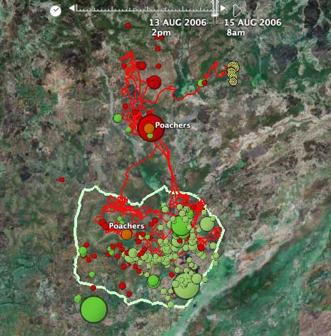
The file contains a wealth of geospatial information about and around Chad’s Zakouma National park — paths, roads, cultivated fields, animal sightings, photos, poacher camps… but the most poignant part is the time-stamped location readings of Annie the elephant, who carried a GPS collar for three months in 2006. We get to follow her and her herd around, but then on August 15 her path ends, as she’s been killed by poachers.

Annie’s journey is exactly the kind of information Google Earth excels at visualizing, and this makes it the perfect complement to the National Geographic’s text and photos. The only way to really convey the spurts and stops of Annie’s wanderings is as an animation on a virtual globe; I think it is wonderful that a magazine like National Geographic has embraced such geospatial tools as an essential component of its storytelling.
This layer also illustrates some of the challenges of making complex data accessible using KML in Google Earth. For example, it’s not (yet) possible to set the defaults for the timeline navigation via KML element attributes, so I needed to experiment with the settings before Annie’s position data became truly compelling, and that’s not something a first-time user is likely to figure out right away. It would be nice to have more control over the end-user experience, should the user want it.
Great content!
… but the end-user experience is lacking- it was difficult to pick apart the datasets and content that pop-up on screen all at once and figure out what to do with them, and I assume ten times as hard for someone new to GE.