Is it too early to look Google Earth’s timeline gifthorse in the mouth? It’s an excellent new tool — so much so that I’m wishing I could do more with it.
Like what? I’ll illustrate by way of example:
1. Add periodicity: Some datasets have a natural periodicity to them — seasonal water temperatures, for example, or the tides, or the daily schedule of ferries in Stockholm. It would be very useful to be able to compare successive equivalent phases in the data.
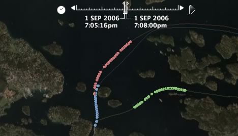
As it is now, events that happen in successive days, months or years will also appear in the timeline successively. For example, here are the time-enabled trajectories of the 6pm ferry from Stockholm to Sandhamn on August 30, 31, and September 1. Each trajectory leaves separately; but how would these trajectories look relative to one another, timewise?
To find out, I cheated, converting all the date stamps to Sept 1 but leaving the time component unchanged. Here is the resulting file. It’s lovely to look at, as if three caterpillars are racing through the Stockholm Archipelago (if you set your timeline parameters right — I suggest an interval of 2-3 minutes, played as slowly as possible):

It would be cool to build in such functionality into the timeline tool — an option that lets you choose the periodicity of the data (hour, day, month, year, and perhaps week?), and then an option that lets you choose whether you want to show the data for each phase simultaneously or in succession. For example, for the ferries it makes sense to show the data simultaneously, but for overlays showing global snow cover, it would make sense to show December data for successive years in succession, so that long-term trends become visible.
2. Fine-tuning controls: There is currently no way (that I know of) to advance from individual time event to individual time event in a granular way. This makes it harder to navigate precisely, or to ensure that something is always visible, especially if the timeline is set to show just an instant rather than a wedge of time.
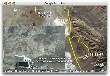
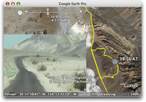
By way of example, check out this really innovative use of the timeline, by Virgil Zettterlind at DestinSharks.com. He took a video of a drive through Death valley, associated some video stills to a GPS tracklog, and then plastered the stills onto Google Earth as a ScreenOverlay, to be played as a slide show with the timeline. (Here is the KMZ file directly.) The effect works very well. Just like with the ferries, you should really see this in real life, as a screenshot does not do it justice:


But Virgil had to “cheat” as well. As he explains, he chose to associate the stills with overlapping time spans rather than just the instant they were taken, so that there is no danger of the user seeing nothing at all. And the ScreenOverlay hack is a good way of forcing images to be visible, in the absence of a (documented) way to control the popup balloons.
How would such granular controls work? Well, I’d be happy with a simple keyboard shortcut, but otherwise two extra arrows in the UI would suffice, just as with current multimedia players.
3. A way of controlling timeline settings from within the KML. Virgil’s problem would also be solved if he had the ability to control the timeline’s settings via KML. How the data is presented can make a big difference to what information is highlighted. There should be a better way than telling users what the precise settings should be — as Declan Butler does in his recent post on the revamped avian flu layer. If a layer is best viewed with the the time wedge clamped to the left-hand side, then it would make sense to have the KML impart this preference.
A related topic is that the timeline stretches to incorporate all time-enabled KML files that are currently visible on Google Earth, even if they are far apart temporally, or of a radically different timespan. This means that one or more datasets will become difficult to navigate.
It looks like a more advanced Google Earth API may soon come to the rescue, however. This morning, Let’s Push Things Forward writes about some new undocumented enhanced classes for Google Earth’s component object model, including what sounds like the ability to pop up balloons at will. That would be useful:-)
(Finally, a bug report: On my Mac, the timeline does not seem to adjust itself after layers are turned off. I currently solve the problem by deleting folders in My Places and then restarting Google Earth.)
In sum, the timeline is a wonderful innovation, one for which the possibilities are just beginning to be explored.
great suggestions Stefan and I love the ferry KML you created. What’s really cool is the LookAt tags obey the timeline stuff as well, so you can control the orientation of the camera. For example, you could create 3 folders with time enabled LookAts that follows behind each of the ferrys. Using the new radial folder checkbox options, you could provide the viewer with multiple camera tracks to look at your data. Its not quite “real” animation but its coming close
also, the COM API is not accessable from KML but I agree, they are making some good changes to the underlying infrastructure.
cheers
brian
Stefan, I like your suggestions. I agree with all of them. I would also add that a way to control the span of time covered by the time gadget be controlled by which folder is selected in the Places pane. Right now if you have two time stamped folders, with two widely differing time spans, the time gadget shows the time span for both – which makes it ineffective for playback for one or the other.
Another thing that should be improved:
Currently, the beginning and end of a time line are barely shown. For example, if you are viewing a time line from 2 pm to 6 pm, and the width of the shown interval is 1 hour, the animation starts at 2-3 pm, and loops to 5-6 pm, showing all points in time from 3 to 5 pm for a third of the time, but 2 pm and 6 pm only for an instant.
It would be better if it started at 1-2 pm (so initially showing only that single point in time), and looped to 6-7 pm. That way, all points in time would be shown for an equal period (20% of the time).
– Michael
One more thing:
In addition to your point 3 above, it should also be possible to specify to simply loop through the available points in time, one at a time. (I.e. always show exactly one of them, never more or none.)
This would help tremendously for stuff like this rain radar mockup.
– Michael
I have been looking at google earth and would like to make a comment on a gross error. At posittion 34.33’08” S 58. 41’44”, which is near where I live (Buenos Aires, Argentina) there is a gross picture overlapping. The pictures taken on that area overlap over an area of more than 300 feet. I believe this is an error that should be avoided. It causes confusion (as to the exact location and distances of some positions) and leads to consider google earth as a deficient tool.
I hope this picture overlapping is taken into account, so as to make a better version of it.
Furthermore, I would like to comment on the fact that many of the pictures of less populated areas are still too poor in detail. I hope that, with time, google earth incorporates better images of all of the earth.
Joaquin von der Pahlen