Google Earth version 4.0 beta has just been announced at Google’s Geo Developer Day today. Just go and download it and play, or if you’re stuck at the office, read on…
First, the basics:
- There’s a Linux version of Google Earth! (No plus and Pro version yet)
- The Mac version (v. 4.0.1563 beta) is a universal binary. It screams on Intel machines. You can upgrade the free version to Plus ($20 a year) and there is also a Pro version to download (for business use, $400, with a free trial). (In case you’re wondering, yes, you can run both simultaneously.)
- Here’s the Google Earth for Windows download (v. 4.0.1563 beta), and here’s the Pro version (same deal as the Mac)
What’s new:
The look and feel of Google Earth for Windows and Mac has been greatly improved. (I don’t have access to a Linux machine so can’t report on that version, sorry.)
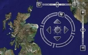
- There is far more efficient use of screen real estate. The controls at the bottom of the screen have been replaced by a transparent “navigator” in the top right corner, which turns from a compass into all the controls you need when you mouse over it. You’ll need to change some of your habits, though, Tip: double click on the”N” at North to reset the direction.

- There is a very narrow toolbar along the top of the screen, with the most common tasks. These include Add Path and Add Polygon, which are Plus-only options.

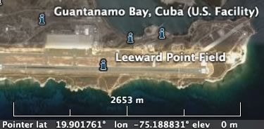
- There is now a scale legend. It gives you a better idea of scale than guessing from the eye altitude indicator you used previously.

- Gone are the slightly garish primary colors that served as title bars for the Places, Search and layers tabs. In both Mac and Windows, they’re now a cool gray. Buttons are much cooler as well.
- A lot of the keyboard shortcuts you may have used have been changed. Toggling the sidebar on and off is now Command-Option B, instead of Command-2. A new placemark is Shift-Command P, instead of Command-Nl. It makes more sense, but again, you’ll need to change your habits.
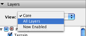
- You may already have noticed that the contents of the Layers tab have been rearranged as of earlier today in the 3.0 Google Earth. (See Google Earth Blog’s post.) The tab itself now has a further refinement: You can select which layers to make visible, like so:

- In the Preferences/Options pane, you can now also tweak “Terrain quality”. It changes the number of polygons that are rendered. More polygons = smoother terrain = more processing needed.
What’s still different between the Mac and Windows version?
- The Mac version still doesn’t support a built-in browser.
- The Mac version doesn’t have a full-screen version (F11 in Windows).
Other nice new things:
- When selecting a placemark, you have far more control in choosing how the icon looks. You can choose plenty of icons easily via a popup menu, and you can choose color and transparency for both the icon label and line (to Earth, in case the placemark is in midair.)
- Importing a SketchUp model now looks far easier, with a dedicated menu item for doing so.
- In the Prefences/Options, you can choose whether the translucent “navigator” controls are always on, off or appear on mouseover.
- Google Earth asks for usage statistics. You can turn this on and off in Preferences/Options.
More to come…
Exciting news! I’ll try it when I get home from the US.
The Universal Binary OS X release is horrible! I was really looking forward to it, but it’s so full of bugs as to be basically unusable.
Firstly, even at the lowest settings, it runs about 1/3 as fast on a MacBook Pro with 1.5Gb RAM as did the old version under Rosetta. (!!!) It freezes and enters spinning-wheel-of-death mode every time you pan or tilt. The new toolbar disappears constantly. You can’t even click a menu item without it taking 15 seconds to open the menu. Pieces of terrain go missing leaving holes in the landscape. Clicks that should move you a little bit suddenly jump you hundreds of miles away.
In short, they obviously released this wayyyy too soon.
Interesting. I too am using a MacBook Pro, 17 inch, 2GB RAM, and I find it to be extremely fast for regular use. I did get lag when using those very large demo files, but other content seems to work fine. I had some corrupted caches that caused constant crashes, but cleaned those out via the preferences panel and everything worked again.
Question: Did you also run the Pro trial? I’m wondering if their shared files might not create some sort of clash. Just a hunch though.
Re the speed: I do set GE4 to around 980MB or RAM (the max allowed) and 2GB of disk cache.
Hmm.
Clearing the caches and setting them to their highest values sped things up a bit, at first…but once I get low to the ground the speed begins degrading and _keeps_ degrading until it’s getting stuck at loading 1% and there’s the spinning colorwheel…at that point it’s completely uncontrollable, as well. Yuck!