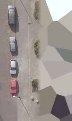
 The Dutch are discovering that the latest Maps and Earth dataset update for the Netherlands includes censored areas, such as of the Ministry of Defence and the headquarters of the Dutch airforce (KML). (Google Earth Blog‘s Frank Taylor noted soon after the updates on Google Earth Community that this Dutch air base was blurred.)
What’s interesting is that the imagery carries no attribution (zoom close enough, be sure to turn off place names), yet the resolution of the uncensored parts is among the highest available in Google Earth. This leads me to suspect that the data is of governmental origin — hence maybe cheap or free, but not unretouched. I wonder if Google has a policy on accepting such datasets (and if so, if it might want to articulate it) — the trade-off means it’s not a completely free lunch, and it opens the door to charges of hypocrisy by the more paranoid government ministers in India. The dataset of Bergen, Norway, which the city recently donated to Google, will likely also have censored areas if/when it is included in a future update.
At least on the Dutch maps the censored areas are clearly marked as such, instead of camouflaged (as is the case on official Swedish and Norwegian maps). This preserves trust in the maps and avoids users being lied to.
[Update 1:03 UTC: Forgot to add a proposed policy for Google: Accept datasets from governmental sources that include blurred/speckled areas if these areas still have a higher resolution than the old imagery being replaced. That might even be the case in the Netherlands.]
[Upfate 23:25 UTC: Story updated]
Some time ago, I used an areal photo from a third party producer as a ground overlay for a client’s location in Holland. The point was: the dutch blur was just unbearable (very low res in Holland till recently).
That high res photo had a big ugly greyish polygon on the spot where an Army Helicopter Base is situated.
So, fair enough, it actually looked like if there was a bug in GE! A grey hole on planet Earth! Spooky Sc-Fi. It kind of proclaimed its own absurdity.
Now, with these fine filters from Photoshop, we can get the frustration boiling point a level higher.
You see what you are supposed to see (although it really looks ugly and should be prohibited if only for non compliance to Earth Imagery aesthetical common sense). And you are told NOT to look at what you saw in more detail.
Why be double standard here?
Either not show it (or show a banner saying ‘classified’in ugly colors, for which we could ask the exact reasons) or show it all (with all tiny roof tiles, bricks and trivial pieces for the interested freak).
The effect is here, rather, that the place looks overly ‘important’ , and its pre-supposed ‘protected viewing’ (which it is not) attracts added attention and most certainly negative feelings of visual frustration.
Showing and not showing at the same time is most inadequate to this medium: it proclaims its right to lie to us – visuallly.
Is this the first example of an act of terror on GE?