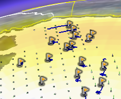
Some network links really astound with the kind of information they can convey. For example:
Örsted DTU (Technical University of Denmark) does a lot of remote sensing of the polar regions. Some of their projects monitor polar sea ice, and in fact they have a couple of very fancy java applets that shows you the extent of polar ice in real time.
 DAMOCLES (“Developing Arctic Modelling and Observing Capabilities for Longterm Environmental Studies”) tries to pin down the effects of climate change on Arctic sea ice by measuring a range of properties, both via satellite and from drift buoys. Damocles (apt name:-) is a brand new project, with barely a home page to its name, but if you dig a bit deeper, you find a network link [kml] that renders all this information about the Arctic sea ice in near real-time, with drift indicators. Wow.
Our receding Arctic icecap is a hot-button issue at the moment, and this network link is precisely the kind of contribution to the debate that science can and should make.
(Aside 1: Though 2D, there are plenty of dimensions of data portrayed by this network link; it reminds me somehow of that graphic of Napoleon’s Russia adventure highlighted by Edward Tufte.)
(Aside 2: And while you’ve got a snapshot of Arctic sea ice on Google Earth, why not complement it with the auroral activity overlays Google Earth Blog linked to last week?)
Thanks for the nice introduction to our DAMOCLES prototype
DTU DAMOCLES web pages are now available at
http://www.seaice.dk/damocles
Cheers, Leif