Google Lat Long Blog has announced new, improved borders for the default dataset of Google Maps (and soon Google Earth). This is much-anticipated news, because many have begun to see Google’s border choices as a proxy for international recognition of sovereign territorial claims, with perceived errors loudly contested by aggrieved parties, sometimes even by governments.
As Google’s announcement clarifies, the improvements are of several types — increased resolution, changed symbology, and changed borders:
Increased resolution:
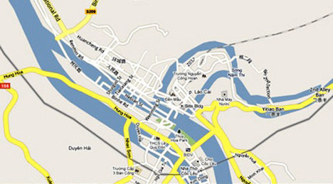
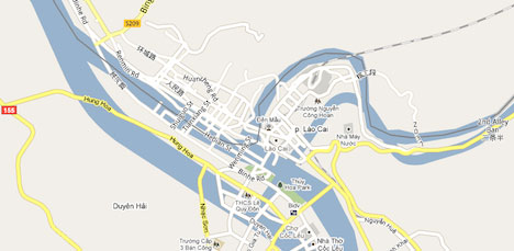
In some cases, the resolution of the border is improved, increasing accuracy. Google’s post shows an example of this in the Pamirs. From a quick visual inspection, higher accuracy is also visible in the border between Azerbaijan and Armenia. The border between Vietnam and China is also much more detailed — the rougher version of this border prompted a complaint by Vietnam in March 2010 that several of their border towns fell into the Chinese side of the map. That has now been fixed:
Before:
After:
There are likely many other instances of such improved borders around the world. (It would be great to get a list or KML file of these changes, just as Google does with imagery updates, for the sake of transparency.)
Changed symbology:
Google writes that some borders, while not changing shape or resolution, have been given a different symbology, to more accurately reflect their status. As an example, Google proffers a section of the border between Somalia and Ethiopia, which is now accurately shown as “disputed”.
A quick perusal of another disputed border in Africa, however, leads to a problematic change in the symbology. The Ilemi Triangle is claimed by Sudan, Ethiopia and Kenya, but is de facto controlled and administered by Kenya. The current view in Google Earth recognizes this:

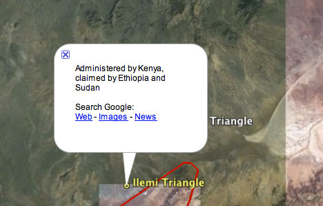
(In fact, it might even be better to show the Sudanese and Ethiopian borders of the area as orange, as that is where the “line of control” is for Kenya. For a guide to what the colors (red/orange/yellow) mean, see Google’s explanation.)
In Google Maps, however (and I assume soon in Google Earth), it appears as if the disputed triangle has been handed to Sudan:
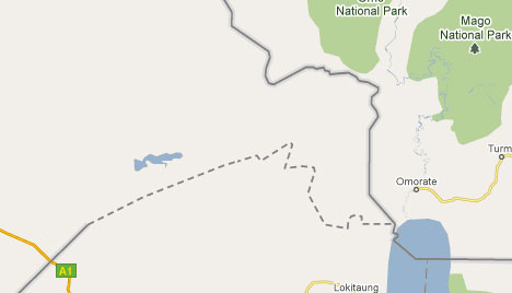
While this change surely is unintentional, the removal of the Sudanese line and the “hardening” of the Ethiopian line can easily lead to mistaken interpretations.
Changed borders:
Google’s announcement uses a disputed island straddling the Uruguay-Brazil-Argentina border as an example of how new information has led to qualitative changes in map borders. There is another example in South America — the border between Chile and Argentina has become more accurate, but also, surprisingly, has changed shape. Back in 2007, the Chilean border town of Villa O’Higgins was accidentally placed in Argentina and labelled as such. The error was soon corrected with the border that until now looked like this in Google Earth:
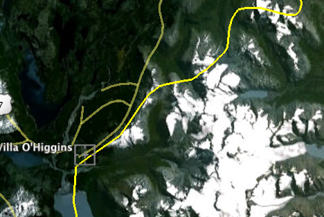
The new version of the border, already visible in Google Maps, looks like this, with further changes up and down the line:
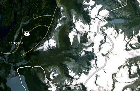
I trust that this latest (third) Argentina-Chile border dataset is to everybody’s liking, as it is not marked as disputed:-)
One place where nothing has changed (as far as I can tell) is in the depiction of the disputed borders between China, India and Pakistan. Arunachal Pradesh is still shown as disputed, with both Chinese and Indian claim lines given equal weight, just has it has been since 2009.
Some Indian bloggers, however, on reading Google’s announcement and checking India’s borders, are discovering anew Arunachal Pradesh’s disputed status, and are not liking it one bit. Trak.in:
I, for one can understand Jammu & Kashmir to be shown as disputed (although, I think only northern part should have been show as disputed), seeing Arunachal Pradesh under dispute is not something I can digest.
Seems like the error in data processing is part of their ‘batch processing’ mistakes? Or an attempt to please Chinese government [J&K dispute is well understood and most of the international news sites shows J&K as disputed area, but not Arunachal Pradesh].
Relax, guys, nothing’s changed. In fact, Pluggd.in noted themselves back in October 2009 that the the international version of Google Maps shows Arunachal Pradesh as disputed. You might not like it, but you can’t act surprised.
One thing Google could do, however, to make their map of Arunachal Pradesh more accurate, is to draw India’s claim line in orange, not red, because India is the de facto administrator of the region, whereas China “just” claims it. (Same goes for Aksai Chin, which China controls but India claims.)
Preah Vihear:
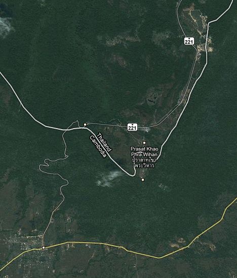
In February 2010 Cambodia vocally protested the depiction of its border with Thailand in Google Earth, especially around the temple of Preah Vihear. (All the gory details are here.) Basically, the demarcation line did not show that the area around the temple is disputed, instead opting to show the maximalist version of Thailand’s claim:
Now, it looks like this in Google Maps:
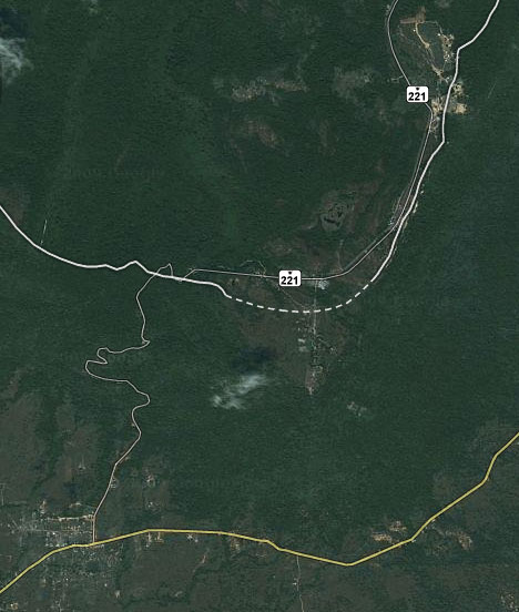
It’s an improvement. Still, the road coming in from the left is completely inside Cambodian-controlled territory, so the dotted dispute line should be longer. Also, there is a Cambodian claim line and a Thai claim line — we already know the contours of the Thai claim line, so why not just add the Cambodian claim line and show both in red in Google Earth?
Elsewhere, you can see that the resolution of the border between Thailand and Cambodia has been much improved. Here is the change around the Ta Muen temple complex, which straddles the border further to the west:
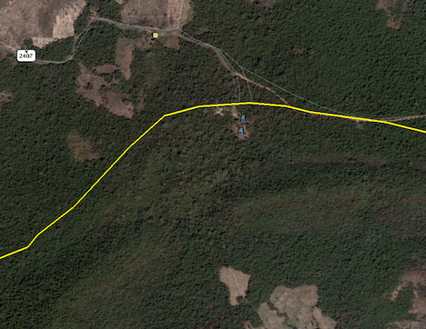
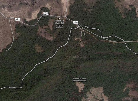
This and other temple complexes along the border have become more heavily contested in the wake of the controversy surrounding Preah Vihear.
Perfection is elusive when mapping, but it is good to see that Google is spending resources on improving the depiction of borders in Google Earth and Google Maps.
[Update 2010-07-22: A Google spokesperson writes:
“I just wanted to clarify one point regarding the Ilemi Triangle: as part of this update, we have revised this area to depict the 1938 “Red Line.” This line is considered to more accurately reflect which country controls which portion of the area.”
Several independent online resources all state that Kenya is the de facto administrator of the entire area, but I will read up more thoroughly on this dispute before reporting back.]