I’m always interested when the (mis)management of human affairs leads to large-scale effects visible from space. This blog has documented several such cases, from depopulation policies in Burma and Zimbabwe to massive refugee camps in Chad and a polluting mine on Indonesia’s West Papua.
I was therefore excited when I noticed that Alex Tabarrok in Marginal Revolution — one of my favorite economics blogs — had written up the use of Google Earth imagery to examine the large-scale effect of Mugabe’s land redistribution policy on Zimbabwean farmland.
[Update 2010-03-21: Tabarrok has now updated his post in response to mine.]
Tabarrok’s post is about an article by the economist Craig J. Richardson entitled Visual Evidence of the Cost of Destroying Property Rights, likely published in late 2006 (no date is given) on the website of The Center for Global Development (CGD), a Washington DC think tank. (I’m surprised I hadn’t seen the article before, but perhaps this is due to the fact that it was not ever in an RSS feed.) The article’s intention is to illustrate with before-and-after satellite imagery from Google Earth what happened when, beginning in 2000, white-owned commercial farmland was redistributed to poor and landless Zimbabweans. The apparent moral of the story is that the tragedy of the commons is an all too predictable outcome when property rights are destroyed:
Instead of improving [the farmland], the move towards equality has had ironic results: [The] commercial farming sector now increasingly resembles the communal lands. The once irrigated commercial land is brown and scorched, and the reservoirs have dried up due to a lack of parts.
The presentation is given its own section on CGD’s website, introduced by
Scorched Earth in Zimbabwe: Before and After Satellite Photos and including a page dedicated to a discussion of the satellite imagery used.
CGD even produced a Flash animation to highlight the changes: (Click on the arrow to progress between before and after photos)
Over at Marginal Revolution, Tabarrok’s post resulted in a long and interesting comment thread that even includes an appearance by Richardson, the original article’s author.
There is unfortunately one fundamental error in Richardson’s empirical research, one that has little to do with his skills as an economist but everything to do with his lack of skills as a forensic neogeographer:
His before-and-after images are derived from the same original raw Landsat image. They are from the same point in time.
There is no doubt about it. Here’s why:
The base imagery in Google Earth is 15m-per-pixel Landsat imagery, and it can be over a decade old. The imagery in Richardson’s presentation was indeed the base imagery visible in Google Earth during 2005 and 2006, before any high-resolution imagery was added for that region.
But Google routinely updates its imagery dataset, and when it does so, it is not uncommon for different post-processing settings to be applied to the same base imagery, to better match colors across regions.
It is the case that colors in satellite imagery are always false, albeit made to look realistic (just as with those pretty pictures of galaxies and planets). A lake captured on a raw satellite image may have the vaguest grayish-blueish tint, but then the saturation, hue and vibrancy are typically tweaked so that we get a bright blue color in the final image. The same goes for grasslands, fields and forests. Very slight color changes reflecting different crop choices can lead to drastically different hues by the time the image hits Google Earth.
So how do I know that these two images are the same, albeit post-processed differently, as opposed to taken a few years apart, as posited by Richardson? Because the composition of the fields, like the outlines of pieces in a jigsaw puzzle, is identical. All the fallow fields in one image are fallow in the other. Not a single field has been tilled, planted, harvested, abandoned, burned or overgrown, in whole or in part, in the supposed interval.
As anybody who’s stared long enough at satellite images knows, the state of the fields is like a fingerprint. If they match, the images match. The main difference between these two identical images is that one is yellower than the other, and that in one the blue hues have been turned way up, while in the other they have not. Instead of scorched earth and dried up reservoirs, we have two different post-processing settings.
One eagle-eyed commenter, in addition to noticing that these images are identical, pointed out that there are some cloning artifacts at the bottom of the images (and he is right, with a gallery to prove it). I do not, however, think that the images were doctored with the intention to deceive. Rather, as thumbnails of Richardson’s originals hint, the author likely wanted to erase the Google logo and the compass from the presentation.
The main problem, however, is that this unfortunate revelation makes a mockery of Richardson’s main empirical point in support of his thesis, which is that post land reform, the reservoirs ran dry by 2006, just because they looked yellow in Google Earth in 2006.
There is an easy way to see that the reservoirs were not dry in 2006: Launch Google Earth and take a look for yourself.
Today, Google Earth not only has high-resolution imagery for the area of Richardson’s imagery, the latest version of the application also boasts a historical timeline that can show older satellite imagery. As it happens, Google Earth has 2.5m Spot Image imagery for the whole area taken on October 5, 2005, and better-than-1m GeoEye imagery for part of the area taken on October 7, 2006.
Because I realize not everybody is fluent in Google Earth, you can follow along with me. Just download this file to your desktop and open it in Google Earth (download the application here). It shows you the exact area in question, bounded by a white rectangle.
Notice that the easternmost third of the rectangle is in a different hue. That is the newer GeoEye imagery from Oct 2006. The western two thirds is Spot Image imagery, taken almost exactly a year earlier:
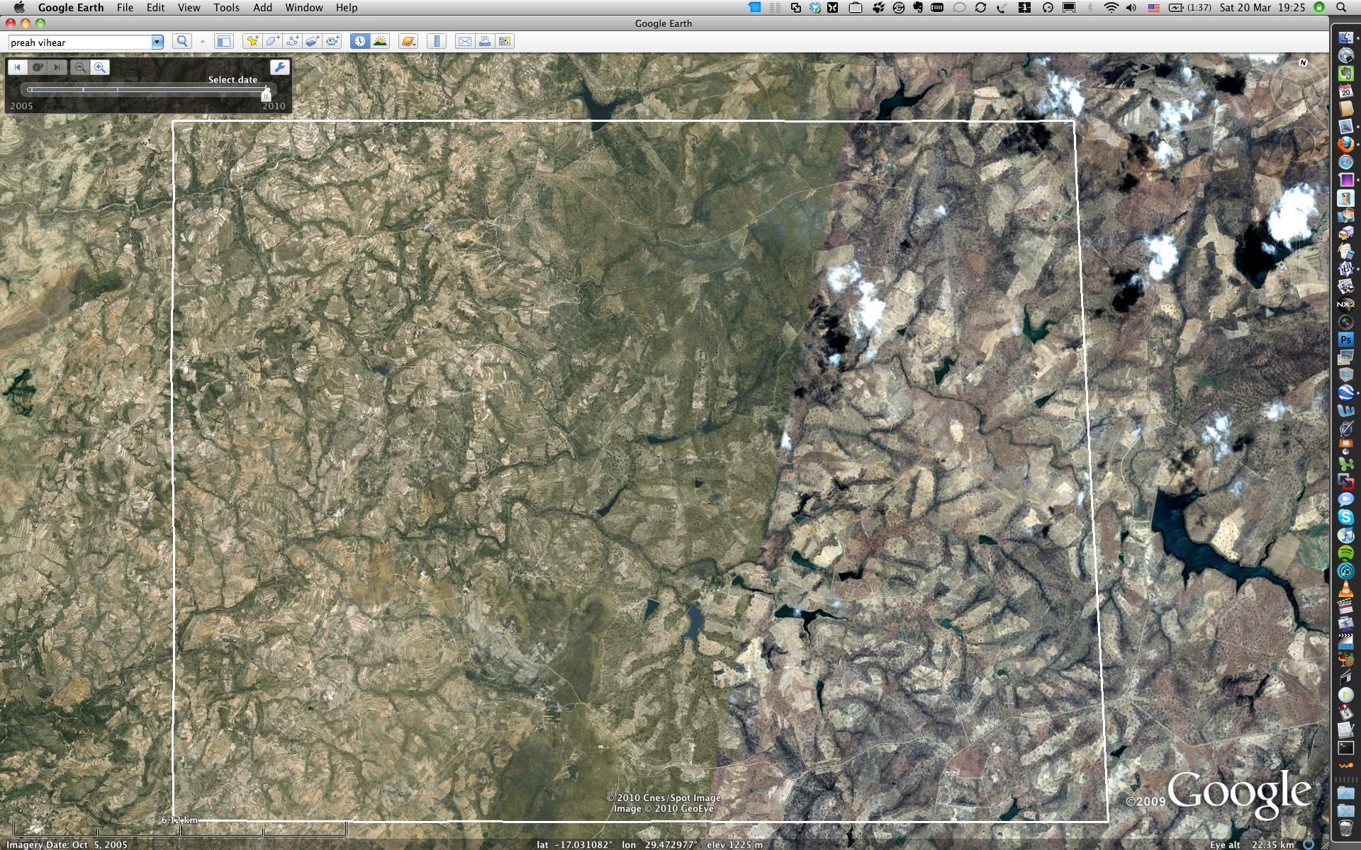
(Click to see full-resolution version.)
Take a moment to observe the reservoirs. They are not “dried up”.
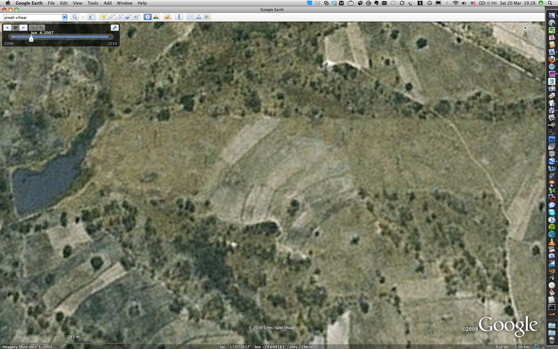
You can strip away the newer imagery by using the historical imagery timeline. Click on the clock icon in the toolbar at the top of the screen — a timeline appears. Shift the slider to the left, to the next-most recent view, from June 4, 2007. The GeoEye imagery from Oct 2006 disappears, because it had not yet been added to Google Earth on June 4, 2007.
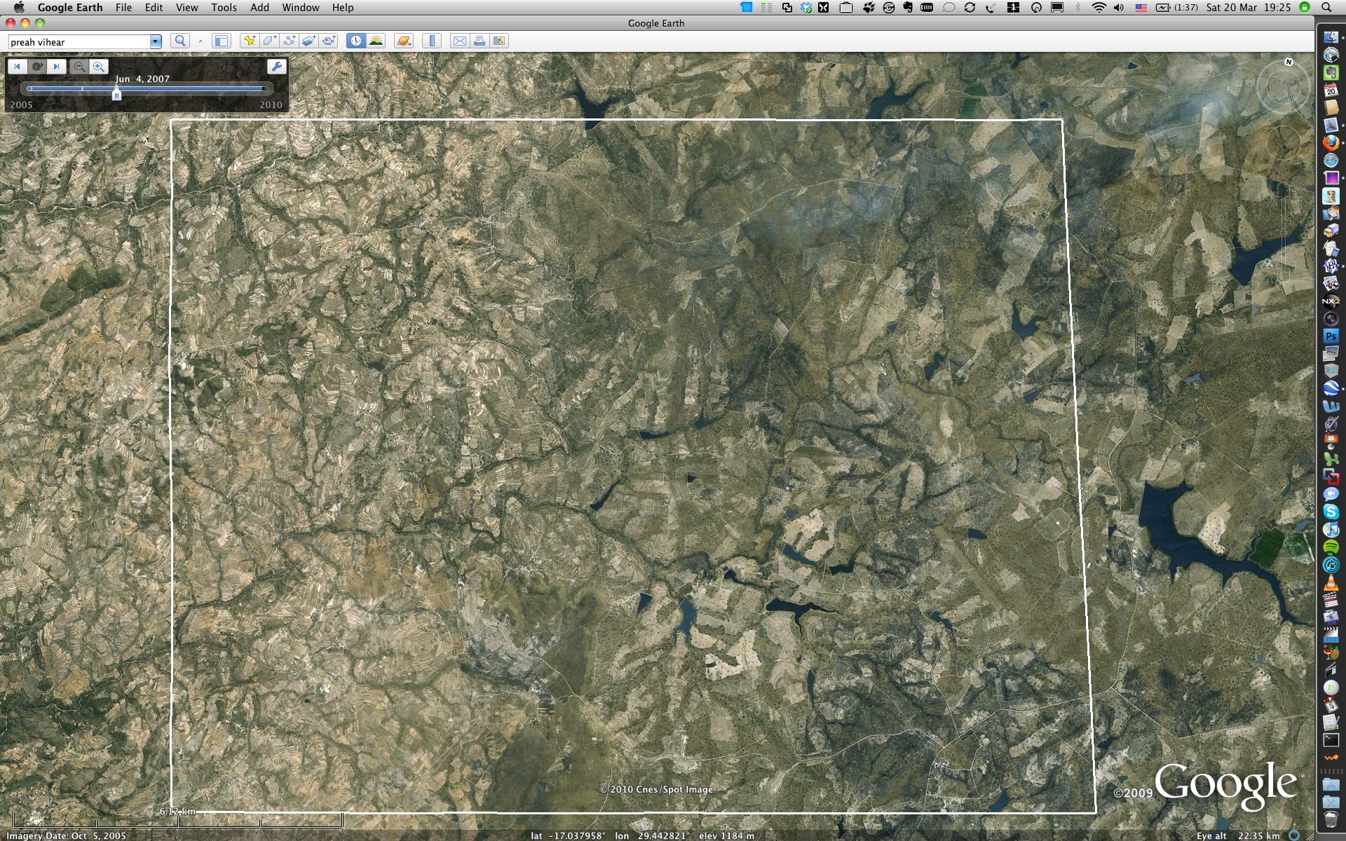
(Click to see full-resolution version.)
If you zoom in on any lake in the eastern third of the rectangle, you can now toggle between its state in Oct 2005 and Oct 2006, simply by dragging the slider back and forth between June 4, 2007 and the present day. You’ll notice that the reservoir levels in Oct 2005 are somewhat higher than in Oct 2006.
Explore this easternmost area and toggle the slider some more. Notice something strange? Many of the shallow valleys, which are slightly more wooded, seem to have been burned between Oct 2005 and Oct 2006. There is a very clear example of this at the area where I’ve placed a pin in the Google Earth file:
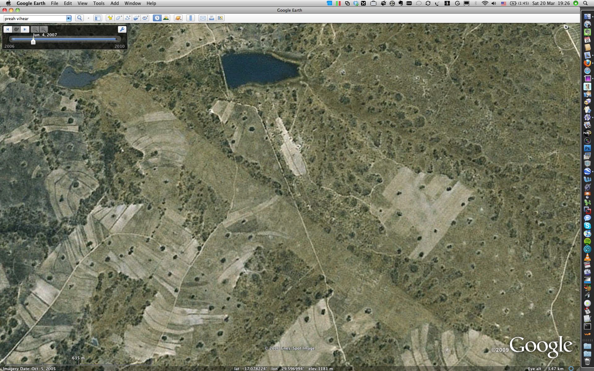
Oct 5, 2005 imagery (Click to see full-resolution version.)
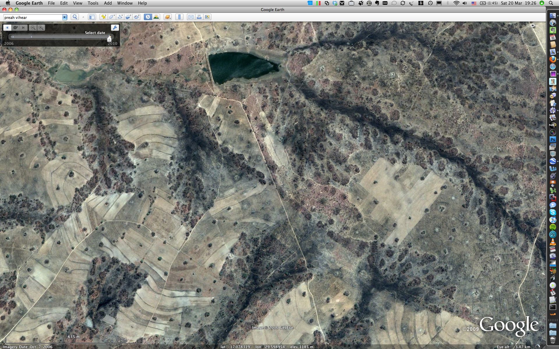
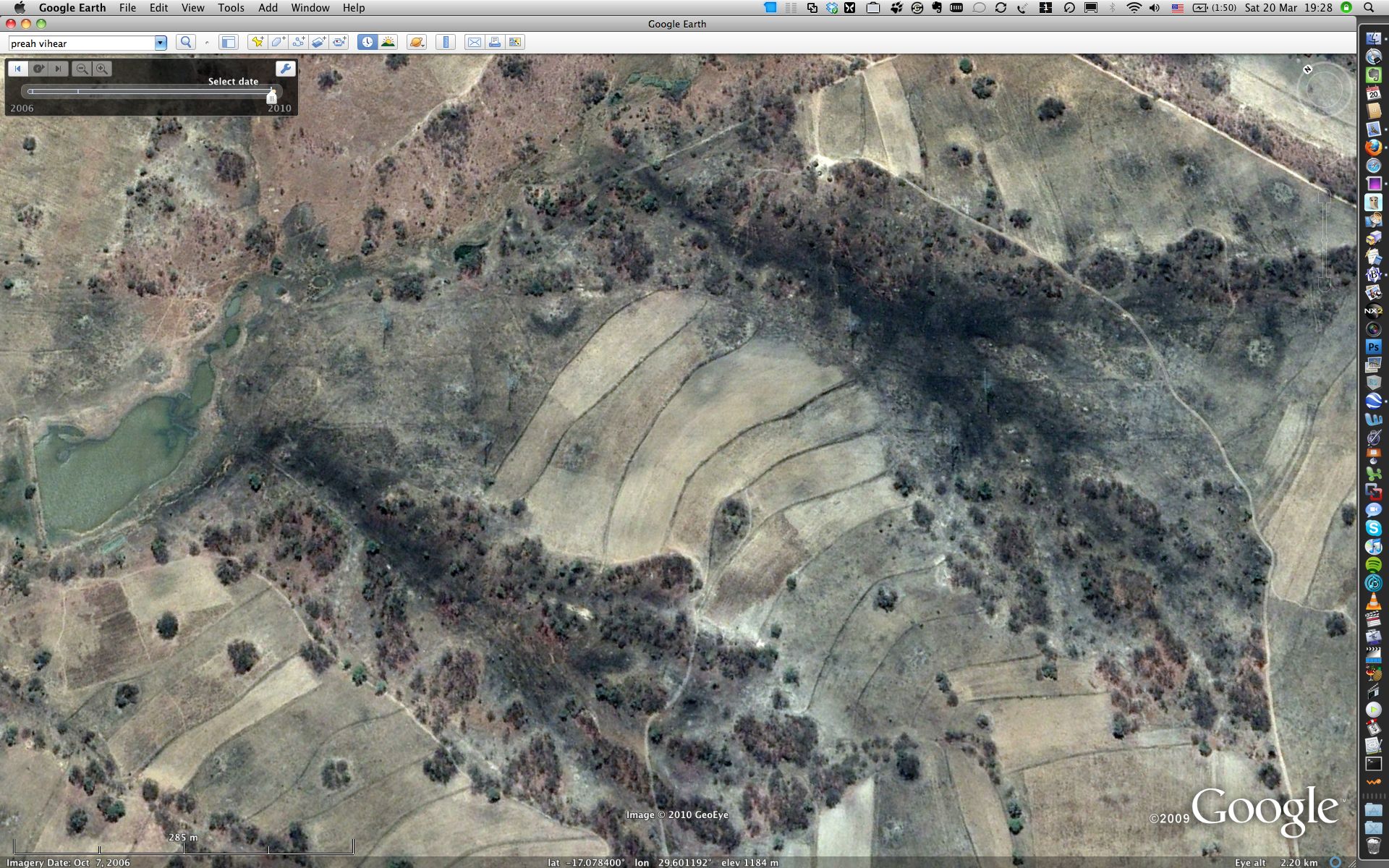
Oct 7, 2006 imagery (Click to see full-resolution version.)
Here’s a close-up:
Oct 5, 2005 imagery (Click to see full-resolution version.)
Oct 7, 2006 imagery (Click to see full-resolution version.)
Now that we have all this evidence in place, this much is clear: Tabarrok should pull the PowerPoint slides he made incorporating CGD’s interactive graphic, because they do not show that Mugabe’s land reforms led to a tragedy of the commons. The reforms may well have done so, but CGD’s graphic, being based on a single image, cannot show this.
(Also worth mentioning is a point raised by some of the commenters, which is that the land repossessed from white land-owners was not in the main given to poor or landless farmers, but to Mugabe’s cronies, who are as likely to be competent at farming as they are at governing Zimbabwe. So even if there were a discernible worsening of the farmland previously owned by white farmers, it would not illustrate the tragedy of the commons so much as the tragedy of cronyism.)
One thing we may not conclude, however, is that Richardson is wrong just because the evidence he used to support his thesis was false. In his comment to Tabarrok’s post, Richardson writes something very interesting:
Lastly, I have photos from my visits to Zimbabwe that document thousands of acres of burned fields- former commercial farmland- that were torched so that starving people could eat the wild game that hid there. Ironically the fields were worth more burned to the ground after the titles were revoked.
This would certainly be one plausible explanation for the extensive burning of the fields and shallow valleys visible in the Oct 2006 imagery above. It is quite likely that we do, after all, have here an instance of a large-scale effect visible from space due to the (mis)management of human affairs — just not the one Richardson had in mind — supporting Richardson’s thesis that the destruction of property rights leads to the tragedy of the commons.
Aren’t those before and after images OBVIOUSLY derived from the same source image? It’s equally baffling to me that someone would publish a paper without bothering to double-check one of the core assumptions, and that the author didn’t encounter anyone even marginally competent with Photoshop before publication, who would have immediately said, “This looks shooped.”
Bravo!
-“Eagle eyed” Dimitri
In Africa, burning grassland every year is common practice in many places. I don’t think it is reasonable to draw any conclusion whatsoever from the burning without knowing the practices of the area in question. October is the end of the dry season and the exact time that most such burning takes place in preparation for the rains. It may have simply happened a week earlier in 06.
Additionally, the levels of dams and color and extent of vegetation can vary quite considerably over the years depending on rainfall patterns, so again, without good meteorological records, it would be wrong to draw any serious conclusions from those either.
If anything, one would expect some dams to be fuller, if the water is not being used for irrigation.
what’s interesting about the burned areas is that there seem to be fields and shallow valleys in the vicinity which were already burned in the 2005 imagery. Those areas are still seen as burned in the 2006 imagery, but are joined with newer, freshly burned areas. The effect is quite stark if you toggle between the two years. There thus seems to be a cumulative effect to the burning, as opposed to something that is done annually.
Of course, it is always possible that underbrush gets cleared every five years or so. Always best to go check on the ground to see what is happening.
I grew up in a poor area of rural Alabama (is that redundant?) where farmers burned off their fields every year — along with large swathes of surrounding countryside if the burning was done at the wrong time. I agree with Dmitri that burned fields may indicate nothing more sinister than outmoded farming techniques common in many regions of the world where the use of heavy cultivation machinery is not practical.