It’s not that I’ve stopped paying attention to the social implications of neogeography in general and Google Earth in particular: It’s simply been a quiet few months in the niche topic Ogle Earth covers. Maybe this is because the new geospatial technologies introduced these past few years are now being embraced by the mainstream, so there are fewer opportunities for disruptions to long-held assumptions, both among users and politicians. Just as with the plain-vanilla web before it, people are now getting the geoweb.
But this lull gives us the space to focus on three unheralded yet significant trends in Google’s mapping service, which are going to make it an even more useful product than it is now.
1. Imagery freshness:
With every monthly imagery update since August 2009, Google has made available a KML file outlining where all the new imagery is to be found (on Google Lat-Long Blog). This makes it very easy to check up on new imagery in areas of interest.
It used to be that newly added imagery would be at least 6 months old, but usually a year or more. Perhaps this was by agreement with Digital Globe or because of an internal process. Since a few months ago, however, a good chunk of the imagery has been just weeks old. It’s basically being added to the dataset as quickly as it is gathered.
The traditional complaint of Google Earth users has been that the imagery was outdated, often by several years. In fast-developing places like China, that kind of delay is especially frustrating. This new bias towards near-realtime updates is a huge improvement to the usefulness of the satellite imagery as a tool, but one that is not immediately obvious if you’re not paying close attention to the metadata.
2. Map and imagery correlation:
European and American cartographical institutions have long synced their products with the geodetic system used by standard GPS devices, WGS84. As a result, map data and imagery across Europe and the US correlate well, often to within a few meters. On Google Maps, you can switch between the map and the imagery without confusion. Place a feature on one dataset and it is accurately positioned on the other.
Not so in other parts of the world. When I lived in Egypt during 2007-2009, the road layer and other map data for Egypt was positioned some 125 meters NW of the imagery, because it was prepared using some other geodetic system datum. Even imagery tiles were sometimes badly stitched together, with errors of up to 20 meters at the seams (as blogged here).
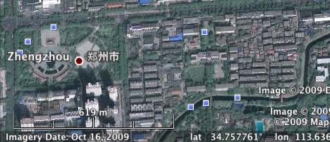
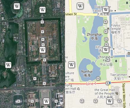
Now that I have moved to China and am looking closely at the local data around me, I’ve noticed the situation here is even worse. The map and imagery layers are off by 250 to 500 meters across all of China. This is causing all sorts of problems that will have repercussions in the future, even after these discrepancies have been reconciled, because a lot of user-generated data is being created on top of the map layer, and this content then bleeds into Google Earth and Google Maps’s imagery layer, where the locations are plain wrong. The opposite happens also, (though without repercussions for the future): Wikipedia placemarks that are accurate in Google Earth are misplaced in Google Maps’s maps layer:
But Google is working to make things better. Egypt recently received a revamped map layer, and now the discrepancy is only 10-20 meters from the GPS reading. The content generated on top of the old map data is still in evidence, however, so for a while yet we will have to deal with inaccurate POIs, such as hotels situated in the middle of the Nile:

In fact, both Egypt and China are exceptions, because neither country is currently included in Google Mapmaker, a community effort focused on the developing world that lets users generate objects on the map layer aligned with the underlying satellite imagery. Vietnam, for example, enjoys a high degree of alignment between the two datasets; this is how mapping is now being done for most places in Google Earth outside Europe and the US, and the results are replacing existing substandard or incomplete datasets.
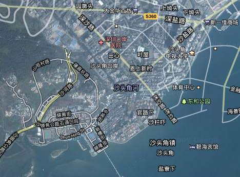
For extra credit: Hong Kong also has a good fit between the two datasets, which led me to wonder if there might be a visible edge between HK’s accurate map data and China’s off-kilter data. Sure enough, the two datasets clash quite dramatically, with lots of roads to nowhere:
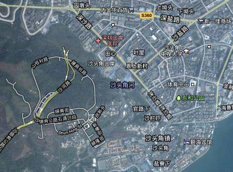
The Chinese version of Google Maps, ditu.google.cn, introduces an interesting hack to fix this discrepancy around Hong Kong. If you turn on hybrid mode and scroll across the border from Hong Kong to mainland China, the background imagery tiles will suddenly shift to the Chinese geodetic system, so as to correlate with the foreground map data. In the image below, the imagery tiles have shifted to accommodate the Chinese map datum.
3. Cloud-power:
For a while now, Google Maps’s My Maps has allowed Google account holders to create and share simple maps via a web browser, storing the content on Google’s servers. Google Earth, even though it has far more sophisticated tools for creating content, has never been connected to Google’s account management cloud. Yes, there is a sidebar in Google Earth containing all your user-generated and downloaded content, but it isn’t synced with Google, nor can you easily share it via Google’s servers. Instead, you have to manually upload it to your own server or to Google Earth Community, after which the public content is no longer synced with the version on your desktop (obviously).
It’s long been mooted that this stuff could and should be synced with the cloud, just as with Google Maps. For example, you might be able to choose which datasets you want to share; subscribers to your content would then see the changes live as you update it, just as your subscriptions to the content of others would be automatically updated.
We’re not there yet, but two weeks ago Google took a step in that direction by linking My Maps to Google Earth for the iPhone. As a result, all the maps I’ve made over the past few years with My Maps are suddenly available on my iPhone via Google Earth. For example, these georeferenced photos of a trip to Ethiopia:
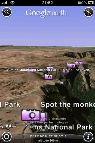
In effect, the Google Earth iPhone app now better connected to the cloud than the standalone Google Earth, but somehow I suspect that this is not how things will remain.
My Maps doesn’t currently support imagery overlays, so it doesn’t parse all the KML Google Earth’s content would throw at it, but there is no technical reason for it not to. It’s just a hunch, but I think that Google Earth’s next big revamp is going to involve a more intense integration of user data with the cloud. (Especially as such user data is something you can sell ads against :-)
PS:
A bit off-topic, but I can’t let this be: Sometime in the past few months, between the last time I checked and this week, Google Earth gained a high-resolution image of our planet’s remotest island, Norway’s Bouvetøya. The imagery is from 2008, even, and it is just gorgeous:
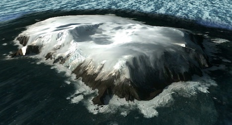
Considering it is one of the places I am least likely to end up at, I will settle for this high-resolution view.