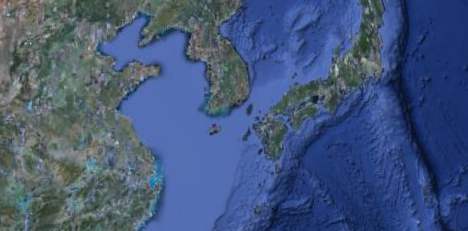
The Google globe looks a lot nicer today, at least from afar, because the faux 3D bathymetry painted onto the ocean surface just got a lot more detailed. It’s now a lot clearer, for example, that while the Mediterranean is a deep sea, the Yellow Sea/West Sea a shallow sea.
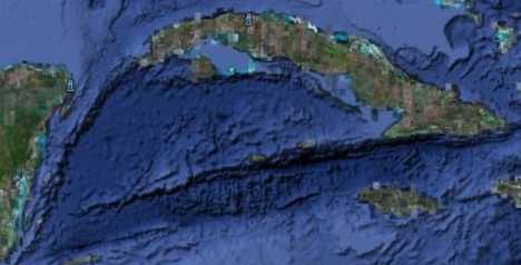
And it is now also a lot clearer how islands connect below the surface of the sea, for example with the Cayman Islands and Cuba.
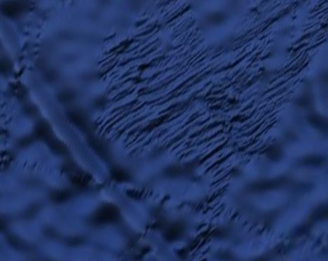
And finally, in many places the ocean floor appears to be rendered in as detailed a fashion as is currently available — you can see clear evidence of where bathymetric surveys were taken and of survey ship paths in the Southern Ocean, where high resolution mapping of the ocean floor is otherwise still scarce:
Google credits the data to SIO, NOAA, the US Navy, the NGA and the GEBCO.
But what this layer also hints at is that the mooted and hoped-for true 3D ocean landscape is likely not arriving anytime soon to Google Earth. A true bathymetry DEM for the globe would have been a real feat, but instead we’ll be looking at a 2D rendering of it for a while yet.
(BTW, In November 2008 GEBCO released a 1-minute resolution global grid to the public as a free download, with 2D viewing software (for Windows). I suspect this is the same data as is now viewable in Google Earth in 2D (though a 30 arcsecond resolution dataset was due to be releasedin “early 2009” as well). To view it, start here on the GEBCO site; the actual registering and downloading is done from the British Oceanographic Data Centre (BODC). The complete dataset is a 274MB download. There is software that lets you view this data in 3D as well, but I believe you have to buy it.)
Some have not been so happy with what Google hath taken away with this update: Commenters on Frank Taylor’s Google Earth Blog report that pacific atolls previously rendered at the global base resolution of 15m per pixel have now gone missing wholesale.
And another commenter, who knows the bathymetry of the Catalan coast quite well, reports that the data sports four fictitious sea mounds there. Indeed, an overlay for Google Earth lets you do a direct comparison:
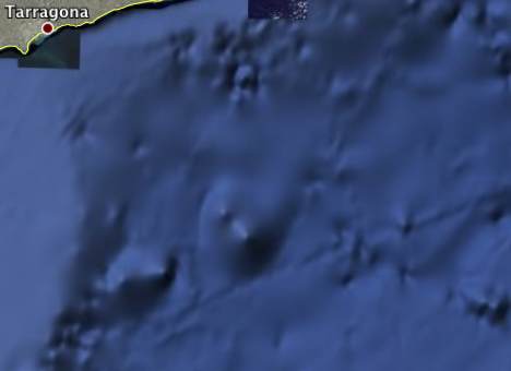
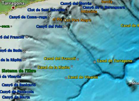
That’s likely the result of some erroneous original data being processed and ultimately rendered as a undersea peak.
Meanwhile,Barry Hunter isn’t impressed with how the bathymetry visualization melds with the satellite imagery along the coastlines. And Kurt’s Weblog notes that discrete contour lines are visible on some parts of the US coastline.
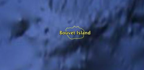
I went looking for some of my own favorite small islands, and noticed that they too have gone missing: The most remote island on Earth, Bouvetøya, has disappeared…
And so have a number of other sub-Antarctic islands, such as the Balleny Islands:
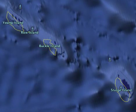
These islands are uninhabited, yes, but Sturge Island alone is 30km in length. To be fair, none of the other online mapping services have anything useful on the Ballenys, but that is no reason to lose them in Google Earth:-)
Hi Stefan
Talking about free 3D bathymetry software, don’t miss “Cove”. Take a look at this post at GEC, please:
http://bbs.keyhole.com/ubb/ubbthreads.php?ubb=showthreaded&Number=1169974
You don’t need to travel as far as the Antartic – the Isles of Scilly, with a population of 2,100 off SW UK, have disappeared like the Atlantis of legend, leaving numerous land based place marks bobbing in the pale blue sea,
Images are available – see the entry for the Isles in Wikipedia, ironically linked from a place mark in GE. Hopefully GE will soon restore the missing images.
I’m distraught about the removal of ‘imagery’ of the surface of the earth and its ad-hoc replacement by other data.
We work with Inuit in the Arctic. Sea ice is critical to their lives and culture. While the previous imagery was not frequently updated, it at least showed a real picture of what is up there. Sea, land, and ice features and how they interacted were clearly visible. Important ice features and locations now appear over an artificial blue surface, eliminating context. The Inuit have an uphill battle getting recognition of sea ice as legitimate occupied area, critical to their livelihood, and part of their territory rather than a ‘hazard to navigation’ as classified by southern governments. The removal of ice imagery and its replacement by a map of the ocean floor is detrimental to an understanding of the surface, where people live.
The ‘satellite’ layer in Google Maps and Earth should consist of what you would ‘see’ from space. I have no problem with the bathymetry being available in another layer, but to replace the default ‘satellite’ imagery layer in Maps with an airbrushed mix of sources is, to me, a mistake.
If anyone sees a Google announcement on the change (or, good grief, maybe a spot where they solicited feedback before making the change) please post it here. Reaching someone at Google seems like a deliberately difficult task.
Amos Hayes
Carleton University
The General Bathymetric Chart of the Oceans (GEBCO) have released a new global bathymetric grid with 30 arc-second spacing — the GEBCO_08 Grid. This is now available for download alongside the GEBCO One Minute Grid from the British Oceanographic Data Centre (BODC). You may opt to download complete netCDF grid file(s) or a user defined area.
The GEBCO_08 Grid was generated by combining quality-controlled ship depth soundings with interpolation between sounding points guided by satellite derived gravity data. It is a continuous terrain model for ocean and land with the land data largely derived from the Shuttle Radar Topography Mission (SRTM30) data set.
Should users identify grid artifacts we would be grateful for feedback.