A comprehensive phylogenetic visualization of the avian flu virus (phylogenetics = the mapping of genetic mutations over time and space) has just been published (press release) and its centerpiece is a KML file that shows the evolution of the virus as it travels out of East Asia and into Europe and Africa. Here is the KMZ file:
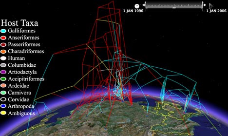
We’ve seen these shapes before in Google Earth. In fact, almost exactly a year ago Andrew Hill published a teaser of this data. At the time, this blog wished Google Earth had a timeline function — that wish has now been granted, and Andrew has been quick to take advantage of the technology: You can now see the virus mutate as a function of both space and time. It’s a mesmerizing but sobering sight.
Using the timeline is not the only cool thing about this visualization. I especially like how the KMZ file uses a combination of radio boxes and screen overlays to create what looks a lot like a list of interactive PowerPoint slides. It’s a technique well worth remembering:
The article itself you’ll have to buy, but the eyecandy is free. And really, who reads Systematic Biology for the articles? :-)
(Via H5N1)
Hey Stefan –
Thanks for taking the time to look at this again, meant to get to you yesterday, but was a busy press day. Bigger and better in the pipeline – using some cool flight tricks, more diseases, etc.
Andrew