Aaron Klein’s article on WorldNetDaily accusing Google Earth of anti-Israel bias is just so depressing and dreary. But to rebut just one charge:
Google Earth states it demarcates its maps according to international standards, but no Israeli-Palestinian negotiations — even the failed Camp David final-status negotiations in 2000 — ever placed the Temple Mount within Palestinian territory.
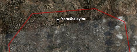
The reason is that the border as drawn by Google Earth is several orders of magnitude less precise than the convoluted course it actually takes. That’s obvious as soon as you zoom in:
This WorldNetDaily article is what happens when you mash up mapping neophytes with conspiracy theorists. What’s especially noxious, though, is to feed a terrorist commander your own deluded version of events and then getting him to congratulate Google in a quote (read the article).
The one amusing thing about all this is that elsewhere on the web, Google Earth is simultaneously accused of pro-Israel bias. Google must be doing something right to be smack in the middle of the firing line of this conflict.
Couple of things.
If the border isn’t drawn precisely/correctly, then why didn’t Google state so? Instead they say they meet international standards. Which would imply the line, which is the boundary, is represented correctly. Not something that isn’t correct. Maybe Google should have stated up front it isn’t correct, instead of passing the buck.
Two, were you part of the interview or have all the notes of the interview with Abu Nasser? If so, please show me where he was feed “deluded versions of events”. So asking a question is a or force feed “deluded versions of events”? From what I read, not that it was stated directly. Nasser was asked about what is shown in GE(regardless if the boundary is correct or not). Which seems to be the question, from the answer Nasser provided.
To me, making assumptions about someones intent is noxious and a “deluded versions of events”. Not asking a question and getting a response.
So Google must be doing so right, huh. So it’s ok for Google to add to the continuing crap that is going on over there. Hell lets just pile on some more. What fun. Gheez.
KoS
Meeting international standards does not imply everything is ‘correct’. That is your reading of it. International standards need to apply internationally and are therefore the best that can be achieved at a global level. Quick question – how would you measure when the border position is correct enough for you?
Well, if a road is the same as a boundary line between two countries. And I can zoom in a see features nicely. Then I expect the boundary line to be on the road, not here or there. If it’s a stream, I expect the line to be on the stream. Now if it’s a very coarse image, then I can see where the line isn’t in the correct position.
International boundaries should be very accurate and precise. Not capturing the data at 100k scale and then scaling it to 1k scale(for example). And then calling it good enough.
Yes you are right, international standards don’t mean it’s 100% correct. But if it’s brought to Google’s attention a feature is incorrect and Google says they are meeting international standards. Then it implies, to me, they are saying the line is in the correct position.
You are also assuming international standards means just mapping features at a global scale. I see international standards as agreed upon mapping standards at any scale, local or global. By having those international standards it would make exchange of information easier. So, international doesn’t mean just mapping at a global scale, could be any scale of mapping.
GE doesn’t just show features at a global scale. It also has a local scale. If it’s going to show both, then features should be right at any scale. Especially in that part of the world, being precise in the boundaries means alot. In some cases, it’s life and death. We are not talking about a boundary dispute between to friendly neighbors here.
I’m a big believer in representing information correctly. Given there is always limitations depending on the situation.
KoS
This is not an issue of inaccuracy created by generalization, positional error, or any of the other usual suspects when things on maps show up in the wrong place. I think that this is GE trying to have it both ways by claiming to use the “international” consensus and then intentionally using a boxy polygon so generalized that no one could reasonably believe that it represented the actual boundary. With stuff like this they need to either leave the boundaries off entirely or use some kind of a designation like “disputed boundary” to let people know that they need to do their own research and draw their own conclusions.
Ben
I think the red color to the boundry is Google’s way of saying that it is disputed.
Well, the issue here is not the accuracy of GE, at least this was not the main object of critisizm in the pro-israeli article. The issue is the GE adherance to UN maps. This is the core of the issue.
Now according to the UN. Palestine was devided into two states, Israel and Palestine. But Jerusalem was put under a separate zone. It was not given either to Israel or to Palestine. The fact that Israel occupied (or controlled as Israelis say) west Jerusalem in 1948 and then East Jerusalem in 1967 does not make Jerusalem within the israeli boarder in the eyes of the UN. When you know these facts, it comes clear that some ppl who are critisizing GE are actually demanding that GE to reflect their own point of view.
But GE should not reflect the views of any party in this conflict. It should remain neutral. The closest point to neutrality in this complex conflict is the UN guidelines.
Stefan is right. If you look very closely, you’ll see that GE has multiple levels of detail for each border (like multiple levels of imagery), designed to look right when you’re at a certain distance, or level of “zoom.” As with imagery, if you get too close, rather than show nothing, the software keeps using the last/best level of detail, albeit “blurred.” Lines don’t get blurred like pixels do — they get coarse and need more vertices to look good. This low-resolution line probably looks fine from a much higher altitude, but not this close. So the line isn’t wrong, it’s just not precise enough for this level of zoom.
Ideally, Google could add higher-fidelity border lines for these close-ups. But the most you could fault them for is not prioritizing this over adding other new data, like whole countries that still need definition. So I see no bias whatsoever. There’s only so much they can do at any one time.
read up about map scale and vector vs raster data. with raster (bitmaps) you can tell you are zoomed in beyond the appropriate scale by pixellation. with vector lines it isn’t as clear. a clue is the relatively large distance between vertices. it is clear to me that this border line was not meant to be viewed at so large a scale.